Provision Newsletter
Nine key things for successful investing
There is an ever-present worry list surrounding investment markets – usually involving some combination of concerns about economic activity, inflation, profits, interest rates, politics, natural calamities, wars, etc. It makes it hard for investors to stay focussed and avoid silly mistakes. Uncertainty is magnified by perennial predictions of a crash and then periodically by talk of the next best thing
Read MoreIntroduction
There is an ever-present worry list surrounding investment markets – usually involving some combination of concerns about economic activity, inflation, profits, interest rates, politics, natural calamities, wars, etc. It makes it hard for investors to stay focussed and avoid silly mistakes. Uncertainty is magnified by perennial predictions of a crash and then periodically by talk of the next best thing that’s going to make us rich.

It would be nice if the investment world was neat and predictable, but it’s well known for sucking investors in during good times and spitting them out during bad times. If anything, it’s getting harder reflecting a surge in the flow of information and opinion. This has been magnified by social media where everyone is vying for attention and the best way to get this is via headlines of impending crisis. This all adds to investor uncertainty and erratic investment decisions.
With this in mind, I have written regularly about nine key things for investors to bear in mind to be successful. This note provides a reminder.
1. Make the most of the power of compound interest
Making the most of compound interest – which refers to the way returns compound on past returns for an investor over long periods – is the most important thing an investor needs to do if they want to build wealth. It works best for growth assets. The next chart shows the value of one dollar invested in 1900 in Australian cash, bonds and equities with interest and dividends reinvested along the way, before fees and taxes. That one dollar would be worth $253 today if it had been invested in cash. But if it had been invested in bonds it would be worth $879 and if it was allocated to shares it would be worth $752,213. Although the average return on shares (11.6% pa) is just double that on bonds (5.9% pa), the magic of compounding higher returns leads to a substantially higher balance. The same applies to other growth assets like property. So, the best way to build wealth is to take advantage of the power of compound interest and have a decent exposure to growth assets. Of course, there is no free lunch and the price for higher returns is higher volatility but the impact of compounding returns from growth assets is huge over long periods.
Shares versus bonds & cash over the very long term – Australia

Source: ASX, Bloomberg, RBA, AMP
The volatility set off by the pandemic and now flowing from high inflation and interest rate increases does nothing to change this, any more than previous setbacks (highlighted with arrows) like WW1, the Great Depression, the 1973-74 bear market, the 1987 crash or the GFC did. The likely end of the secular decline in inflation and interest rates over the last few decades which super charged investment returns means average returns over the next decade or so will be somewhat more constrained than we have become used to. But shares offering a dividend yield of 4% (5% or more with franking credits) should still provide superior medium-term returns and hence grow wealth better than bonds where the 10-year yield is 4.50% pa. Unfortunately making the most of the magic of compounding returns can be one of the hardest things to do.
2. Don’t get thrown off by the cycle
This is often because investment markets go through cyclical swings. All eventually set up their own reversal – eg, as falls make shares cheap and low interest rates help them rebound. But the outcome is extreme volatility in short term returns as evident in the next chart which shows the pattern of rolling 12 month ended returns in Australian shares (compared to rolling 20 year ended returns).
Australian share returns over rolling 12 mth & 20 yr periods

Source: ASX, Bloomberg, RBA, AMP
The trouble is that cycles can throw investors off a well thought out investment strategy that aims to take advantage of the power of compounding longer-term returns. But cycles also create opportunities. Looked at in a long term context, the 20% or so plunge in share seen into October last year was just another cyclical swing, after which markets rebounded. The key is not to get thrown off when markets plunge.
3. Invest for the long term
Looking back, it always looks obvious as to why things happened and dips in investment markets look like great buying opportunities. But looking forward the future is shrouded in uncertainty. And no-one has a perfect crystal ball. As JK Galbraith observed “there are two kinds of forecasters: those who don’t know, and those who don’t know they don’t know.” Usually the grander the forecast the greater the need for scepticism as such calls invariably get the timing wrong or are dead wrong. If getting markets right were easy, then the prognosticators would be mega rich and would have stopped doing it. Related to this many get it wrong by letting blind faith – eg, “there is too much debt” – get in the way of good decisions. They may be right one day, but an investor can lose a lot in the interim. The problem is that it’s not getting easier as the world is getting noisier. This has all been evident through the pandemic and its high inflation aftermath with all sorts of forecasts as to where markets would go, most of which provided little help in actually getting the big swings right. Given the difficulty in getting market moves right in the short-term, for most it’s best to get a long-term plan that suits your level of wealth, age, tolerance of volatility, and stick to it. Focus on the green 20-year return line in the previous chart rather than short term swings.
4. Diversify
Don’t put all your eggs in one basket. Having a well-diversified portfolio will provide a much smoother ride. For example, global and Australian shares provide similar returns over the very long term but go through long periods of relative out and underperformance (eg, Australian shares outperformed in the mining boom years but global shares have outperformed since). Similarly listed assets (like shares) and unlisted assets (like property) often perform differently through the cycle. The key is to have a mix of investments.
5. Turn down the noise
After having worked out a strategy that’s right for you, it’s important to turn down the noise on the information flow and prognosticating babble and stay focussed. The trouble is that the digital world is driving an explosion in information and opinions about economies and investments. But much of this information and opinion is of poor quality. As “bad news sells” there has always been pressure to put the negative news on the front page of newspapers but there was hopefully some balance in the rest of the paper. In a digital world each story can be tracked via clicks so the pressure to run with sensationalised and often bad news headlines is magnified. This has gone into hyperdrive since the pandemic – with a massively stepped up flow of economic information. This may be of use in providing timely information on how the economy is travelling but it’s also added immensely to the flow of information and often it’s contradictory. The heightened uncertainty is leading to shorter investment horizons which in turn can add to the risk that you could be thrown off well thought out investment strategies. The key is to turn down the volume on all this noise. This also means keeping your investment strategy relatively simple. So don’t waste too much time on individual shares or funds as it’s your high-level asset allocation that will mainly drive the return and volatility you will get. Here are several tips to help turn down the noise:
-
Put the worries in context – there have been plenty of worries over the last century and yet long-term investment returns have been fine.
-
Recognise it’s normal for markets to swing around in the short term.
-
Focus on only a few reliable news services and turn off all “notifications” on your smart device.
-
Don’t check your investments so regularly – on a day-to-day basis it’s a coin toss as to whether the share market will rise or fall but the longer you stretch it out between looking at your investments the more likely you will get positive news. See the next chart.
Percentage of positive share market returns

Source: Bloomberg, AMP
6. Buy low, sell high
The cheaper you buy an asset (or the higher its yield), the higher its prospective return will likely be and vice versa, all other things being equal. So as far as possible it makes sense to buy when markets are down and sell when they are up. Unfortunately, many do the opposite, ie, selling after a collapse and buying after a big rally…which just has the effect of destroying wealth even though it might feel good at the time in the midst of a panic (or euphoria). Again, turn down the noise!
7. Beware the crowd at extremes
It often feels safe to be in a crowd and at times the investment crowd can be right. However, at extremes the crowd is invariably wrong – whether it’s at market highs like in the late 1990s tech boom or market lows like in March. The problem with crowds is that eventually everyone who wants to buy in a boom (or sell in a bust) will do so and then the only way is down (or up after crowd panics). As Warren Buffet has said the key is to “be fearful when others are greedy and greedy when others are fearful”.
8. Focus on investments with sustainable cash flow
If it looks dodgy, hard to understand or has to be based on obscure valuation measures then it’s best to stay away. Most cryptocurrency “investments” are a classic example of this. If an investment looks too good to be true it probably is. By contrast, assets that generate sustainable cash flows (profits, rents, interest) and don’t rely on excessive gearing or financial engineering are more likely to deliver.
9. Seek advice
We are all susceptible to psychological traps like the tendency to over-react to current investment market conditions, or to pay more attention to information and opinion that confirms our own views. And the increasing complexity of investing makes it anything but easy. However a good approach is to seek advice via an investment information and/or advisory service or a coach such as a financial adviser, in much the same way you might use a specialist to look after your plumbing or medical needs. As with plumbers and doctors it pays to shop around to find a service or adviser you are comfortable with and can trust.
Dr Shane Oliver – Head of Investment Strategy and Chief Economist, AMP
Source: AMP Capital November 2023
Important note: While every care has been taken in the preparation of this document, AMP Capital Investors Limited (ABN 59 001 777 591, AFSL 232497) and AMP Capital Funds Management Limited (ABN 15 159 557 721, AFSL 426455) make no representations or warranties as to the accuracy or completeness of any statement in it including, without limitation, any forecasts. Past performance is not a reliable indicator of future performance. This document has been prepared for the purpose of providing general information, without taking account of any particular investor’s objectives, financial situation or needs. An investor should, before making any investment decisions, consider the appropriateness of the information in this document, and seek professional advice, having regard to the investor’s objectives, financial situation and needs. This document is solely for the use of the party to whom it is provided.
Australian home prices up on supply shortfall, but at risk from high rates
The big surprise in the Australian housing market last year was how quickly home prices fell with RBA rate hikes. But the big surprise this year is how they rebounded when most including myself were looking for further falls. October CoreLogic data showed another 0.9% rise in national home prices, leaving them just 0.5% below their April 2022 record.
Australian dwelling
Read MoreIntroduction
The big surprise in the Australian housing market last year was how quickly home prices fell with RBA rate hikes. But the big surprise this year is how they rebounded when most including myself were looking for further falls. October CoreLogic data showed another 0.9% rise in national home prices, leaving them just 0.5% below their April 2022 record.

Australian dwelling price growth, to October
|
|
Oct % chg |
Annual % chg |
% recent peak to low |
% recent low to now |
|
Sydney |
0.8 |
9.0 |
-12.4 |
11.6 |
|
Melbourne |
0.5 |
2.4 |
-7.9 |
4.5 |
|
Brisbane |
1.4 |
7.8 |
-8.9 |
10.5 |
|
Adelaide |
1.3 |
6.5 |
-1.7 |
7.7 |
|
Perth |
1.6 |
10.8 |
-0.6 |
11.0 |
|
Hobart |
0.8 |
-4.9 |
-12.2 |
0.8 |
|
Darwin |
-0.1 |
-1.7 |
-5.1 |
2.5 |
|
Canberra |
0.1 |
-1.6 |
-7.9 |
1.3 |
|
National avg |
0.9 |
5.6 |
-7.5 |
7.6 |
Source: CoreLogic, AMP
After the initial rebound earlier this year we came to the conclusion that prices had bottomed and would rise another 5% next year. This remains our view, but the outlook for the property market is more uncertain than normal as the property market is caught between the extremes of a supply shortfall and the negative impact of higher interest rates – both of which are still playing out and are getting more extreme.
Supply shortfall still dominating for now
The rebound in prices reflects a far worse than expected shortfall of supply relative to underlying demand for homes as immigration rebounded driving the fastest population growth rate since the 1950s at the same time that the supply of new dwellings slowed. This accentuated already tight rental markets, forcing rents up & driving renters to consider buying. So, demand improved but supply remains weak with total listings below normal. Talk of rising prices and shortages further boosted demand from less interest rate sensitive buyers. Expectations that rates were at or close to the top have also helped. Looking at the key elements of this:
-
Net immigration looks to have been around 500,000 in 2022-23, more than double the 235,000 forecast in last October’s budget. And monthly arrivals suggest it’s continuing to surge this financial year.
Surging Australian net immigration

Source: ABS, AMP
-
This along with the constrained completion of new homes (with material and labour shortages and falling approvals) has meant an ongoing rise in the accumulated undersupply of housing, estimated to be 120,000 dwellings, rising to 190,000 dwellings by mid next year.
Home construction versus population growth

Population estimates based on recent data for 2022-23 and 2023-24, then Australian Budget forecasts for 2024-25. Source: ABS, Australian AMP
-
The Government’s commitment to produce 240,000 dwellings a year over five years is great news but only starts from July 2024 and may struggle as we only completed 187,000 pa over the last five years.
-
Tight housing supply is reflected in record low rental vacancy rates and surging rents, which in turn is driving some to try and buy.
Falling vacancy rates, rising rents

Source: REIA, AMP
So strong population driven housing demand, constrained supply and an existing shortfall remains a strong source of support for home prices.
But high rates may start to get the upper hand again
However, even when there is a supply shortfall, interest rates still matter.
-
The long-term bull market in property prices from the 1980s was underpinned by the shift from high inflation and high interest rates to low inflation and low interest rates which allowed a rise in home price to income levels and a similar rise in household debt. This valuation effect boosted house prices by around 3.3% pa, accounting for 46% of the total increase in house prices since the early 1980s. So, if we have moved into a more inflation prone world with higher average interest rates this structural boost has run its course & could start to reverse.
-
Australian housing remains very expensive on all metrics – home price to income ratios are only just below record highs; they are at the high end of comparable countries; and the time taken to save for a 20% deposit has more than doubled over the last 40 years from less than 5 years to now more than 10.
Ratio of home prices to wages and incomes

Sources: ABS, CoreLogic, AMP
-
The rise in interest rates since May last year has caused a big hit to home buyer “capacity to pay”. We estimate that the capacity to pay for a home by a borrower with a 20% deposit on full time average earnings is around 29% lower than it was in April last year as they can’t borrow as much now on a given income. See the next chart. This threatens a downwards adjustment in home prices at some point unless incomes rise dramatically or mortgage rates fall dramatically. It may have been offset this year by a pool of less interest sensitive buyers (eg, those who had access to the bank of Mum and Dad) but that leaves the market vulnerable if such buyers are exhausted.
Australian home prices versus capacity to pay

Source: RBA, CoreLogic, AMP
-
Australians continue to see this as a poor time to buy homes consistent with very depressed levels of consumer confidence generally. This makes the current upswing in home prices unusual as it’s normally accompanied by improved sentiment towards property.
Consumer housing sentiment and home prices

Source: Westpac/Melbourne Institute, CoreLogic, AMP
-
New listings are trending up and are likely to be boosted by increased listings from distressed sellers, including investors with rental yields falling further below mortgage rates. Measures of mortgage stress are continuing to rise. Mortgage interest payments as a share of household income are rising to record levels and scheduled payments are already at a record according to the RBA. And combining the RBA’s own analysis for variable and fixed rate borrowers one in seven home borrowers were estimated to be in negative cash flow as at July. This will worsen if the RBA raises rates further as appears likely.
-
Just as rate hikes impact the economy with a lag it’s the same with the property market. This is because it takes time for rate hikes to cool demand, for unemployment to rise and for distressed sales to increase. So last year’s slump in property prices that started as soon as interest rates started to rise maybe ran ahead of itself. Similarly, the last three major cyclical upswings in home prices have required lower interest rates to be sustained. With rates cuts still a long way away, the impact of past rate hikes still feeding through to demand and listings, and the RBA looking like it will raise rates again, the risk of another leg down in prices is high.
Interest rate moves normally impact prop prices with a lag

Arrows show the lagged lead from rate hikes to price falls. Source: CoreLogic, RBA, AMP
Concluding comment
The combination of slowing home price growth since May (when it peaked at 1.2% month on month), slowing auction clearance rates from the low to mid 70% range to the low to mid 60% range and weak growth in housing finance suggest that housing demand is struggling to keep up with listings. The supply shortfall in the face of strong demographic demand has had the upper had this year but high interest rates and their lagged impact look to be starting to reassert themselves. The headwinds of high interest rates and poor affordability will likely constrain the upswing at the very least and so our base case remains for price growth to slow to 5% next year. But it also means there is a very high risk of another leg down in average home prices emerging next year, particularly if unemployment rises significantly. After surprising on the upside this year, they may surprise on the downside next year! Interest rates, unemployment and auction clearance rates are key indicators to watch.
Dr Shane Oliver – Head of Investment Strategy and Chief Economist, AMP
Source: AMP Capital November 2023
Important note: While every care has been taken in the preparation of this document, AMP Capital Investors Limited (ABN 59 001 777 591, AFSL 232497) and AMP Capital Funds Management Limited (ABN 15 159 557 721, AFSL 426455) make no representations or warranties as to the accuracy or completeness of any statement in it including, without limitation, any forecasts. Past performance is not a reliable indicator of future performance. This document has been prepared for the purpose of providing general information, without taking account of any particular investor’s objectives, financial situation or needs. An investor should, before making any investment decisions, consider the appropriateness of the information in this document, and seek professional advice, having regard to the investor’s objectives, financial situation and needs. This document is solely for the use of the party to whom it is provided.
Five constraints on medium term investment returns
Starting in the early 1980s investment returns were spectacularly strong. Sure there were bumps along the way like the 1987 share crash, but Australian balanced growth superannuation funds returned an average 14.1% pa in nominal terms and 9.4% pa in real terms (i.e. after inflation) between 1982 and 1999. And that was after taxes and fees. This was well above
Read MoreIntroduction
Starting in the early 1980s investment returns were spectacularly strong. Sure there were bumps along the way like the 1987 share crash, but Australian balanced growth superannuation funds returned an average 14.1% pa in nominal terms and 9.4% pa in real terms (i.e. after inflation) between 1982 and 1999. And that was after taxes and fees. This was well above what would normally be expected from such funds.

Balanced/growth superannuation fund returns
Source: Mercer Investment Consulting, Morningstar, AMP
Since 2000 nominal super returns have been more constrained averaging 6.2% pa as we entered a lower return world with real returns averaging 3.6% pa. Mind you this is still pretty good considering that 1 year bank term deposit rates averaged just 3.7% pa and only 1.1% pa after inflation and that was before taxes. The odds are that returns are likely to be even more constrained over the next 5 to 10 years. This note looks at why.
What drove the strong returns from the early 1980s?
There was an element of mean reversion (or payback) after the poor returns of the high inflation 1970s. But fundamental drivers were:
-
Economic rationalist policies – deregulation, privatisation, competition reforms, tax reform and free trade – as policy makers focussed on supply side reforms in reaction to the inflation of the 1970s.
-
Globalisation which boosted trade & competition and lowered costs.
-
Easing geopolitical tensions with the ending of the Cold War in 1989 which led to the peace dividend of reduced defence spending.
-
Corporate focus on return on capital.
-
Positive demographics as baby boomers entered peak consumption and peak productivity.
-
Inflation targeting by independent central banks with a focus on keeping inflation and inflation expectations at low levels.
-
And, of course, the tech boom of the 1990s.
Taken together this drove low inflation and strong productivity growth which underpinned a secular bull market in shares – which are the biggest exposure in balanced growth super funds – through the 1980s and 1990s. See the next chart. It paused in the US in 2000-2013 but then took off in Australia with the 2000s resources boom only to take off in the US again from 2013 helped by ever lower interest rates into the pandemic (which pushed up the value of shares and other growth assets). Meanwhile bond returns were high given their high starting point yields in the early 1980s.
Long term bull and bear phases in US shares
Since 1900 there have been four major secular bull markets in US shares: the 1920s (with electricity; chemicals & mass production); the 1950s and 60s (with petro chemicals, electronics & aviation); the 1980s and 90s (see the text); and since 2013. Source: Bloomberg, R Shiller, AMP
Megatrends – five key constraints on returns
Unfortunately, the drivers of strong returns from the 1980s are reversing. There are five megatrends of relevance (see here for more detail).
1. Bigger government, less economic rationalist policies
As a result of the problems highlighted by the GFC, rising inequality, stagnant real wages, aging populations, climate change, the success of government income support in the pandemic, the rise of populism and a collective memory loss regarding the lessons of the past there is a backlash against economic rationalist policies and more support for big government. It’s evident in Australia, with the rising share government spending, widespread support for higher taxes and labour market reregulation. The risk is lower productivity & higher inflationary pressure.
2. The reversal of globalisation
The post-WW2 period saw a huge surge in global trade and financial links between countries as more countries entered the global trading system and trade barriers collapsed. This saw production allocated globally according to comparative advantage and highly integrated global supply chains. The cost reductions and competition helped reduce inflation. But the trend towards freer trade stalled in the 2000s and trade barriers are on the rise. The pandemic, rising geopolitical tensions and rising nationalism are accelerating this. Support for free trade policies has faded in favour of friendshoring, onshoring and old-fashioned protectionism to support manufacturing locally, eg, with subsidies for battery projects and electric vehicles. Inevitably this will lead to higher costs.
3. Increasing geopolitical tensions – a new cold war
Declining military spending into the 2000s was disinflationary. This was facilitated by the move to a “unipolar” world dominated by the US and increasing believe in free market liberalism. This started to fracture after the GFC and we are now in a “multipolar” less stable world with arguably a new Cold War between China, Russia and Iran on the one hand and Western countries on the other. The war in Ukraine and now Israel are arguably signs of this. This adds to the threat to free trade but also risks increased military spending. This means more demand for metals and more government spending which will add to inflationary pressure.
4. Climate change and decarbonisation
Ultimately the shift to sustainable energy could result in lower costs. But we are a long way from that and climate change and the move to net zero will add to costs and inflation via: extreme weather events; associated rebuilding and higher insurance premiums; costs of mitigation; increased metals demand as economies retool; and increased pollution regulation.
5. Less workers, more consumers
Global population growth is slowing, while in advanced countries and China the working age population is declining. And populations are aging, resulting in a rise in the ratio of children and older people to working aged people. Thanks to its high immigration program Australia is in a somewhat better position. But globally, the upshot is less workers (supply) and more consumers (demand) which will add to inflationary pressures.
Implications for growth and inflation
Taken together these key megatrends risk lowering productivity growth making economies more inflation prone. There is some offset with technological innovation – with artificial intelligence offering significant potential to boost services sector productivity, although this will take time to materialise. But the more inflation prone environment means central banks will have to work harder to keep inflation down, which will require higher and more variable interest rates than we saw pre-pandemic.
The collapse in inflation from the 1980s provided a tailwind for super returns because the fall in interest rates and economic uncertainty allowed growth assets to trade on lower investment yields and higher price to earnings multiples (which boosted capital growth). A more inflation prone world will remove this tailwind and threaten its reversal with cash and fixed interest becoming relatively more attractive, price to earnings ratios on shares settling at lower levels and income yields on real assets at higher levels (which will constrain capital growth).
What does all this mean for medium term returns?
Our approach to get a handle on medium-term (i.e. 5-10 year) return potential of major asset classes is as follows:
-
For bonds, the best predictor of future medium-term returns is current yields. The rise in yields has increased their return potential.
-
For equities, current dividend yields plus trend nominal GDP growth does a good job of predicting medium-term returns.
-
For property, we use current rental yields and likely trend inflation as a proxy for income and capital growth. The surge in online spending and “work from home” means significant downside risks to returns.
-
In the case of cash, we use our forecast cash rate over medium term.
Our latest return projections are shown in the next table. The second column shows each asset’s current income yield, the third shows their 5–10 year growth potential, and the final column shows their total return potential. Note that: we assume inflation averages around 2.5% pa; and we have cautious real economic growth assumptions reflecting the five megatrends noted above. This will likely constrain capital growth.
Projected medium term returns, % pa
|
|
Current Yield # |
Growth |
= Return |
|
World equities |
1.9^ |
4.7 |
6.6 |
|
Emerging equities |
2.2^ |
7.3 |
9.4 |
|
Australian equities |
4.3 (5.6*) |
3.7 |
8.0 (9.3*) |
|
Unlisted commercial property |
4.6 |
2.5 |
7.1 |
|
Australian REITS |
5.0 |
2.5 |
7.5 |
|
Global REITS |
4.0^ |
2.5 |
6.4 |
|
Unlisted infrastructure |
3.9*^ |
3.0 |
6.9 |
|
Australian bonds (fixed interest) |
4.5 |
0.0 |
4.5 |
|
Australian cash |
3.0 |
0.0 |
3.0 |
|
Diversified Growth mix |
|
|
6.7 |
|
Diversified Grth mix* ex tax & fees |
|
|
5.5 |
All returns are pre super taxes & fees except the final row, which is post taxes & fees. # Current dividend yield for shares, net rental yields for property & duration matched bond yield for bonds. ^ Includes forward points. * With franking credits added in. Source: AMP
Key observations
-
After falling for many years due to the fall in starting point yields for major assets the medium-term return potential using this approach has improved to around 6.7% over the last 15 months (see next chart) due to now higher starting point interest rates and bond yields and somewhat higher starting point yields on shares (which remain down in value from record highs) and commercial property.
-
After allowing for taxes and fees this still implies pretty constrained nominal medium term returns for balanced growth super funds based on a traditional mix of assets of 5.5% pa which is a bit below the average since 2000. This is still better than bank term deposit rates which average up to 4.5% before taxes, and makes no allowance for any value added from active investment management.
Projected medium term returns
Source: AMP
-
The main downside risk is that inflation trends higher driving a further trend rise in interest rates, bond yields and yields on shares, property & infrastructure resulting in an ongoing drag on capital growth.
Implications for investors
-
First, have reasonable return expectations. In the past super returns were boosted by very favourable conditions which have now faded.
-
Second, remember there is no free lunch – investment opportunities offering higher returns likely entail much higher risk.
-
Third, medium term returns from super are still likely to be well above bank term deposit rates on an after tax and fees basis.
-
Finally, while bear markets are painful, they push up the medium-term return potential of shares and so provide opportunities.
Dr Shane Oliver – Head of Investment Strategy and Chief Economist, AMP
Source: AMP Capital October 2023
Important note: While every care has been taken in the preparation of this document, AMP Capital Investors Limited (ABN 59 001 777 591, AFSL 232497) and AMP Capital Funds Management Limited (ABN 15 159 557 721, AFSL 426455) make no representations or warranties as to the accuracy or completeness of any statement in it including, without limitation, any forecasts. Past performance is not a reliable indicator of future performance. This document has been prepared for the purpose of providing general information, without taking account of any particular investor’s objectives, financial situation or needs. An investor should, before making any investment decisions, consider the appropriateness of the information in this document, and seek professional advice, having regard to the investor’s objectives, financial situation and needs. This document is solely for the use of the party to whom it is provided.
For what it’s worth: why what you pay for an investment is a key driver of its return
It’s logical that the cheaper you buy an asset the higher its prospective return might be. However, this is frequently forgotten with investors often tempted to project recent returns into the future regardless of valuations. A valuation measure for an asset is basically a guide to whether it’s expensive or cheap. This note looks
Read More– and how do valuations look now?
Introduction
It’s logical that the cheaper you buy an asset the higher its prospective return might be. However, this is frequently forgotten with investors often tempted to project recent returns into the future regardless of valuations. A valuation measure for an asset is basically a guide to whether it’s expensive or cheap. This note looks at the main issues.

It’s relatively simple for cash and bonds
An obvious example of where the starting point valuation matters critically is cash. If the interest rate on offer from a term deposit rate is low as was the case into early last year when rates were 0.5% or less then it means pretty poor returns. Recently term deposit rates have increased with the RBA cash rate and so are offering a more attractive return potential, albeit they are still down from levels around 6-7% in 2010.
Bank term deposit rates are well up from their lows
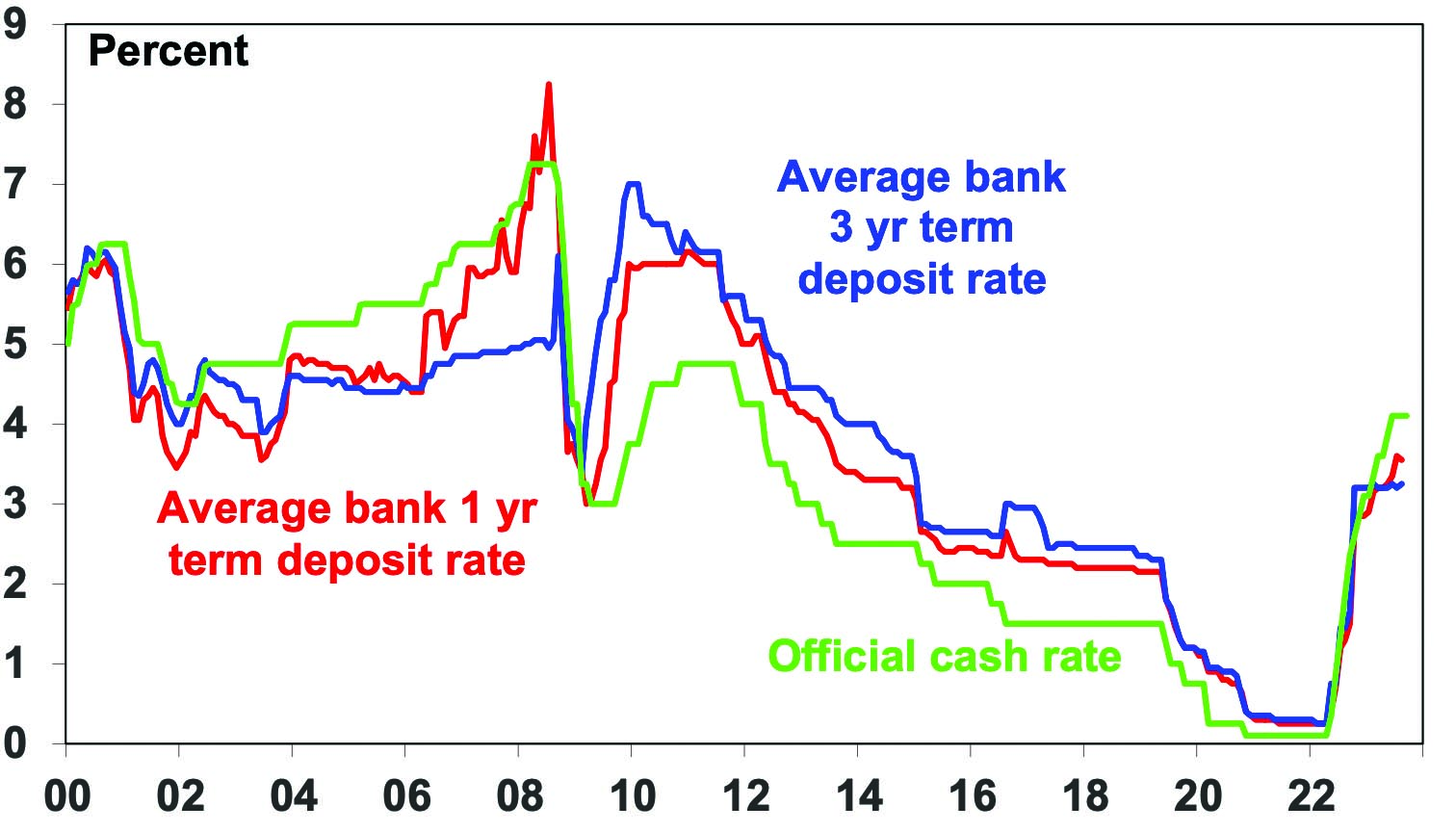
Source: RBA, AMP
For government bonds in advanced countries the yield is similarly a good guide to starting point value and hence medium-term return potential. Over short-term periods bond prices can move up and down and this influences short term returns, but over the medium term the return a bond investor will get is what bond yields were when they invested. If the yield on a 10-year bond is 5%, and you hold the bond to maturity, your return will be 5%. Of course, the relationship is not perfect but it’s a good guide. This can be seen in the next chart which shows a scatter plot of Australian 10-year bond yields since 1950 (horizontal axis) against subsequent 10 year returns from Australian bonds based on the Composite All Maturities Bond index (vertical axis).
Australian bonds – the higher the bond yield the better the return
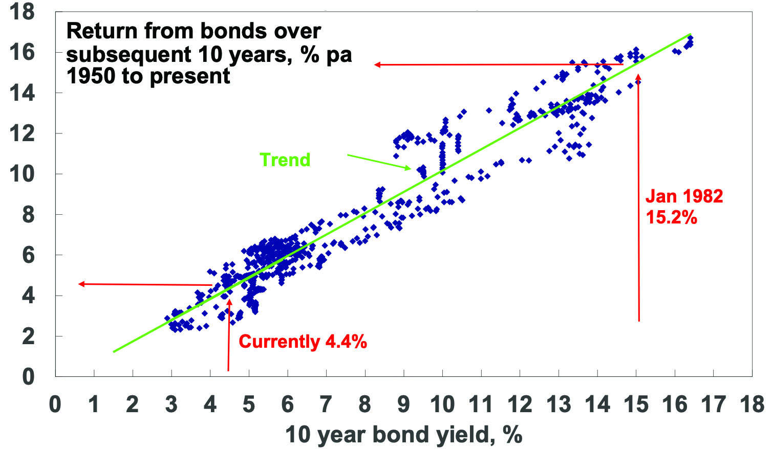
Source: Bloomberg, AMP
When bond yields are high, they set up high bond returns over the medium term and vice versa. For example, Australian 10-year bond yields in January 1982 were 15.2% and it’s not surprising that bond returns over the next 10 years were 15.4%. At their low point of 0.6% in 2020 they were pointing to very low returns but they have now increased to around 4.4% pointing to better medium term returns, albeit still historically low.
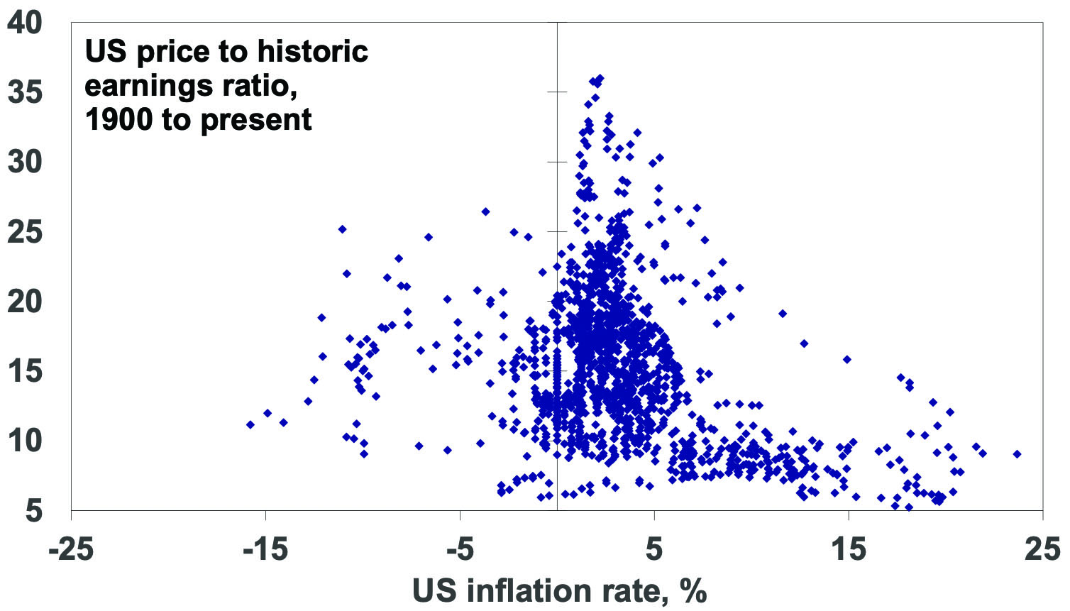
For shares a similar relationship holds. The following chart shows a scatter plot of the price to trailing 12 months earnings ratio for US shares since 1900 (along the horizontal axis) against subsequent 10-year total returns (ie, dividends plus capital growth) from US shares. While the relationship is not as smooth as that for bonds as there is much more involved in share returns, it is a negative relationship. That means when share prices are high compared to earnings, subsequent returns tend to be low and vice versa. The best time for shares is after PEs have fallen to single digits.
US shares – the lower the PE the better the medium term return
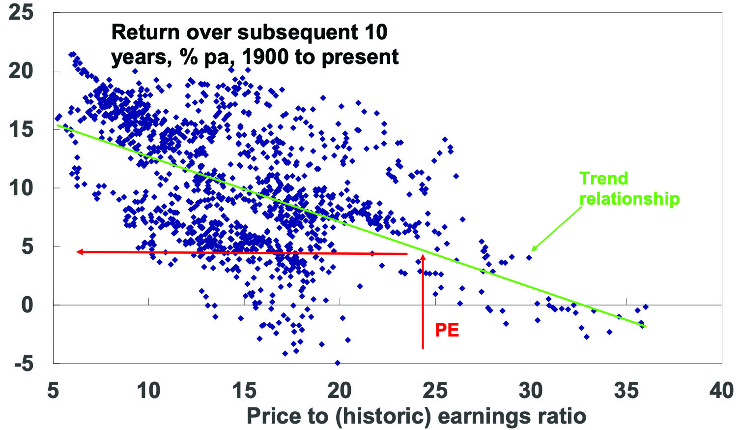
Source: Bloomberg, AMP
The next chart shows the same for Australian shares from 1962, as a PE series is not available before then. Again, there is the expected negative relationship between the level of the PE and subsequent total returns (based on the All Ords Accumulation Index) with the best returns coming after periods of low PEs. For example, at the end of the mid-1970s bear market in September 1974 the PE was just 5.4 times which was a great time to buy as Australian shares returned 21.8% pa over the next decade.
Aust shares – the lower the PE the better the medium term return
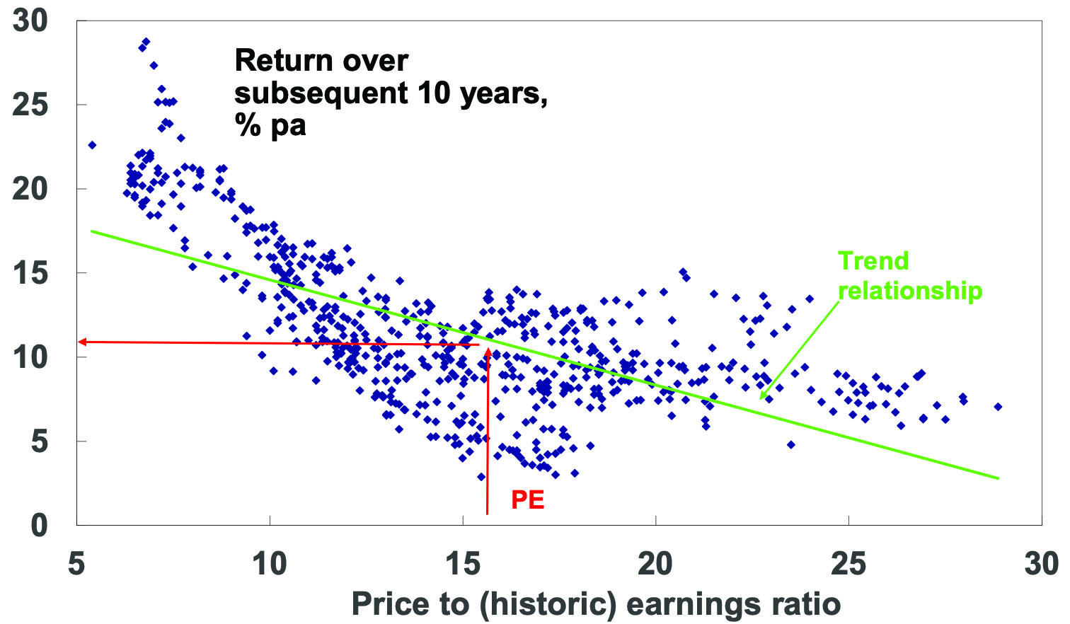
Source: RBA, ASX, AMP Capital
There is dividend yield data for Australian shares from 1900 and as expected the higher it is the better the subsequent return.
The key is that the starting point matters – put simply the higher the yield and the lower the price to earnings ratio (for shares) relative to their history the better for an asset’s medium term return potential.
Of course, valuation is not a perfect guide to returns
But the importance of starting point valuations is often forgotten. Behavioural finance tells us that it’s natural for investors to pay too much attention to recent performance, so after a run of strong years investors expect it will continue. This leads many to buy only after good times, only to find they have bought when shares are overvalued and therefore find themselves locked into poor returns. And vice versa after a run of poor returns. So, when valuations matter the most, they often get ignored. But of course, valuations can have their own pitfalls.
-
First, you need to allow for risk as sometimes assets are cheap for a reason. This can be an issue with individual shares, eg, a tobacco company subject to lawsuits even though current earnings are fine.
-
Second, valuation is a poor guide to market timing, often being out by years. To paraphrase John Maynard Keynes, the market can remain expensive (or cheap) for longer than you can remain solvent. For example, economist Robert Shiller’s call that US shares were exhibiting “irrational exuberance” in 1996 was four years before the tech wreck & shorting them in 1996 would have sent an investor bust.
-
Third, there is a huge array of valuation measures when it comes to shares. For example, the “earnings” in the PE can be actual historic earnings as reported for the last 12 months, consensus earnings for the year ahead or earnings that have been smoothed to remove cyclical distortions. All have pros and cons. For example, the historic PE is based on actual data, but it can give the wrong signal during or after of a recession as earnings may be depressed making shares look far more expensive than they actually are.
-
Finally, the appropriate level of valuation will vary with inflation and interest rates. In times of low inflation, assets can trade on lower yields as the yield structure in the economy falls, uncertainty falls and (for shares) the quality of reported earnings improves. This means higher PEs. So low inflation, say down to 2%, can be good for shares via higher PEs as seen in the next chart. The shift from the high inflation of the 1970s and 1980s to the low inflation last decade was very positive for shares. But if inflation rises resulting in higher interest rates, then shares should trade on lower PEs as investors find shares less attractive, uncertainty rises and earnings quality falls. This of course was a major factor weighing on share markets last year.
US shares – Low inflation = higher PEs
Source: Bloomberg, AMP Capital
To get technical: share prices in theory should equal the present value of future dividends discounted by the required rate of return which equals the risk-free interest rate (usually seen as government bond yields) plus a return premium to cover the higher volatility of shares. It follows from this that shares should trade on higher price to earnings ratios when interest rates fall and vice versa when they rise, all other things being equal. This is why interest rates can’t be ignored when valuing shares.
Current valuation signals
Right now, starting valuation signals are as follows:
Cash – Cash and term deposit rates at 4% or so are far more attractive than was the case two years ago but are still below the rate of inflation.
Bonds – Bond yields at 4% or more are far more attractive than was the case two years ago, pointing to much improved medium term return potential albeit it’s still constrained.
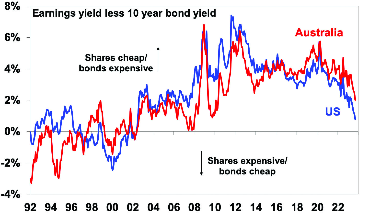
Shares – PE ratios for shares point to a medium-term return potential of around 10% for Australian shares but just 5% for US shares (see the red lines on the PE charts earlier). Allowing for the rise in bond yields – by subtracting 10-year bond yields from the earnings yields (using forward earnings) – shows US and Australian shares now offer a reduced return premium over bonds of around 0.8% in the US and 2% in Australia. See the next chart. For the US this is the lowest risk premium over bonds since after the tech wreck whereas current uncertainties (around interest rates, recession risk & geopolitics) suggest the risk premium should ideally be higher. Fortunately, that for Australian shares is more attractive. But ideally bond yields need to fall to improve the prospects for shares. If we are right and inflation continues to fall over the year ahead, then this should allow lower bond yields and provide some support to shares. But in the near term the risk of a further correction in share markets led out of the US remains high reflecting the deterioration in US share valuations particularly for tech stocks which are very sensitive to bond yields.
Shares offering a lower risk premium over bonds
Source: Bloomberg, AMP Capital
Dr Shane Oliver – Head of Investment Strategy and Chief Economist, AMP
Source: AMP Capital September 2023
Important note: While every care has been taken in the preparation of this document, AMP Capital Investors Limited (ABN 59 001 777 591, AFSL 232497) and AMP Capital Funds Management Limited (ABN 15 159 557 721, AFSL 426455) make no representations or warranties as to the accuracy or completeness of any statement in it including, without limitation, any forecasts. Past performance is not a reliable indicator of future performance. This document has been prepared for the purpose of providing general information, without taking account of any particular investor’s objectives, financial situation or needs. An investor should, before making any investment decisions, consider the appropriateness of the information in this document, and seek professional advice, having regard to the investor’s objectives, financial situation and needs. This document is solely for the use of the party to whom it is provided.
Immigration and housing affordability – why immigration should be lower
For years now there has been much discussion about poor housing affordability in Australia but debate about how immigration contributes to this issue is often lacking. For a country with abundant land, it’s ironic that housing affordability is so poor. Much of the focus has been on grants and other means to make it easier for first time buyers to
Read MoreIntroduction
For years now there has been much discussion about poor housing affordability in Australia but debate about how immigration contributes to this issue is often lacking. For a country with abundant land, it’s ironic that housing affordability is so poor. Much of the focus has been on grants and other means to make it easier for first time buyers to get a loan or on rent subsidies. But of course, this just boosts demand making affordability worse. In recent times, there seems to be more recognition of constraints on the supply side. But surging immigration levels could easily overwhelm these efforts and lead to an even worse situation.

Australia’s surging population
March quarter data showed that Australia’s population rose by 563,000 or 2.2% over 12 months, with 454,000 of that coming from immigration. Permanent and long-term arrival data up to July suggest that the surge in immigration is continuing and we are on track for net immigration of 500,000 or more in the last financial year.
Surging Australian net immigration
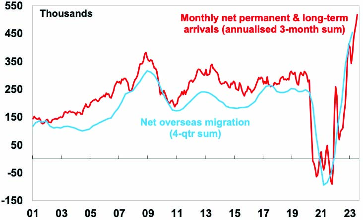
Source: ABS, AMP
This would take population growth to 2.5% in 2022-23, its fastest since the 1950s. Note the next chart assumes net immigration falls to 315,000 this financial year and 260,000 thereafter as consistent with the May Budget projections, but budget immigration projections have been very unreliable. For example, net immigration for 2023-24 was projected to be 213,000 in the March 2022 Budget, 235,000 in the October 2022 Budget and 400,000 in the May Budget but now looks like 500,000 or more.
Australian population growth
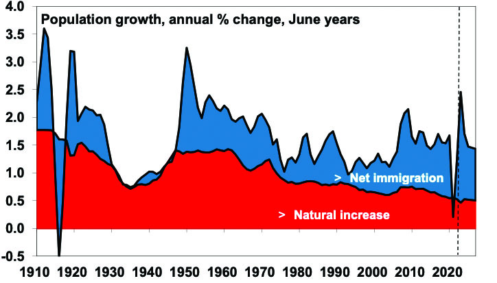
Source: RBA, ABS, AMP
Some of the surge is catch up after the pandemic slump. It will help boost GDP growth and immigration makes for a more dynamic economy. But what really counts for living standards is per capita GDP (and it’s going backwards) & surging immigration is making the housing shortage worse.
Poor housing affordability
At its core, housing affordability is determined by home prices, income levels, and interest rates. Whichever way you cut it housing affordability has deteriorated massively in recent decades.
-
The ratio of home prices to wages and household income (which allows for the rise of two income families) has surged since the 1980s.
Ratio of home prices to wages and incomes
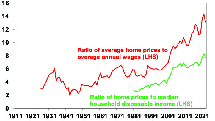
Source: ABS, CoreLogic, AMP
-
According to the 2023 Dermographia Affordability Survey, the median multiple of house prices to income for major cities is 8.2 times in Australia versus around 5 times in the UK & US. In Sydney, it’s 13.3x!
-
The share of mortgage interest as a share of household income is set to rise to record levels once current interest rates fully flow through.
-
Since the mid-1990s, the time taken for someone on average full-time earnings to save a 20% deposit has doubled from about 5 years to 10.
Deteriorating housing affordability is something to be concerned about as it is driving increasing inequality and could threaten social cohesion.
Key drivers of poor housing affordability
The drivers of poor housing affordability have been subject to much debate. At times many zoom in on things like tax concessions for investors, SMSF buying and foreign demand. But investor and foreign demand were not big drivers of the surge in prices going into early 2022. Rather the fundamental drivers have been a combination of three things:
-
The shift from high interest rates at the start of the 1990s to low interest rates along with the increased availability of debt has boosted borrowing ability and hence buyers’ capacity to pay for homes. But this can’t be the full story because lots of countries have had low interest rates without such expensive housing relative to incomes.
-
Looking a bit deeper, there has been a fundamental failure of housing supply (for lots of reasons ranging from development controls to capacity constraints) to keep up with a surge in demand for housing that started in the mid-2000s with rapid population growth.
-
The concentration of people in just a few coastal cities hasn’t helped.
The role of immigration in the demand/supply mismatch is critical.
Population growth and Australia’s housing shortfall
Starting in the mid-2000s annual population growth jumped by around 150,000 people on the back of a surge in net immigration levels – see the blue line in the next chart. This should have been matched by an increase in dwelling completions of around 60,000 per annum but there was no such rise in completions until after 2015 leading to a chronic undersupply of homes – see the red line. The unit building boom of the second half of last decade and the slump in population growth through the pandemic helped relieve the imbalance but the unit building boom was brief and a decline in household size from 2021 resulted in demand for an extra 120,000 dwellings on the RBA’s estimates. The rebound in population growth has taken the property market back into undersupply again.
Home construction versus population growth
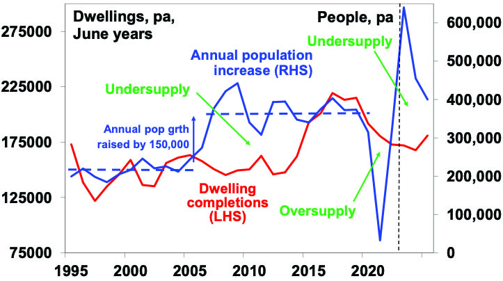
Source; ABS, AMP
The next chart looks at this in terms of underling demand (blue line) and supply (red line) for homes and the cumulative undersupply gap between them (green line). Up until 2005 the housing market was in rough balance. It then went into a massive shortfall of about 250,000 dwellings by 2014 as underlying demand surged with booming immigration. This short fall was then cut into by the unit building boom and we nearly got back to balance in the pandemic. A rebound in underlying demand on the back of this year’s immigration surge and weak completions has now pushed the shortfall back up to 120,000 and by mid next year it will be around 165,000. This makes no allowance for the pandemic induced fall in household size which could take the shortfall up to around 285,000.
Meanwhile the surge in immigration has pushed underlying demand for homes to an average 220,000 dwellings over the three years to 2025. But thanks to rate hikes and capacity constraints dwelling completions look like averaging around 175,000 which means a new shortfall each year of about 45,000 dwellings adding to the already existing shortfall.
Home construction and underlying demand
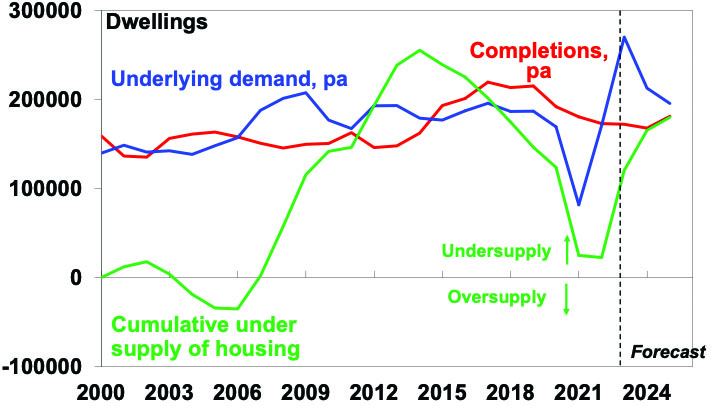
Source; ABS, AMP
The housing shortfall is confirmed by record low rental vacancy rates.
Housing supply
The good news is that Australian governments appear at last to be serious about focussing on supply as a key to improving housing affordability. The target to build 1.2 million new homes over five years from July 2024 (or 240,000 pa) – supported by 50,000 social and affordable homes over five years from the Housing Australia Future Fund and the National Housing Accord along with various programs to incentivise states to build more homes – are to be welcomed. Over the five years to 2022 Australia built nearly one million new homes (or 200,000 pa) mostly in the private sector but we need a stretch target to solve the housing affordability issue given a shortfall of 165,000 to 285,000 dwellings by mid next year. However, this is not going to be easy. First, despite a backlog of approvals yet to be completed we are struggling to complete 180,000 dwellings pa with labour and material shortages and regular failures amongst homebuilders. We may be able to get this back up to 200,000 pa with more units/lower cost housing in the mix (like late last decade) but it’s hard to see where the capacity is going to come from to get to 240,000 dwellings a year.
Secondly, similarly albeit less ambitious supply side commitments in the past have failed. And finally, as noted, the surge in immigration is adding to the already large supply shortfall and threatening to swamp the extra supply commitments governments are making.
Immigration levels need to be lower
There are a lot of things that need to be done to improve housing affordability: making it easier to build more homes but in a way that does not lead to ever worsening urban congestion and compromise the very things that make Australia great (yes like many Australians I admit to being a NIMBY); encouraging greater decentralisation to regional Australia to take pressure off cities; and tax reform in terms of replacing stamp duty with land tax and reducing the capital gains tax discount. But it’s impossible to escape the conclusion that immigration levels need to be calibrated to the ability of the home building industry to supply housing. This is critical. Current immigration levels are running well in excess of the ability of the housing industry to supply enough homes exacerbating an acute housing shortage and poor housing affordability.
Our rough estimate is that if home building supply capacity is 200,000 dwellings a year (as we managed in the five years to 2022) then immigration levels need to be cut back to 260,000 from around 500,000 now. But if capacity is just 180,000 dwellings pa or we want to reduce the accumulated supply shortfall by say 20,000 dwellings a year then immigration should be cut back to near 200,000 people a year.
Dr Shane Oliver – Head of Investment Strategy and Chief Economist, AMP
Source: AMP Capital September 2023
Important note: While every care has been taken in the preparation of this document, AMP Capital Investors Limited (ABN 59 001 777 591, AFSL 232497) and AMP Capital Funds Management Limited (ABN 15 159 557 721, AFSL 426455) make no representations or warranties as to the accuracy or completeness of any statement in it including, without limitation, any forecasts. Past performance is not a reliable indicator of future performance. This document has been prepared for the purpose of providing general information, without taking account of any particular investor’s objectives, financial situation or needs. An investor should, before making any investment decisions, consider the appropriateness of the information in this document, and seek professional advice, having regard to the investor’s objectives, financial situation and needs. This document is solely for the use of the party to whom it is provided.
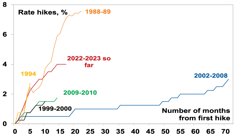
Has the RBA finished rate hikes?
At its September meeting the RBA left the cash rate on hold for the third meeting in a row at 4.1%. The pause in interest rates over the last three months comes after the biggest interest rate hiking cycle (of 400 basis points over 14 months) since the late 1980s. (While the 1988-89 rate hiking cycle was nearly double that
Read MoreIntroduction
At its September meeting the RBA left the cash rate on hold for the third meeting in a row at 4.1%. The pause in interest rates over the last three months comes after the biggest interest rate hiking cycle (of 400 basis points over 14 months) since the late 1980s. (While the 1988-89 rate hiking cycle was nearly double that seen since May last year, back then household debt to income ratios were about one third of current levels.)

RBA rate hiking cycles since the late 1980s
Source: RBA, AMP
This took the cash rate to 2012 levels and similarly for mortgage rates.
Australian interest rates
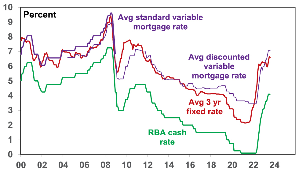
Source: RBA, AMP
In leaving the cash rate on hold the RBA reiterated that interest rates have already been increased by 4%, higher rates are working to establish a “more sustainable balance between supply and demand”, uncertainty remains high and staying on hold provides further time to assess the outlook. The RBA also noted again that recent data is consistent with inflation returning to target in late 2025. So have we reached the peak in the cash rate? And what does this mean for the economy?
The case for the peak in rates
We were way too optimistic as to how far the RBA would raise the cash rate, but our view remains that the RBA has done more than enough to bring inflation back to target and so we are likely at the peak.
First, rate hikes impact the economy with a lag of a year or more. This is because it takes a while for the hikes to be passed through to borrowers and for them to adjust their spending and for this to impact companies and jobs. This time around the lag has likely been lengthened by savings buffers built up in the pandemic, the reopening boost, more than normal home borrowers locking in at 2% or so fixed mortgage rates in the pandemic and the highly competitive mortgage market which has meant that actual mortgage rates paid on outstanding mortgages have gone up by less than the cash rate. However, these protections are now wearing off.
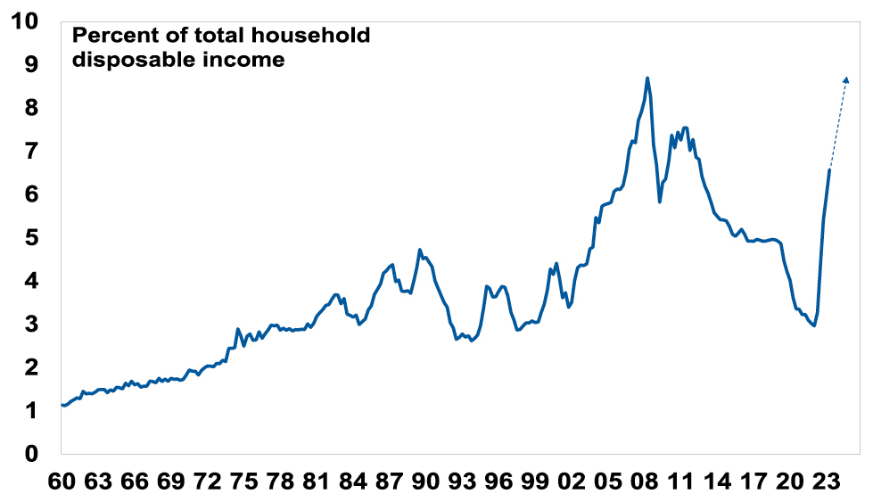
The rate hikes since April last year mean that a variable rate borrower with a $600,000 mortgage will have seen around $1300 a month added to their mortgage payments. That’s an extra $15,700 a year. Even if the borrower has managed to get a 0.5% discount to their mortgage rate it would amount to an extra $13,300. Many of those on fixed rates are now starting to experience an even bigger increase (because fixed rates in 2020-21 fell to much lower levels than variable rates) in one jump. This has already seen housing debt interest payments as a share of household disposable income double from their lows. Once the rate hikes fully flow through it will likely go to a record high. This is a very big hit to household spending power.
Australia – Housing Debt Interest Payments
Source: ABS, RBA, AMP
Secondly, we are now seeing increasing evidence that rate hikes are biting:
-
Real retail sales have fallen for three quarters in a row and are very weak on a per capita basis, ie adjusting for population growth.
Australia Retail Sales
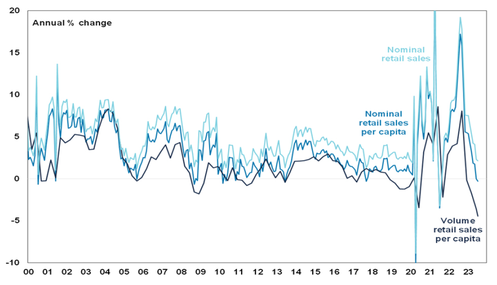
Source: Macrobond, AMP
-
The ABS’ Household Spending Indicator suggests annual growth in nominal consumer spending has gone negative this quarter which suggests weakness in both goods and services.
Australia Consumer Spending Indicators
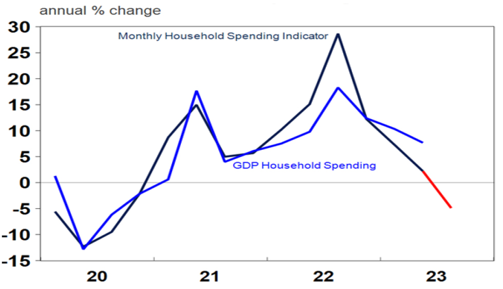
Red portion of the ABS’ Household Spending Indicator line assumes spending remains at July level for August and September. Source: ABS, AMP
-
A sharp slump in building approvals points to weak in-home building.
-
Business investment plans as surveyed by the ABS for the current financial year are only up 7.1% on the same estimate made for the last financial year pointing to a deceleration in growth from the 15.9% rise seen in 2022-23. This is in nominal terms so the slowdown after allowing for inflation will be greater.
Actual and expected capital expenditure
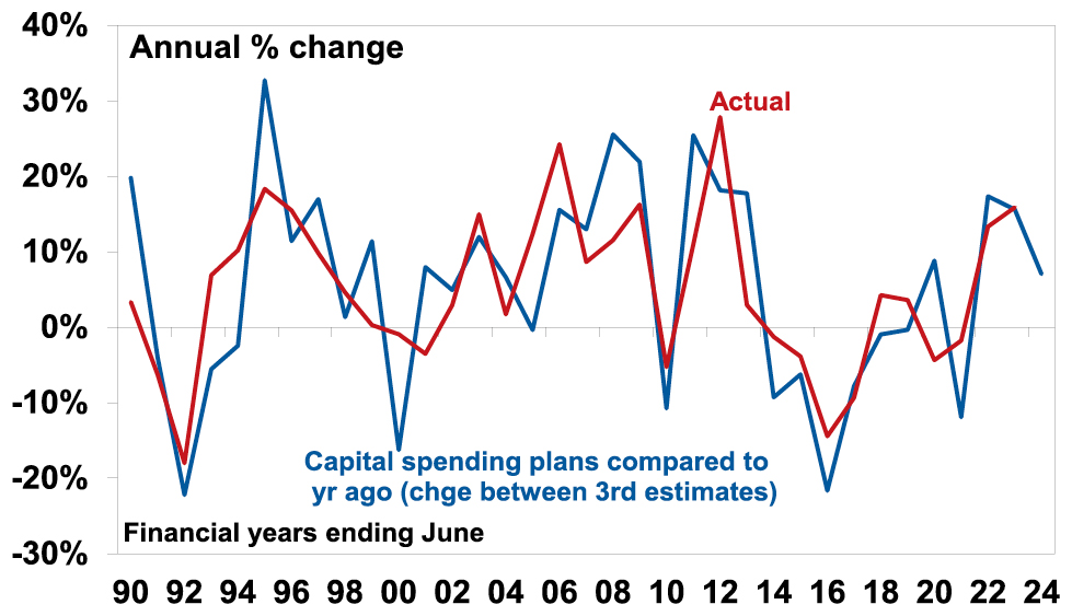
Source: ABS, AMP
-
GDP growth has slowed to a 1.6% pace in the last two quarters.
-
Labour market indicators including job vacancies and hiring plans in surveys have started to cool and unemployment looks to have bottomed at 3.4% late last year.
-
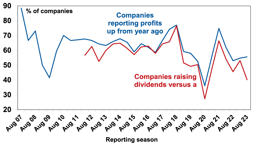
The June half profit reporting season saw less companies than normal report profits up on a year ago and far less than normal raise their dividends, suggesting a degree of caution.
Proportion of Australian companies with profits & dividends up
Source: AMP
Finally, while our Australian Inflation Indicator has picked up a bit with higher labour and raw material costs it continues to point to a further rapid fall in inflation.
Australia Pipeline Inflation Indicator
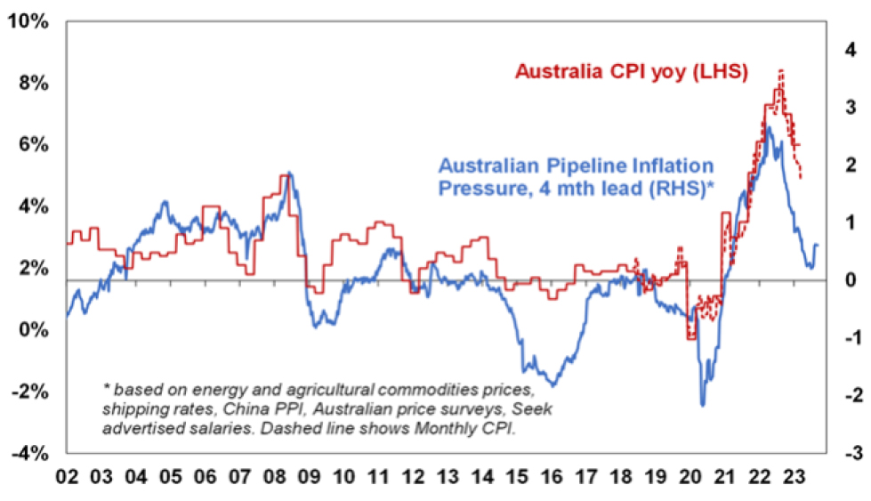
Source: Bloomberg, AMP
Continuing to raise interest rates will only add to the already very high risk (at around 50%) of recession. At the very least the economy is likely to have slowed substantially by late this year with unemployment starting to rise faster than the RBA is allowing for. This will likely see inflation fall next year faster than the RBA expects. As a result, our base case is that the cash rate has peaked ahead of rate cuts starting in the March quarter next year which should help growth then stabilise and improve later next year.
Short term risks for rates are still on the upside though
In the short term, the risks are still skewed to a further increase in interest rates and or a delay in the start of rate cuts as: inflation is still too high; the labour market remains tight with upwards risks to wages flowing from higher minimum and award wage rises; productivity growth is very weak; and the rebound in home prices is partly offsetting the tightening impact of higher interest rates. Consistent with this the RBA retained its guidance that some further rate hikes may be required. Key to watch will be the global economy, household spending, inflation and the labour market.
While the near-term risks for interest rates are still on the upside those risks have declined though. Absent much stronger wages growth, a further drop in unemployment and/or a reversal of the downtrend in inflation, the RBA is expected to leave interest rates on hold for the rest of this year ahead of rate cuts next year. We are allowing for four rate cuts through 2024 as the economy and inflation slow further.
So soon-to-be Governor Bullock should get an easier run than Governor Lowe. Her main challenge may be trying to turn the economy back up.
Dr Shane Oliver – Head of Investment Strategy and Chief Economist, AMP
Source: AMP Capital September 2023
Important note: While every care has been taken in the preparation of this document, AMP Capital Investors Limited (ABN 59 001 777 591, AFSL 232497) and AMP Capital Funds Management Limited (ABN 15 159 557 721, AFSL 426455) make no representations or warranties as to the accuracy or completeness of any statement in it including, without limitation, any forecasts. Past performance is not a reliable indicator of future performance. This document has been prepared for the purpose of providing general information, without taking account of any particular investor’s objectives, financial situation or needs. An investor should, before making any investment decisions, consider the appropriateness of the information in this document, and seek professional advice, having regard to the investor’s objectives, financial situation and needs. This document is solely for the use of the party to whom it is provided.