Olivers Insights
The medium term investment return remains constrained
The last five years have seen strong returns for diversified investors thanks to double digit gains in shares (after a rebound from a mini bear market around the Eurozone crisis) and solid returns from unlisted commercial property and infrastructure. For example, balanced superannuation funds saw median returns of 9.3% per annum over the five years to September (after taxes and
Read MoreThe last five years have seen strong returns for diversified investors thanks to double digit gains in shares (after a rebound from a mini bear market around the Eurozone crisis) and solid returns from unlisted commercial property and infrastructure. For example, balanced superannuation funds saw median returns of 9.3% per annum over the five years to September (after taxes and fees). Despite this our assessment remains that medium term (ie 5-10 year) returns will be constrained because of low investment yields across most asset classes.

Back in the early 1980s the medium term return potential from investing was pretty solid. The RBA’s “cash rate” was around 14%, 3-year bank term deposit rates were around 12%, 10-year bond yields were around 13.5%, property yields were running around 8-9% and dividend yields on shares were around 6.5% in Australia and 5% globally. Such yields meant that investments were already providing very high cash income and only modest capital growth was necessary for growth assets to generate good returns. As it turns out most assets had spectacular returns in the 1980s and 1990s and superannuation fund returns averaged 14.1% in nominal terms and 9.4% in real terms between 1982 and 1999 (after taxes and fees).

Source: Mercer Investment Consulting, Morningstar, AMP Capital
Since the early 1980s starting point investment yield have collapsed, resulting in slowing 10-year average nominal and real returns for superannuation funds as seen the chart above. Today the RBA cash rate is just 1.5%, 3-year bank term deposit rates are just 2.5%, 10-year bond yields are just 2.6%, gross residential property yields are around 3% and while dividend yields are still around 5.6% for Australian shares (with franking credits) they are around 2.4% for global shares.
Starting point yield matters – a lot!
Investment returns have two components: capital growth and yield (or income flow). The yield is the most secure component and generally speaking the level it starts at when you undertake the investment is key – the higher the better. So our approach to get a handle on medium term return potential is to start with current yields for each asset class and apply simple and consistent assumptions regarding capital growth. We also prefer to avoid a reliance on forecasting and to keep the analysis as simple as possible.
Complicated adjustments and forecasting can just lead to compounding forecasting errors.
-
For bonds, the best predictor of future medium term returns is current bond yields. If a 10-year bond is held to maturity its initial yield will be its return over 10 years. It can be seen in the next chart that the higher the starting point bond yield, the higher the subsequent return. We use 5-year bond yields as they roughly match the maturity of bond indexes.

Source: Global Financial Data, Bloomberg, AMP Capital
-
For equities, a simple model of current dividend yields plus trend nominal GDP growth (as a proxy for earnings and capital growth) does a good job of predicting medium term returns. This approach allows for current valuations (via the yield) but avoids getting too complicated. The next chart shows this approach applied to US equities, where it can be seen to broadly track the big secular swings in returns.

Source: Thomson Reuters, Global Financial Data, AMP Capital
-
For property, we use current rental yields and likely trend inflation as a proxy for rental and capital growth.
-
For unlisted infrastructure, we use current average yields and capital growth just ahead of inflation.
Medium term return projections
Our latest return projections using this approach are shown in the next table. The second column shows each asset’s current income yield, the third shows their 5-10 year growth potential, and the final column their total return potential. Note that:
-
We assume central banks average around or just below their inflation targets, eg 2.5% in Australia & 2% in the US.
-
For Australia we have adopted a relatively conservative growth assumption reflecting constrained commodity prices and slower productivity growth.
-
We allow for forward points in the return projections for global assets based around current market pricing – which adds 1% to the return from world equities.
-
The Australian cash rate is assumed to average 2.75% over the medium term. Cash is one asset where the current yield is of no value in assessing the asset’s medium term return potential because the maturity is so short. So we assume a medium term average. Normally for cash this would be around a country’s potential nominal growth rate, but we have adjusted for higher than normal bank lending rates relative to the cash rate and higher household debt to income ratios which have pulled down the neutral cash rate.
Combining the return projections for each asset indicates that the implied return for a diversified growth mix of assets has now fallen to 6.5% pa and is shown in the final row.

# Current dividend yield for shares, distribution/net rental yields for property and duration matched bond yield for bonds. ^ Includes forward points. * With franking credits added in. Source: AMP Capital
Megatrends influencing the growth outlook
The assumptions for nominal growth used in these projections allow for several medium term themes: slower than pre-GFC growth in household debt; an ongoing backlash against the economic rationalist policies of globalisation, deregulation and small government; rising geopolitical tensions; aging and slowing populations; constrained commodity prices; technological innovation & automation; rapid growth in Asia and China’s growing middle class; rising environmental awareness; and the energy revolution. Most of these are constraining nominal growth and hence investor returns. However, technological innovation is positive for profits and some of these point to inflation bottoming. (See “Megatrends…”, Oliver’s Insights, July 2016.)
Key observations
Several things are worth noting from these projections.
-
The medium term return potential using this approach has continued to soften due largely to the rally in most assets which has pushed investment yields lower. Projected returns using this approach for a diversified growth mix of assets has fallen from 10.3% pa at the low point of the GFC in March 2009 to 6.5% now.

Source: AMP Capital
-
The starting point for returns today is far less favourable than when the last secular bull market in shares and bonds started in 1982, due to much lower yields.
-
Government bonds offer low return potential thanks to ultra low bond yields.
-
Unlisted commercial property and infrastructure continue to come out relatively well, reflecting their relatively high yields.
-
Australian shares stack up well on the basis of yield, but it’s still hard to beat Asian/emerging shares for growth potential.
-
The downside risks to our medium term return projections are that: the world is plunged into another recession or that investment yields are pushed up to more normal levels as inflation rebounds causing large capital losses. These risks are referred to endlessly by financial commentators – but just allow that drawdowns in returns tend to be infrequent but concentrated and it’s been a while since the last big one.
-
The upside risks are (always) less obvious but could occur if we see a continuation of the last year, ie improving global growth but inflation remaining low which could see a continuing search for yield further pushing up capital value
Implications for investors
-
First, have reasonable return expectations. Low investment yields & constrained nominal GDP growth indicate it’s not reasonable to expect sustained double digit returns. In fact, the decline in the rolling 10-year average of superannuation fund returns (first chart) indicates we have been in a lower return world for many years – it’s just that it only becomes clear every so often with strong returns in between.
-
Second, allow that this partly reflects very low inflation. Real returns haven’t fallen as much.
-
Third, using a dynamic approach to asset allocation makes sense as a way to enhance returns when the return potential from investment markets is constrained.
-
Finally, focus on assets providing decent and sustainable income flow as they provide confidence regarding future returns, eg, commercial property and infrastructure.
Source: AMP Capital 8 November 2017
Author: Dr Shane Oliver, Head of Investment Strategy and Economics and Chief Economist at AMP Capital is responsible for AMP Capital’s diversified investment funds. He also provides economic forecasts and analysis of key variables and issues affecting, or likely to affect, all asset markets.
Important note: While every care has been taken in the preparation of this article, AMP Capital Investors Limited (ABN 59 001 777 591, AFSL 232497) and AMP Capital Funds Management Limited (ABN 15 159 557 721, AFSL 426455) makes no representations or warranties as to the accuracy or completeness of any statement in it including, without limitation, any forecasts. Past performance is not a reliable indicator of future performance. This article has been prepared for the purpose of providing general information, without taking account of any particular investor’s objectives, financial situation or needs. An investor should, before making any investment decisions, consider the appropriateness of the information in this article, and seek professional advice, having regard to the investor’s objectives, financial situation and needs. This article is solely for the use of the party to whom it is provided.
Five great charts on investing for income (or cash flow)
The low interest rates of recent times along with periodic turmoil in investment markets has provided us with a reminder of the importance of the income (cash) flow or yield an investment provides. It’s particularly important for those relying on investment income to fund their living expenses. As with all investment topics, investing for income can seem complicated and daunting
Read More
The low interest rates of recent times along with periodic turmoil in investment markets has provided us with a reminder of the importance of the income (cash) flow or yield an investment provides. It’s particularly important for those relying on investment income to fund their living expenses. As with all investment topics, investing for income can seem complicated and daunting once you move beyond bank deposits but in fact it’s really quite simple. So this note looks at five charts I find useful in understanding investing for income or yield.
Chart #1 There are lots of alternatives to bank deposits
The yield an investment provides is basically its annual cash flow divided by the value of the investment.
-
For bank deposits, the yield is simply the interest rate, eg bank 1-year term deposit rates in Australia are about 2.25% and so this is the cash flow they will yield in the year ahead.
-
For ten-year Australian Government bonds, annual cash payments on the bonds (coupons) relative to the current price of the bonds provides a yield of 2.8% right now.
-
For corporate debt, it’s a margin above government bond yields and depends on the riskiness of the company but is currently averaging around 3.6% in Australia.
-
For residential property, the yield is the annual value of rents as a percentage of the value of the property. On average in Australian capital cities it is about 3.9% for apartments and around 2.5% for houses. After allowing for costs, net rental yields are about 2 percentage points lower.
-
For unlisted commercial property, yields are around 5.5%. For infrastructure investment it averages around 4.5%.
-
For a basket of Australian shares represented by the ASX 200 index, annual dividend payments are running around 4.3% of the value of the shares. Once franking credits are allowed for, this pushes up to around 5.7%.
The next chart shows the yield available on a range of investments both now and in December 2009.
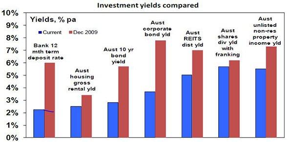
Source: Bloomberg, REIA, RBA, JLL, AMP Capital
Key messages: first, there are plenty of alternatives to cash when it comes to yield or income. Second, the yields on these investments will move over time and since the aftermath of the Global Financial Crisis (GFC) the trend has been down.
Of course investors need to allow for risk. Bank deposits have close to zero risk but any move to higher-yielding investments does entail taking on risk. More on this later.
Chart #2 The gap between yields on different assets relative to historic norms provides a guide to value
The next chart shows average yields on Australian shares and unlisted commercial property relative to the one-year term deposit rate since 2000. While yields have fallen, the gap between share and property yields and the bank deposit rate is extreme historically, with neither share or property yields plunging to the degree bank deposit rates have. In fact, the share yield is in its historic range. All things equal, this suggests commercial property and Australian shares continue to provide better value. The same would apply to unlisted infrastructure.

Source: JLL, Bloomberg, AMP Capital
Key message: comparing yields provides a guide to relative value and right now shares and unlisted commercial property remain very attractive relative to bank deposits.
Chart #3 Shares can provide stronger growth in income with less volatility than bank deposits
Investing in shares of course entails the risk of capital loss. But it can offer a higher and less volatile income flow over time. The next chart is a bit heavy but it compares initial $100,000 investments in Australian shares and one-year term deposits in December 1979 and the income they have provided over time (before franking credits are allowed for in the case of shares).
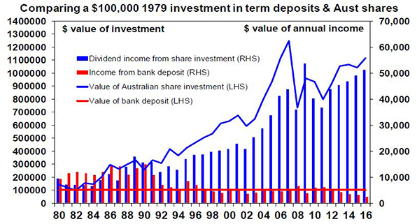
Source: RBA, Bloomberg, AMP Capital
The term deposit would still be worth $100,000 (red line) and last year would have paid roughly $2450 in interest (red bars). By contrast the $100,000 invested in shares would have grown to $1.12 million (blue line) by end 2016 and last year would have paid $51,323 in dividends before franking credits (blue bars). The point is that dividends tend to grow over time (because profits and hence an investment in shares tends to rise in value) and are relatively stable compared to income from bank deposits, which vary with interest rate settings. Over the period the worst decline in dividend income from shares was a 32% decline between 2009 and 2011, whereas the income from bank deposits plunged 68% between 1990 and 1994 and by 60% between 2011 and last year. Once franking credits are allowed for, the comparison would become even more favourable towards shares.
Key message: while shares come with the risk of capital loss, a well-diversified portfolio of Australian shares can provide stronger growth in income with less volatility in that income than bank term deposits. Investors focussed on income need to decide what is most important: stability in the value of their investment or a higher, more sustainable income flow. The key when investing in shares for income is to have a well-diversified portfolio. Or better still a well-diversified portfolio of shares paying high and sustainable dividend yields. Finding high dividend yields is easy but the key is to look for stocks that have a reliable track record of growing those dividends and that have dividends that are not threatened by things like excessive gearing.
Chart #4 A bird in the hand is worth two in the bush
A high and sustainable starting point yield provides some security during volatile times. Since 1900, dividends (prior to allowing for franking credits) have provided just over half of the 11.8% average annual return from Australian shares and as can be seen in the next chart their contribution has been stable in contrast to the capital value of shares.
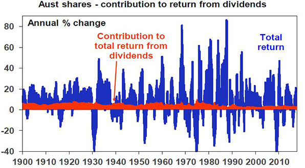
Source: Global Financial Data, Bloomberg, AMP Capital
Dividends are relatively smooth over time because most companies hate having to cut them as they know it annoys shareholders so they prefer to keep them sustainable.
Key message: a high and sustainable income yield for an investment provides some security during volatile times. It’s a bit like a down payment on future returns.
Chart #5 Yield provides a guide to future returns
The yield an investment provides forms the building block for its total return, which is essentially determined by the following.
Total return = yield + capital growth
As a general principle, the higher the yield an investor invests at, the higher the return their investment will likely provide. This is self-evident in the case of bank deposits because the yield is the return (assuming the bank does not default on its deposits – which is very unlikely in Australia given Government protections). It can be seen in relation to bonds in the next chart, which shows a scatter plot of Australian ten-year bond yields since 1950 (along the horizontal axis) against subsequent ten-year bond returns based on the Composite All Maturities Bond Index (vertical axis). Over short term periods, bond prices can move up and down and so influence short-term returns, but over the medium term the main driver of the return a bond investor will get is what bond yields were when they invested. If the yield on a ten-year bond is 5%, then if you hold the bond to maturity your return will be 5%. Of course a portfolio of bonds will reflect a range of maturities and so the relationship is not perfect, but it can be seen in the next chart that the higher the starting point bond yield, the higher the subsequent return.

Source: Global Financial Data, Bloomberg, AMP Capital
Put simply when bond yields are high they drive high bond returns over the medium term and vice versa. For example, when Australian ten-year bond yields in January 1982 were 15.2% it’s not surprising that returns from bonds over the subsequent ten years were 15.4% per annum. Similarly, when bond yields were just 3.1% in January 1950, it’s no surprise that returns from bonds over the next ten years were 3.1%. At 2.8% now, we are off the bottom of the chart meaning record low bond returns for the next decade.
Similar albeit less perfect relationships exist for other asset classes – the higher the yield, the higher the subsequent return.
Of course there are some risks investors must watch out for. At the individual share level, a very high dividend yield may be a sign of a “value trap” – where current profits and dividends may be fine but there is an impending threat to the company and so the share price is low. Second, high distributions may also be unsustainable if they are being paid for out of debt and reflect excessive gearing or high risk investments (eg, sub-prime mortgages prior to the GFC). Just remember that there is no free lunch.
Key message: while returns have been solid lately, low investment yields do warn of lower returns ahead – most notably from government bonds.
Source: AMP Capital 24 October 2017
Author: Dr Shane Oliver, Head of Investment Strategy and Economics and Chief Economist at AMP Capital is responsible for AMP Capital’s diversified investment funds. He also provides economic forecasts and analysis of key variables and issues affecting, or likely to affect, all asset markets.
Important note: While every care has been taken in the preparation of this article, AMP Capital Investors Limited (ABN 59 001 777 591, AFSL 232497) and AMP Capital Funds Management Limited (ABN 15 159 557 721, AFSL 426455) makes no representations or warranties as to the accuracy or completeness of any statement in it including, without limitation, any forecasts. Past performance is not a reliable indicator of future performance. This article has been prepared for the purpose of providing general information, without taking account of any particular investor’s objectives, financial situation or needs. An investor should, before making any investment decisions, consider the appropriateness of the information in this article, and seek professional advice, having regard to the investor’s objectives, financial situation and needs. This article is solely for the use of the party to whom it is provided.
Where are we in the global investment cycle and what’s the risk of a 1987 style crash?
This month of October often creates apprehension amongst investors given its historic track record with the 1929 and 1987 share market crashes. And it was in October 2007 that US shares peaked ahead of 50% plus falls (in most share markets) through the Global Financial Crisis (GFC). From the post-GFC share market lows in March 2009, US shares are up
Read More
This month of October often creates apprehension amongst investors given its historic track record with the 1929 and 1987 share market crashes. And it was in October 2007 that US shares peaked ahead of 50% plus falls (in most share markets) through the Global Financial Crisis (GFC). From the post-GFC share market lows in March 2009, US shares are up 278% and global shares are up 196% to new record highs and Australian shares are up 92%. After such strong gains it’s natural to wonder whether another major bear market is imminent. Aside from left field events triggering a crash, the key question remains where are we in the investment cycle? This note updates our analysis on this front from earlier this year (see http://bit.ly/2kPIlha) and also provides a comparison to 1987.
Second-longest US cyclical bull market since WW2
The cyclical bull market in US shares is eight and a half years old. It’s the second longest since World War Two and the second strongest in terms of gain. See the next table.

I have applied the definition that a cyclical bull market is a rising trend in shares that ends when shares have a 20% or more fall (ie, a cyclical bear market). Source: Bloomberg, AMP Capital.
At the same time, according to the US National Bureau of Economic Research the current US economic expansion is now 100 months old and compares to an average expansion of 70 months. The concern is that with the US bull market and economic expansion both old, US shares are vulnerable to another bear market and, by implication, global and Australian shares are, too.
Still in the sweet spot in the investment cycle
First some context. The next chart is a stylised version of the investment cycle – the thick grey line is the economic cycle.

Source: AMP Capital
A typical cyclical bull market in shares has three phases: scepticism – when economic conditions are weak and confidence is poor, but smart investors see value in shares helped by ultra easy monetary conditions; optimism or the “sweet spot” – when profits and growth strengthen and investor scepticism gives way to optimism while monetary policy is still easy; euphoria – when investors become euphoric on strong economic and profit conditions, which pushes shares into clear overvalued territory and excesses appear forcing central banks to become tight, which combines with overvaluation and investors being fully invested to drive a new bear market.
Typically, the bull phase lasts five years. However, “bull markets do not die of old age but of exhaustion” – their length depends on how quickly recovery precedes, excess builds up, inflation rises and extremes of overvaluation and investor euphoria appear.
Our assessment is that we are still in the “sweet spot” phase, albeit more advanced now. Global economic indicators are strong, growth forecasts are being revised up as highlighted by the IMF and this is driving stronger profits. But thanks partly to the slow post GFC recovery, there are still few signs of the sort of excesses that characterise the “euphoria” phase that ultimately leads to the “exhaustion” of the cyclical bull market and the next bear market.
-
There is no overinvestment globally. While the US recovery is further advanced than most, even here business investment and housing investment (excesses in which preceded the tech wreck and GFC, respectively) are around or below long-term averages relative to GDP.
-
Overall private sector debt growth is modest in most countries.
-
After years of below trend growth globally, spare capacity still remains & this (along with technological innovation) has been constraining inflation. Wages growth remains weak and has only just started picking up in the US. Core inflation in major countries ranges between 0.2% in Japan to 1.3% in the US.

Source: Bloomberg, AMP Capital
-
As a result, global monetary conditions remain easy and without a surge in inflation look likely to remain so. The Fed is continuing to tighten but it’s “gradual” and from a very easy base and other central banks (including the RBA) are on hold. A shift to tight money that brings about a global economic downturn looks a fair way off.
-
Share market valuations are mostly okay. Measured against their own history, shares are no longer cheap. This is particularly so for US shares. But once allowance is made for low inflation and still-low bond yields, shares are fair value to cheap depending on the market (next chart).

Source: Bloomberg, AMP Capital
-
Finally, while short term investor sentiment bullish, long-term measures of positioning are not. In the US, the huge investor flows into bond funds over the last few years have yet to reverse in favour of shares. In Australia, sentiment towards shares remains low. Still no euphoria here.
It may also be argued that major non-US share markets and Australian shares did have a bear market in both 2011 and 2015-16 so their cyclical bull markets are not old at all.
Overall, we are still not seeing the signs of excess, euphoria and exhaustion that typically come at cyclical economic and share market peaks ahead of recessions and deep bear markets. So barring some sort of external shock, the cyclical bull market in shares looks like it still has further to go.
What to watch?
The key to watch for the next big bear market is for signs of excess – eg, overinvestment in key areas, rapidly-rising inflation, aggressive tightening in monetary policy, clear overvaluation and investor euphoria. This would then set the scene for the next economic downswing and hence a more severe bear market (as opposed to a correction or short-term bear market like we saw in 2015-16). At the moment, it’s hard to see much excess but we do expect US inflation to start rising from here. One risk is that the longer things remain benign, the more investors will expect them to remain benign and this will result in excessive risk taking setting up the scene for a sharp fall in markets. But it’s only lately investors have started to get comfortable. So this may have further to go.
What about comparisons to 1987?
October 19 marks the 30th anniversary of the 1987 share market crash and as always comparisons are being wheeled out. While the bulk of the crash was concentrated in October 1987 (US shares fell 20% on October 19 and Australian shares fell 25% on October 20), US shares fell 34% over three months and Australian shares lost 50% over two months. The causes remain subject to debate – but the key appears to have been a 3% rise in US inflation, a 2% rise in US bond yields and Fed tightening hitting markets after a period of very strong gains. The following tables provide a brief comparison to today.

Source: Thomson Reuters, AMP Capital
Compared to 1987, the gains over the past 12 months have been more modest and while forward price to earnings ratios are higher (in the US) or the same, this should be the case given far lower inflation and bond yields and real dividend yields are far more attractive. It’s also noteworthy that share markets had already started to break down before the October 19 1987 crash whereas that has not happened now. As an aside, it’s worth noting that despite the 1987 crash, economic growth was barely impacted and so shares moved higher in 1988 and 1989.
Investment implications
First, corrections should be anticipated – with Trump, North Korea and the Fed being potential triggers – and the fickleness of investor confidence means we can’t rule out another crash like in 1987. But despite this we still appear to be a long way from the peak in the investment cycle.
Second, non-US share markets and economies are less advanced in their cycles and provide opportunities for investors.
Finally, it’s worth noting that several bad years (1987 and 1929) have given Octobers a bad wrap globally. While historically they have been a soft month in Australia (with shares down an average 0.3% since 1985 in October), they have actually been positive in the US (up 1% on average).
Source : AMP Capital 18th October 2017
About the Author
Dr Shane Oliver, Head of Investment Strategy and Economics and Chief Economist at AMP: l is responsible for AMP Capital’s diversified investment funds. He also provides economic forecasts and analysis of key variables and issues affecting, or likely to affect, all asset markets.
Important note: While every care has been taken in the preparation of this article, AMP Capital Investors Limited (ABN 59 001 777 591, AFSL 232497) and AMP Capital Funds Management Limited (ABN 15 159 557 721, AFSL 426455) makes no representations or warranties as to the accuracy or completeness of any statement in it including, without limitation, any forecasts. Past performance is not a reliable indicator of future performance. This article has been prepared for the purpose of providing general information, without taking account of any particular investor’s objectives, financial situation or needs. An investor should, before making any investment decisions, consider the appropriateness of the information in this article, and seek professional advice, having regard to the investor’s objectives, financial situation and needs. This article is solely for the use of the party to whom it is provided.
Will Australian House Prices Crash? five reasons why it’s more complicated than you think!
A common narrative on the Australian housing market is that it’s in a giant speculative bubble propelled by tax breaks, low interest rates and “liar loans” that have led to massive mortgage stress and that it’s all about to go bust, bringing down the banks and the economy with it. Recent signs of price falls – notably in Sydney –
Read MoreA common narrative on the Australian housing market is that it’s in a giant speculative bubble propelled by tax breaks, low interest rates and “liar loans” that have led to massive mortgage stress and that it’s all about to go bust, bringing down the banks and the economy with it. Recent signs of price falls – notably in Sydney – have added interest to such a view.

The trouble is we have been hearing the same for years. Calls for a property crash have been pumped out repeatedly since early last decade. In 2004, The Economist magazine described Australia as “America’s ugly sister” thanks in part to a “borrowing binge” and soaring property prices. At the time, the OECD estimated Australian housing was 51.8% overvalued. Property crash calls were wheeled out repeatedly after the Global Financial Crisis (GFC) with one commentator losing a high-profile bet that prices could fall up to 40% and having to walk to the summit of Mount Kosciuszko as a result. In 2010, a US newspaper, The Philadelphia Trumpet, warned “Pay close attention Australia. Los Angelification (referring to a 40% slump in LA home prices around the GFC) is coming to a city near you.” At the same time, a US fund manager was labelling Australian housing as a “time bomb”. Similar calls were made last year by a hedge fund researcher and a hedge fund: “The Australian property market is on the verge of blowing up on a spectacular scale…The feed-through effects will be immense… the economy will go into recession.” Over the years these crash calls have even made it on to 60 Minutes and Four Corners.
The basic facts on Australian property are well known:
-
It’s expensive relative to income, rents, its long-term trend (see the next chart) and by global standards.
-
Affordability is poor – price to income ratios are very high and it’s a lot harder to save a sufficient deposit.
-
The surge in prices has seen a surge in debt that has taken our household debt to income ratio to the high end of OECD countries, which exposes Australia to financial instability should households decide to cut their level of debt.

Source: ABS, AMP Capital
These things arguably make residential property Australia’s Achilles heel. But as I have learned over the last 15 years, it’s a lot more complicated than the crash calls suggest.
First, it’s dangerous to generalise
While it’s common to refer to “the Australian property market”, only Sydney and Melbourne have seen sustained and rapid price gains in recent years. On CoreLogic data over the last five years dwelling prices have risen at an average annualised rate of 11.4% per annum (pa) in Sydney and 9.4% pa in Melbourne but prices in Brisbane, Adelaide, Hobart and Canberra have risen by a benign 3 to 5% pa and prices have fallen in Perth and Darwin. Australian cites basically swing around the national average with prices in one or two cities surging for a few years and then underperforming as poor affordability forces demand into other cities. This can be seen in the next chart with Sydney leading the cycle over the last 20 years and Perth lagging.

Source: CoreLogic, AMP Capital
Second, supply has not kept up with demand
Thanks mostly to an increase in net immigration, population growth since mid-last decade has averaged 368,000 people pa compared to 218,000 pa over the decade to 2005, which requires roughly an extra 55,000 homes per year.
Unfortunately, the supply of dwellings did not keep pace with the surge in population growth (see the next chart) so a massive shortfall built up driving high home prices. Thanks to the recent surge in unit supply this is now being worked off. But there is no broad based oversupply problem.

Source: ABS, AMP Capital
Consistent with this, average capital city vacancy rates are around long-term average levels, are low in Sydney and are falling in Melbourne (helped by surging population growth).

Source: Real Estate Institute of Australia, AMP Capital
Third, lending standards have been improving
For all the talk about “liar loans”, Australia has not seen anything like the deterioration in lending standards other countries saw prior to the GFC. Interest-only loans had been growing excessively but are not comparable to so-called NINJA (no income, no job, no asset) sub-prime and low-doc loans that surged in the US prior to the GFC. Interest-only and high loan to valuation loans have also been falling lately. And much of the increase in debt has gone to older, wealthier Australians, who are better able to service their loans.

Source: APRA, AMP Capital
Yes, I know various surveys report high levels of mortgage stress. But we heard the same continuously last decade from the Fujitsu Mortgage Stress Survey and yet there was no crash. By contrast, RBA research shows that while getting into the housing market is hard “those who make it are doing ok” and bad debts and arrears are low. Finally, debt interest payments relative to income are running around 30% below 2008 peak levels thanks to low interest rates. Sure, rates will eventually start to rise again but they will need to rise by around 2% to take the debt interest to income ratio back to the 2008 high.
Fourth, the importance of tax breaks is exaggerated
A range of additional factors like tax breaks and foreign buyers have played a role but their importance is often exaggerated relative to the supply shortfall. While there is a case to reduce the capital gains tax discount (to remove a distortion in the tax system), negative gearing has long been a feature of the Australian tax system and if it’s the main driver of home price increases as some claim then what happened in Perth and Darwin? Similarly, foreign buying has been concentrated in certain areas and so cannot explain high prices generally, particularly with foreign buying restricted to new properties.
Finally, the conditions for a crash are not in place
To get a housing crash – say a 20% average fall or more – we probably need much higher unemployment, much higher interest rates and/or a big oversupply. But it’s hard to see these.
-
There is no sign of recession and jobs data remains strong.
-
The RBA is likely to start raising interest rates next year, but it knows households are now more sensitive to higher rates & will move only very gradually – like in the US – and won’t hike by more than it needs to to keep inflation on target.
-
Property oversupply will become a risk if the current construction boom continues for several years but with approvals to build new homes slowing this looks unlikely.
Don’t get me wrong, none of this is to say that excessive house prices and debt levels are not posing a risk for Australia. But it’s a lot more complicated than commonly portrayed.
So where are we now?
That said, we continue to expect a slowing in the Sydney and Melbourne property markets, with evidence mounting that APRA’s measures to slow lending to investors and interest-only buyers (along with other measures, eg to slow foreign buying) are impacting. This is particularly the case in Sydney where price growth has stalled and auction clearance rates have fallen to near 60%. Expect prices to fall 5-10% (maybe less in Melbourne given strong population growth) over the next two years. This is like what occurred around 2005, 2008-09 & 2012.

Source: CoreLogic, AMP Capital
By contrast, Perth and Darwin home prices are likely close to the bottom as mining investment is near the bottom. Hobart and increasingly Brisbane and Adelaide are likely to benefit from flow on or “refugee” demand from Sydney and Melbourne having lagged for many years.
Implications for investors
Housing has a long-term role to play in investment portfolios, but the combination of the strong gains in the last few years in Sydney and Melbourne, vulnerabilities around high household debt levels as official interest rates eventually start to rise and low net rental yields mean investors need to be careful. Sydney and Melbourne are least attractive in the short term. Best to focus on those cities and regional areas that have been left behind and where rental yields are higher.
Source : AMP Capital 11 October 2017
About the Author
Dr Shane Oliver, Head of Investment Strategy and Economics and Chief Economist at AMP: l is responsible for AMP Capital’s diversified investment funds. He also provides economic forecasts and analysis of key variables and issues affecting, or likely to affect, all asset markets.
Important note: While every care has been taken in the preparation of this article, AMP Capital Investors Limited (ABN 59 001 777 591, AFSL 232497) and AMP Capital Funds Management Limited (ABN 15 159 557 721, AFSL 426455) makes no representations or warranties as to the accuracy or completeness of any statement in it including, without limitation, any forecasts. Past performance is not a reliable indicator of future performance. This article has been prepared for the purpose of providing general information, without taking account of any particular investor’s objectives, financial situation or needs. An investor should, before making any investment decisions, consider the appropriateness of the information in this article, and seek professional advice, having regard to the investor’s objectives, financial situation and needs. This article is solely for the use of the party to whom it is provided.
Where are we in the search for yield? Is it about to reverse as the Fed starts quantitative tightening?
For some time now, the investment world has been characterised by a search for decent yield paying investments. This “search for yield” actually started last decade but was interrupted by the Global Financial Crisis (GFC) and the Eurozone debt crisis before resuming again in earnest.
When investment assets are in strong demand from investors, their price goes up relative to the
Read MoreFor some time now, the investment world has been characterised by a search for decent yield paying investments. This “search for yield” actually started last decade but was interrupted by the Global Financial Crisis (GFC) and the Eurozone debt crisis before resuming again in earnest.

When investment assets are in strong demand from investors, their price goes up relative to the cash flow (eg dividends, interest or rent) they provide pushing their yield down. This is evident in recent times in response to the “search for yield” with yields falling across the board as the next chart shows.

Source: Bloomberg, REIA, RBA, AMP Capital
But everything goes in cycles. So has the “search for yield” gone too far? Will the US Federal Reserve’s shift to start reducing its bond holdings cause a reversal?
Drivers of the search for yield
Interest in yield based investing is not new and is in fact a normal part of investing. Particularly when investors are a bit wary about going for growth. In fact, in Japan it’s become pretty much the norm as interest rates have been stuck at zero for years. In the 1950s, yield focussed investing was the norm in the US and Australia. The search for yield also became apparent last decade and played a role in the GFC itself (as investors piled into yield based investments underpinned by “sub-prime” mortgages, oblivious of the risks). There are three main drivers of the “search for yield” in recent years:
-
First, low interest rates and bond yields and the flow on to bank deposit rates due to low inflation and sub-par growth have encouraged investors to search for higher yielding investments. Central banks buying up bonds and displacing investors into other assets have accentuated this.
-
Second, reduced fear of economic meltdown (as the GFC and subsequently the Eurozone public debt crisis subsided) has helped investors feel comfortable in taking on the greater risk that this entails.
-
Finally, aging populations in developed countries is seeing baby boomers move into pre-retirement and retirement, driving a demand for less volatile investments paying income. Normally, this demand would go to bonds and bank deposits but as their yields are so low some of this demand has gone into other yield paying investments.
Demand for yield from aging populations has further to go as populations age. For example, in Australia the share of the population aged 65 and over is projected to rise from 15% now to 22% by 2061. However, the second driver is cyclical and will reverse next time there is a sustained bout of risk aversion – just as it did in the GFC.
The first driver is a mix of structural and cyclical influences, though, and it’s probably been the main driver of the search for yield. Bond yields and interest rates have been trending down for 30 years or so and this is structural reflecting a downtrend in inflation, which resulted in a long-term super cycle bull market in bonds. But falls this decade also contain a big cyclical element reflecting the sub-par global growth and deflation seen after the GFC. This accentuated the super cycle bull market in bonds and put the search for yield on steroids. This is where the greatest risk of a reversal in the search for yield trade lies.
The logic of falling yields
The search for yield is understandable and can be seen in relation to Australian commercial property ie office, retail and industrial property. The next chart shows average commercial property yields and 10-year bond yields. While average commercial property yields have fallen since the early 1980s from an average of 8.3% to around 5.5%, the yield on bonds has crashed. The longer the decline in bond yields has persisted, the more investors have expected it to continue, driving rising demand for higher yielding assets like property.

Source: Bloomberg, AMP Capital
With Australian 10-year bonds yielding 2.8%, it’s little wonder investors might find commercial property on an average yield of around 5.5% more attractive particularly once capital growth of, say, 2.5% pa (ie inflation) for a total return of 8%, is allowed for. The property risk premium – the return potential property provides over bonds – at 5.2% remains high & well above early 1990s and pre-GFC levels that caused problems for property.

Source: Bloomberg, AMP Capital
The same logic applies to investment in assets such as unlisted infrastructure, listed variants of both commercial property and infrastructure, shares and corporate debt.
But are we getting close to a reversal?
Has it gone too far? The greatest risks are around corporate debt where the gap between US investment grade and junk bond yields and US government bond yields has narrowed sharply to around levels that prevailed prior to the tech wreck and again prior to the GFC. But as we saw in the mid-1990s and mid-2000s, spreads can remain low for a while before trouble arises, which is usually when the economy turns down and there is no sign of that just yet.
For equities the gap between the forward earnings yield on shares and bond yields has narrowed in recent years. But this gap – which is a guide to the risk premium shares offer over bonds – still remains relatively wide by pre GFC standards.

Source: Thomson Reuters, Bloomberg, AMP Capital
And finally for real assets, using commercial property as a guide, as indicated earlier the risk premium offered by commercial property relative to bonds remains wide, albeit it has narrowed as property yields have fallen and bond yields have risen (a bit). Overall, it’s hard to argue the search for yield has gone too far given how low bond yields still are. That said, corrections like what we saw in shares and corporate debt during 2015-16 are healthy in ensuring this remains the case.
But what about the risk of an upswing in bond yields, particularly with the Fed moving to quantitative tightening? This is the biggest risk and our view is that the super cycle bull market in bonds is over. See “The end of the super cycle bull market in bonds?” which can be found at http://bit.ly/2fLoTNw. There are several reason for this:
-
First, global growth is looking stronger as evident in strong business conditions indicators across most countries. Global growth is improving and becoming more synchronised globally. Nearly 75% of the 45 countries tracked by the OECD are seeing accelerating growth, the highest it’s been since the initial bounce out of the GFC in 2010.
-
Part of the reason for this is that the “muscle memory” from the GFC, which commenced a decade ago, is fading and this is contributing to stronger confidence.
-
The risk of deflation is receding and giving way to the risk of a rise in inflation as capital and labour utilisation is on the rise globally & productivity growth is poor, reflecting: low levels of investment; increasing levels of populist regulation in some countries; and as older workers retire. While the impact of technological innovation (the Amazon effect, artificial intelligence) will keep this gradual there will still be a cycle in inflation and the risks are gradually pointing up.
-
Reflecting this, central banks are gradually retreating from ultra easy policy. The Fed is the most advanced here as the US economic recovery is further advanced. As a result, the Fed is moving towards allowing its holding of government bonds and mortgage-backed securities to start declining. This will be achieved by the Fed not rolling over (ie not reinvesting) the bonds on its books as they mature so it won’t be as dramatic as actually selling bonds. But its holding of bonds will nevertheless decline and it will be sucking cash out of the US economy. In other words, it will be undertaking “quantitative tightening” to reverse the “quantitative easing” of a few years ago. This is good news and reflects the strength of the US economy much as its commencement of rate hikes did in 2015. Nevertheless, combined with continuing gradual Fed rate hikes, it will likely see a resumption of the upwards pressure on bond yields acting as a gradual dampener on the search for yield.
The upswing in bond yields is likely to be gradual – with periodic spurts higher then fall backs like over the last year – as the Fed will likely be gradual, other central banks including the Reserve Bank of Australia are well behind the Fed in being able to tighten and yield focussed demand from aging populations will act as a constraint. But the trend in bond yields is likely to be up unless there is an unexpected relapse in global growth.
What does it all mean for investors?
There are several implications for investors: expect lower returns from government bonds as yields gradually rise; the search for yield likely has further to go in relation to commercial property and infrastructure but it is likely to wane as bond yields rise; share markets are now more dependent on earnings growth for future gains (and the signs are positive) but cyclical sectors geared to higher earnings will likely be the outperformers and yield plays may be underperformers. That the Fed is moving to start reversing its post-GFC quantitative easing (money printing) is another sign the global economy is getting back to normal. This is good for investors.
Source: AMP Capital 21 September 2017
Author
Dr Shane Oliver, Head of Investment Strategy and Economics and Chief Economist at AMP Capital is responsible for AMP Capital’s diversified investment funds. He also provides economic forecasts and analysis of key variables and issues affecting, or likely to affect, all asset markets.
Important note: While every care has been taken in the preparation of this article, AMP Capital Investors Limited (ABN 59 001 777 591, AFSL 232497) and AMP Capital Funds Management Limited (ABN 15 159 557 721, AFSL 426455) makes no representations or warranties as to the accuracy or completeness of any statement in it including, without limitation, any forecasts. Past performance is not a reliable indicator of future performance. This article has been prepared for the purpose of providing general information, without taking account of any particular investor’s objectives, financial situation or needs. An investor should, before making any investment decisions, consider the appropriateness of the information in this article, and seek professional advice, having regard to the investor’s objectives, financial situation and needs. This article is solely for the use of the party to whom it is provided.
The US Federal Reserve starts quantitative tightening
The US Federal Reserve provided few surprises following its September meeting. While it left interest rates on hold, it confirmed that it will begin what it calls “balance sheet normalisation” next month and continued to signal its expectation that it will raise interest rates again in December and in the years ahead. While projected interest rates increases were lowered slightly
Read MoreThe US Federal Reserve provided few surprises following its September meeting. While it left interest rates on hold, it confirmed that it will begin what it calls “balance sheet normalisation” next month and continued to signal its expectation that it will raise interest rates again in December and in the years ahead. While projected interest rates increases were lowered slightly for 2019, the Fed was more confident in another rate hike this year than markets had expected. So while US shares were little changed overnight, bond yields and the US dollar rose slightly.

While well flagged and so no surprise, the Fed’s move to start balance sheet normalisation is a momentous shift and tells us just how much stronger the US economy has become in recent years. Balance sheet normalisation basically involves reducing the Fed’s balance sheet back to more normal levels after it was boosted by post Global Financial Crisis “quantitative easing” (QE) or bond buying using printed money.
Only a few years ago, there was talk of “QE forever” and how “the Fed will never be able to unwind it”! Quantitative easing was never optimal to help recover from the Global Financial Crisis but after further fiscal policy stimulus was ruled out it was all the US had. And it worked. So now it’s time to start reversing it.
The Fed remains upbeat on the economic outlook continuing to see inflation heading back to its 2% target and seeing the negative impact on growth from recent hurricanes as temporary. It made only minor changes to its economic forecasts and sees the near-term risks to the outlook as balanced.
Quantitative tightening begins
The start to balance sheet reduction – or what is likely to become known as “quantitative tightening” (or QT) – was well flagged earlier this year and the Fed will follow the plan it laid out at its June meeting. The Fed’s balance sheet was boosted by the government bonds and mortgage-backed securities it purchased during its post GFC related quantitative easing programs. It reached around $US4.5 trillion when the Fed ended QE back in October 2014 and has been maintained at this level ever since as the Fed has been reinvesting (or rolling over) bonds as they mature. Going forward, the Fed will reduce its balance sheet not by selling bonds, but by slowing the reinvestment of maturing bonds. This will start at a maximum cap of $US6 billion a month for Treasury bonds and $US4 billion a month for mortgage-backed securities in the December quarter increasing over 12 months until it reaches $US30bn a month for Treasury bonds and $US20 billion a month for mortgage-backed securities in December quarter 2018 at which point it will continue until the balance sheet falls to no more than the level the Fed deems necessary to implement monetary policy (thought to be around $US2-3 trillion). At this rate, the Fed’s balance sheet will have fallen below $US3 trillion by early next decade.

Source: Bloomberg, Federal Reserve, AMP Capital
While this is not quite as radical as actually selling bonds, it is likely to result in some upwards pressure on bond yields over time (all other things being equal) as the Fed will be reducing its holdings of them. Note that since QE first started in second half 2008 to now, US bond yields have fallen from around 4% to 2.27% at present (having hit a low last year of 1.4%). Of course other factors helped drive this but Fed bond buying no doubt played a role. Looking forward then, it’s likely that some upwards pressure on bond yields is likely to result from the Fed running down its bond holdings albeit this will be at a slower rate (capped at $US50 billion a month) from late next year than the bond buying that occurred under the final round of quantitative easing (QE3), which ran at $US85 billion a month.
The Fed has indicated that the balance sheet reduction could be stopped if there is a material deterioration in the economic outlook, so as with interest rate hikes the Fed will not be on auto-pilot.
Rate hikes to continue gradually
On interest rates, the Fed’s so called median dot plot of (Fed committee members’) interest rate expectations continues to point to one more rate hike this year, which is likely to occur in December and the Fed still sees three more hikes in 2018. However, the expectation for 2019 was lowered from three hikes to two and the Fed lowered its longer run Fed Funds rate estimate to 2.75% from 3%. Again, the Fed continues to stress that increases in the Fed Funds rate will be “gradual” and conditional on economic data.
While the Fed’s dot plot has been lowered for 2019, market expectations for US interest rates remain well below the Fed’s. This is understandable to some degree given the ongoing lack of significant inflation pressures and past experience. However, the Fed is reasonable in our view to assume that the tight US labour market will flow through to faster wages growth and inflation at some point.

Source: Bloomberg, Federal Reserve, AMP Capital
Our view is that the Fed will on balance hike rates again in December assuming inflation picks up a bit from here, and that the subsequent path of rate hikes will be closer to the Fed’s dot plot than the market is assuming. The process will still remain very gradual, though, compared to the rate hike at every meeting that was seen during the last tightening cycle mid last decade, which ultimately saw 17 rate hikes in just over two years.
Implications for investors
There are several implications for investors from the Fed’s move to start quantitative tightening at the same time that it’s in the process of gradually raising rates.
First, expect lower returns from bonds as bond yields are likely resuming their gradual rising trend. Just as US quantitative easing over 2008 to 2014 helped boost US and global bond returns it’s hard to see its unwinding with quantitative tightening being positive for them too – all other things being equal.
Second, shares should be able to withstand the latest leg in Fed tightening just as they have since the end of QE in 2014 and the four rate hikes the Fed has undertaken since: shares are still cheap relative to bonds; the Fed is only tightening because growth is strong and this means higher profits; and Fed monetary policy is a long way from being tight to the extent that it will threaten US or global growth – QT is just beginning and the Fed Funds rate is only 1-1.25%.
Third, within share markets, bond-sensitive yield trades like listed property and listed infrastructure are likely to be relative underperformers but cyclical sectors geared to higher earnings are likely to be outperformers.
Fourth, the ongoing monetary tightening in the US with gradually rising official interest rates and now a gradual reduction in the supply of US dollars through quantitative tightening should help boost the US dollar after its fall so far this year at a time when sentiment toward it is poor.
Finally, this in turn should help reduce the rising pressure on the value of the Australian dollar, which in turn should be welcome news for the Reserve Bank of Australia, which would prefer to see a lower $A.
About the Author
Dr Shane Oliver, Head of Investment Strategy and Economics and Chief Economist at AMP: l is responsible for AMP Capital’s diversified investment funds. He also provides economic forecasts and analysis of key variables and issues affecting, or likely to affect, all asset markets.
Important note: While every care has been taken in the preparation of this article, AMP Capital Investors Limited (ABN 59 001 777 591, AFSL 232497) and AMP Capital Funds Management Limited (ABN 15 159 557 721, AFSL 426455) makes no representations or warranties as to the accuracy or completeness of any statement in it including, without limitation, any forecasts. Past performance is not a reliable indicator of future performance. This article has been prepared for the purpose of providing general information, without taking account of any particular investor’s objectives, financial situation or needs. An investor should, before making any investment decisions, consider the appropriateness of the information in this article, and seek professional advice, having regard to the investor’s objectives, financial situation and needs. This article is solely for the use of the party to whom it is provided.