Olivers Insights
Three reasons to err on the side of optimism as an investor
Dr Shane Oliver – Head of Investment Strategy and Chief Economist, AMP
“More than any other time in history, mankind faces a crossroads. One path leads to despair and utter hopelessness. The other to total extinction. Let us pray we have the wisdom to choose.” – Woody Allen
IntroductionThe “news” as presented to us has always had a negative bent, but one
Read MoreDr Shane Oliver – Head of Investment Strategy and Chief Economist, AMP
“More than any other time in history, mankind faces a crossroads. One path leads to despair and utter hopelessness. The other to total extinction. Let us pray we have the wisdom to choose.” – Woody Allen
Introduction
The “news” as presented to us has always had a negative bent, but one could be forgiven for thinking that it’s become even more negative with constant stories of disasters, conflict, wrongdoing, grievance and loss. Consistent with this it seems that the worry list for investors is more threatening and confusing. This was an issue prior to coronavirus – with trade wars, social polarisation, tensions with China, worries about job loss from automation and ever-present predictions of a new financial crisis. Since the pandemic higher public debt, inflation, geopolitical tensions and rising alarm about climate change have added to the worries. These risks can’t be ignored, but it’s very easy to slip into a pessimistic perspective regarding the outlook. However, when it comes to investing the historical track record shows that succumbing too much to pessimism doesn’t pay.

Three reasons why worries might seem more worrying
Some might argue that since the GFC the world has become a more negative place and so gloominess or pessimism is justifiable. But given the events of the last century – ranging from far more deadly pandemics, the Great Depression, several major wars and revolutions, numerous recessions with high unemployment and financial panics – it’s doubtful that this is really the case viewed in the long-term sweep of history.
There is no denying there are things to worry about at present – notably inflation, political polarisation, less rational policy making and geopolitical tensions – and that these may result in more constrained investment returns. But there is a psychological aspect to this combining with greater access to information and the rise of social media to magnify perceptions around worries. All of which may be adding to a sense of pessimism.
Firstly, our brains are wired in a way that makes us natural receptors of bad news. Humans tend to suffer from a behavioural trait known as “loss aversion” in that a loss in financial wealth is felt much more negatively than the positive impact of the same sized gain. This probably reflects the evolution of the human brain in the Pleistocene age when the key was to avoid being eaten by a sabre-toothed tiger or squashed by a wholly mammoth. This left the human brain hard wired to be on guard against threats and naturally risk averse. So, we are more predisposed to bad news stories as opposed to good. Consequently, bad news and doom and gloom find a more ready market than good news or balanced commentary as it appeals to our instinct to look for risks. Hence the old saying “bad news and pessimism sells”. This is particularly true as bad news shows up as more dramatic whereas good news tends to be incremental. Reports of a plane (or a share market) crash will be far more newsworthy (generating more clicks) than reports of less plane crashes this decade (or a gradual rise in the share market) ever will. As a result, prognosticators of gloom are more likely to be revered as deep thinkers than optimists. As English philosopher and economist John Stuart Mill noted “I have observed that not the man who hopes when others despair, but the man who despairs when others hope, is admired by a large class of persons as a sage.”
Secondly, we are now exposed to more information on everything, including our investments. We can now check facts, analyse things, sound informed easier than ever. But for the most part we have no way of weighing such information and no time to do so. So, it’s often noise. As Frank Zappa noted “Information is not knowledge, knowledge is not wisdom.” This comes with a cost for investors. If we don’t have a process to filter it and focus on what matters, we can suffer from information overload. This can be bad for investors as when faced with more (and often bad) news we can freeze up and make the wrong decisions with our investments. Our natural “loss aversion” can combine with what is called the “recency bias” – that sees people give more weight to recent events in assessing the future – to see investors project recent bad news into the future and so sell after a fall. As famed investor Peter Lynch observed “Stock market news has gone from hard to find (in the 1970s and early 1980s), then easy to find (in the late 1980s), then hard to get away from.”
Thirdly, there has been an explosion in media competing for attention. We are now bombarded with economic and financial news and opinions with 24/7 coverage by multiple web sites, subscription services, finance updates, dedicated TV and online channels, chat rooms and social media. This has been magnified as everything is now measured with clicks – stories (and reporters) that generate less clicks don’t get a good look in. To get our attention news needs to be entertaining and, following from our aversion to loss, in competing for our attention dramatic bad news trumps incremental good news and balanced commentary. So naturally it seems the bad news is “badder” and the worries more worrying than ever which adds to a sense of gloom. The political environment has added to this with politicians more polarised and more willing to scare voters.
Google the words “the coming financial crisis” and it’s teeming with references – 270 million search results at present – and as you might expect many of the titles are alarming:
-
“A recession worse than 2008? How to survive and thrive.”
-
“Could working from home cause the next financial crisis?”
-
“Economic crash is inevitable.”
-
“Three men predicted the last financial crisis – what they’re warning of now is terrifying.”
-
“How China’s debt problem could trigger a financial crisis.
People have always been making gloomy predictions of “inevitable” and “imminent” economic and/or financial disaster but prior to the information explosion and social media it was much harder to be regularly exposed to such disaster stories. The danger is that the combination of the ramp up in information and opinion, combined with our natural inclination to zoom in on negative news, is making us worse investors: more distracted, pessimistic, jittery and focused on the short-term.
Three reasons to be optimistic as an investor
There are 3 good reasons to err on the side of optimism as an investor.
Firstly, without a degree of optimism there is not much point in investing. As the famed value investor Benjamin Graham pointed out: “To be an investor you must be a believer in a better tomorrow.” If you don’t believe the bank will look after your deposits, that most borrowers will pay back their debts, that most companies will see rising profits over time supporting a return to investors, that properties will earn rents, etc, then there is no point investing. To be a successful investor you need to have a reasonably favourable view about the future.
Secondly, the history of share markets (and other growth assets like property) in developed well managed countries with a firm commitment to the rule of law has been one of the triumph of optimists. Sure, share markets go through bear markets and often lengthy periods of weakness – where pessimists get their time in the sun – but the long-term trend has been up, underpinned by the desire of humans to find better ways of doing things resulting in a real growth in living standards. This is indicated in the next chart which tracks the value of $1 invested in Australian shares, bonds and cash since 1900 with dividends and interest reinvested along the way. Cash is safe and so fine if you are pessimistic but has low returns and that $1 will have only grown to $250 today. Bonds are better and that $1 will have grown to $903. Shares are volatile (and so have rough periods – see the arrows) but if you can look through that they will grow your wealth and that $1 will have grown to $811,079.
Shares versus bonds & cash over very long term – Australia
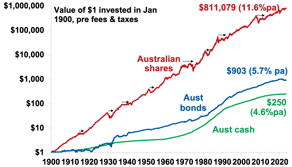
Source: ASX, Bloomberg, RBA, AMP
This does not mean blind optimism where you get sucked in with the crowd when it becomes euphoric or into every new whiz bang investment obsession that comes along (like bitcoin or the dot com stocks of the 1990s). If an investment looks too good to be true and the crowd is piling in, then it probably is – particularly if the main reason you are buying in is because of huge recent gains. So, the key is cautious, not blind, optimism.
Finally, even when it might pay to be pessimistic and hence out of the market in corrections and bear markets, trying to get the timing right can be very hard. In hindsight many downswings in markets like the GFC look inevitable and hence forecastable and so it’s natural to think you can anticipate downswings going forward. But trying to time the market – in terms of both getting out ahead of the fall and back in for the recovery – is difficult. A good way to demonstrate this is with a comparison of returns if an investor is fully invested in shares versus missing out on the best (or worst) days. The next chart shows that if you were fully invested in Australian shares from January 1995 you would have returned 9.3%pa (with dividends but not allowing for franking credits, tax and fees).
Missing the best days and the worst days
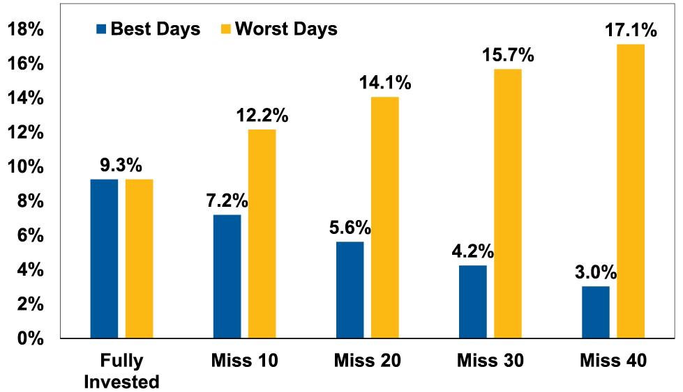
Covers Jan 1995 to March 2023. Source: Bloomberg, AMP
If you were pessimistic about the outlook and managed to avoid the 10 worst days (yellow bars), you would have boosted your return to 12.2%pa. And if you avoided the 40 worst days, it would have been boosted to 17.1%pa! But this is very hard, and many investors only get really pessimistic and get out after the bad returns have occurred, just in time to miss some of the best days. For example, if by trying to time the market you miss the 10 best days (blue bars), the return falls to 7.2%pa. If you miss the 40 best days, it drops to just 3%pa.
As Peter Lynch has pointed out “More money has been lost trying to anticipate and protect from corrections than actually in them.”
On a day-to-day basis it’s around 50/50 as to whether shares will be up or down, but since 1900 shares in the US have had positive returns around seven years out of ten and in Australia it’s around eight years out of ten.
Percentage of positive share market returns
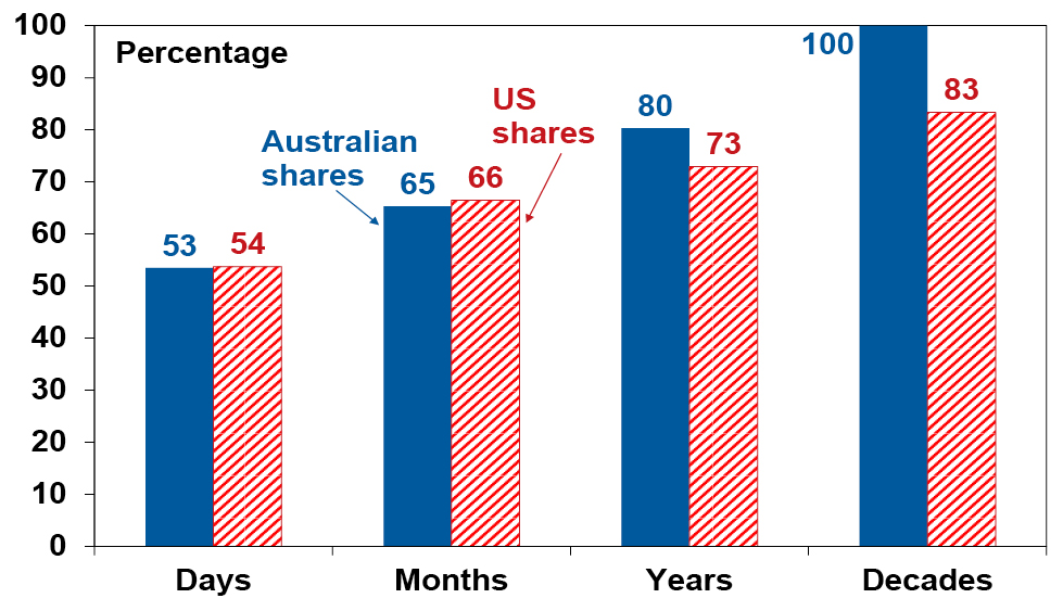
Daily & mthly data from 1995, data for years & decades from 1900. Source: ASX, Bloomberg, AMP
So getting too hung up in pessimism on the next crisis that will, on the basis of history, drive the market down in two or three years out of ten may mean that you end up missing out on the seven or eight years out of ten when the share market rises. Here’s one final quote to end on.
“No pessimist ever discovered the secrets of the stars, or sailed to an uncharted land, or opened a new heaven to the human spirit.” – Helen Keller
Source: AMP Capital September 2023
Important note: While every care has been taken in the preparation of this document, AMP Capital Investors Limited (ABN 59 001 777 591, AFSL 232497) and AMP Capital Funds Management Limited (ABN 15 159 557 721, AFSL 426455) make no representations or warranties as to the accuracy or completeness of any statement in it including, without limitation, any forecasts. Past performance is not a reliable indicator of future performance. This document has been prepared for the purpose of providing general information, without taking account of any particular investor’s objectives, financial situation or needs. An investor should, before making any investment decisions, consider the appropriateness of the information in this document, and seek professional advice, having regard to the investor’s objectives, financial situation and needs. This document is solely for the use of the party to whom it is provided.
China’s slowdown & structural challenges & the implications for Australia
Dr Shane Oliver – Head of Investment Strategy and Chief Economist, AMP
IntroductionScepticism about China’s economic success has been an issue for years. But it’s intensified lately on the back of slowing growth, property problems, high debt and falling long term growth potential with talk that China is “teetering on the brink” and President Biden describing it as a “ticking time
Read MoreDr Shane Oliver – Head of Investment Strategy and Chief Economist, AMP
Introduction
Scepticism about China’s economic success has been an issue for years. But it’s intensified lately on the back of slowing growth, property problems, high debt and falling long term growth potential with talk that China is “teetering on the brink” and President Biden describing it as a “ticking time bomb”. After strong growth and a big run up in debt there is fear that it’s going down the same path as Japan which after a surge in asset prices and debt on the back of what was dubbed a miracle economy in the 1980s slipped into a long period of poor growth and deflation. As the world’s second largest economy what happens in China has significant ramifications globally and in Australia. This note looks at the main issues and what it means for Australia.

Slowing growth
After China’s Covid restrictions were finally eased late last year there was hope its economy would rebound. It did in the March quarter but since then its disappointed with GDP growth slowing to 0.8%qoq (from 2.2% in the March quarter) and July data showing a further slowing in growth in industrial production, retail sales (running at just 2.5%yoy) and investment.
China Activity Indicators, smoothed annual growth (%)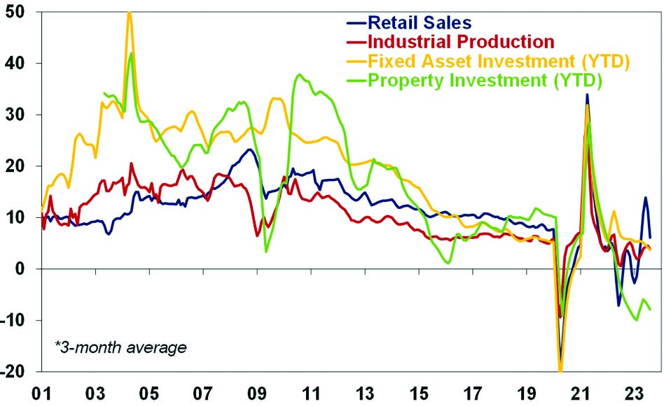
Source: Bloomberg, AMP
Exports and imports are down 14.5% yoy and 12.4% yoy respectively, bank lending and credit growth have slowed despite some monetary easing. Reflecting weaker conditions, business conditions PMIs have also fallen sharply. And youth unemployment has risen from around 12% to 21% over the last five years. Reflecting faltering growth, modest inflation has given way to deflation, although core CPI inflation is slightly positive.
China Inflation Measures (% y/y)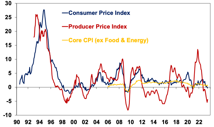
Source: Bloomberg, AMP
The slowdown reflects a combination of factors but high on the list are:
-
Many households seeking to rebuild savings which were depleted through the lockdowns – Chinese households did not have their incomes protected as in most western countries in the lockdowns so did not emerge with lots of excess savings compared to pre-Covid levels.
-
A property collapse – after reaching record highs in 2021 new home sales are down sharply, property transactions are down 33%yoy and home prices have fallen reflecting tightening policies and oversupply. This has led to big problems at: developers (eg, Evergrande and Country Garden) that relied on high debt & a steady flow of new buyers; companies that issue investment products which helped finance developers; local governments that rely on land sales for revenue; & households who have seen property related investments sour.
Chinese residential property prices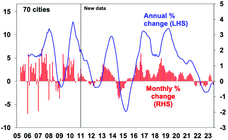
Source: Bloomberg, AMP
Structural problems
However, the slowdown is also being impacted by structural problems:
-
The first thing to note is that China has a very high saving rate of around 45% of GDP, which is roughly double that of countries like Australia. This makes China’s debt problems very different to other countries as China has borrowed from itself (so there are no foreigners to cause a foreign exchange crisis). But it means the savings have to be recycled (usually via debt) into demand or else weak demand, high unemployment and chronic deflation can result. It did this initially through corporate debt into investment and then into property which has resulted in a rapid rise in China’s debt levels since 2008. But this is getting problematic.
Global non-financial debt
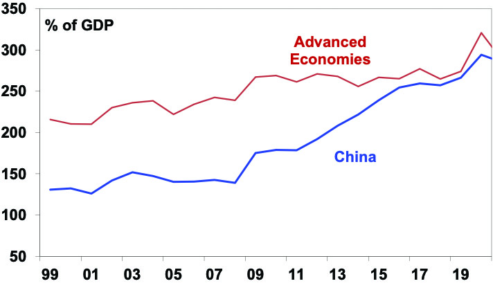
Source: BIS, AMP
-
Second, the easy opportunities for capital investment have been taken. China’s ratio of fresh capital to GDP and fresh debt to GDP have increased substantially indicating that ever more investment and debt is necessary to achieve the same increase in GDP as in the past.
-
Third, this hasn’t been helped by geopolitical tensions which have slowed exports. It’s also added to a plunge in foreign direct investment (which is down 87%yoy) and restricted access to US technology.
-
Fourth, while some cried wolf too early on China’s property market (recall the SBS Ghost Cities story from 2011!), using property to recycle high savings is souring. This was viable when urbanisation was rapid but analysis based on utility usage and light emissions at night suggest some areas may have 25% of apartments vacant.
-
Fifth, China’s demographics are poor as its workforce is now shrinking and it has a rapidly aging population. This also weighs on property demand. But it also removes a key source of economic growth.
-
Finally, despite a falling workforce China could still grow quickly because its GDP per capita and output per worker are around 20% of US levels – so it still has a lot of catching up to do. However, the easy gains of industrialisation by putting people in front of machines have been had and China runs the high risk of falling into the “middle income trap” (where countries fail to transition to being high income countries) as a result of increasing state intervention in the economy – with the resurgence of less efficient state owned enterprises (which now account for 60% of investment, up from 30% 10 years ago) and regulatory crackdowns on tech companies and other sectors acting as a disincentive to future entrepreneurs, state intervention on national security grounds and tighter access to foreign technology.
As a result of China’s falling workforce and slowing productivity growth, estimates of its potential real GDP growth have fallen from around 10% in 2006-10 to around 5% now and around 3% next decade.
The policy response and “Japanification”
The fear is that China continues to slow causing a spiral of bigger property sector problems with sharp falls in asset prices, more developers “failing”, increased consumer caution, weaker growth, and further falls in asset prices. Or that a major near crisis is averted but it slides into a decades long period of stagnation and deflation like Japan did after its 1980s boom years.
With opportunities to recycle China’s high saving rate into investment and property starting to diminish it should be saving less and spending more. To achieve this requires aggressive fiscal stimulus to rebalance the economy towards consumer spending. In particular this would involve improving social welfare (in terms of pensions, health and education) in order lower precautionary household saving and support spending.
Despite indications from Politburo meetings that stimulus would be forthcoming so far it’s been mild with only a few cuts to interest rates and relaxation of bank reserve requirements and measures to “promote” consumers to spend more and buy more homes without large scale measures to help them do so. This has led to concern the Government is more focussed on trying to avoid reflating credit and housing bubbles (much as Japan was in the early 1990s) and/or is not aware of the problem.
Our assessment though is that the Government is well aware of the need to support growth given the risk of social unrest and will ultimately do so – probably after the summer travel boom comes to an end soon. Furthermore the Chinese Government is unlikely to allow a GFC style collapse in property developers and is likely to continue to manage the problem.
So a collapse in the Chinese economy is unlikely but the risk that policy stimulus is too little or too late can’t be ignored and nor can the broader comparison with Japan at the end of the 1980s. A key difference with Japan 30 years ago is that China’s per capita GDP is still low so it still has lots of catch up potential, but its rapid private debt build up is similar to Japan’s, its demographic outlook is a bit worse and the threats to its productivity (with state intervention) and trade (with geopolitical tensions) are greater.
The Chinese share market
Chinese shares are down 36% from their record 2021 high and are cheap when compared to earnings (trading on a PE of just 7.7 times), book value and sales. This suggests significant potential for a bounce if significant stimulus is announced. However, the risks are on the downside.
Chinese shares are cheap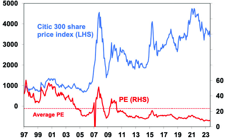
Source: Thomson Reuters, AMP Capital
Implications for Australia
Uncertainty around China’s outlook is a key risk for global growth at present and could be a contributor to a further correction in share markets.
The collapse in the share of Australian goods exports going to China in 2021 and 2022 from around 42% to less than 30% (partly due to trade restrictions) without a major hit to our economy highlights that maybe Australia is not as dependent on China as many think. Nevertheless, a sharp downturn in China would be a double whammy for the Australian economy coming at the same time the lagged impact of big interest rate hikes on household spending comes through. But while it’s a risk it’s not our base case as ultimately we expect a ramp up in Chinese stimulus measures enabling Chinese growth to settle around 5% this year and 4.5% next year (not great compared to the past experience for China but not a disaster). However, the risks around the Chinese outlook and its longer-term growth mean Australia cannot rely on the China/commodity boom indefinitely driving national income and hence masking our poor productivity performance. This is another reason why Australia needs structural reform to boost our longer-term growth potential.
Source: AMP Capital August 2023
Important note: While every care has been taken in the preparation of this document, AMP Capital Investors Limited (ABN 59 001 777 591, AFSL 232497) and AMP Capital Funds Management Limited (ABN 15 159 557 721, AFSL 426455) make no representations or warranties as to the accuracy or completeness of any statement in it including, without limitation, any forecasts. Past performance is not a reliable indicator of future performance. This document has been prepared for the purpose of providing general information, without taking account of any particular investor’s objectives, financial situation or needs. An investor should, before making any investment decisions, consider the appropriateness of the information in this document, and seek professional advice, having regard to the investor’s objectives, financial situation and needs. This document is solely for the use of the party to whom it is provided.
Why the need to lift productivity
Dr Shane Oliver – Head of Investment Strategy and Chief Economist, AMP
Introduction“Productivity isn’t everything, but, in the long run, it is almost everything”. Paul Krugman, Economist
“The only thing that we learn from history is that we learn nothing from history.” Georg Hegel, Philosopher
Outgoing Reserve Bank Governor Philip Lowe has highlighted Australia’s weak productivity growth
Read More– and why it might be hard
Dr Shane Oliver – Head of Investment Strategy and Chief Economist, AMP
Introduction
“Productivity isn’t everything, but, in the long run, it is almost everything”. Paul Krugman, Economist
“The only thing that we learn from history is that we learn nothing from history.” Georg Hegel, Philosopher
Outgoing Reserve Bank Governor Philip Lowe has highlighted Australia’s weak productivity growth and noted that boosting it “should be the issue that dominates economic discussion”. So why is boosting productivity so important? And why is it seen as so hard to do? It’s worth having another look at it given its importance to our economy and investment markets.

What is productivity?
Productivity refers to the level of economic output for a given level of labour and capital inputs. Increased productivity means more is being produced for given inputs. Output usually refers to Gross Domestic Product and dividing inputs of labour (hours worked) and capital (structures and machinery) into GDP gives “multi factor productivity”. However, its more common to refer to measures of labour productivity, ie, GDP per hour worked. The next chart shows this for Australia.
Australian Labour Productivity
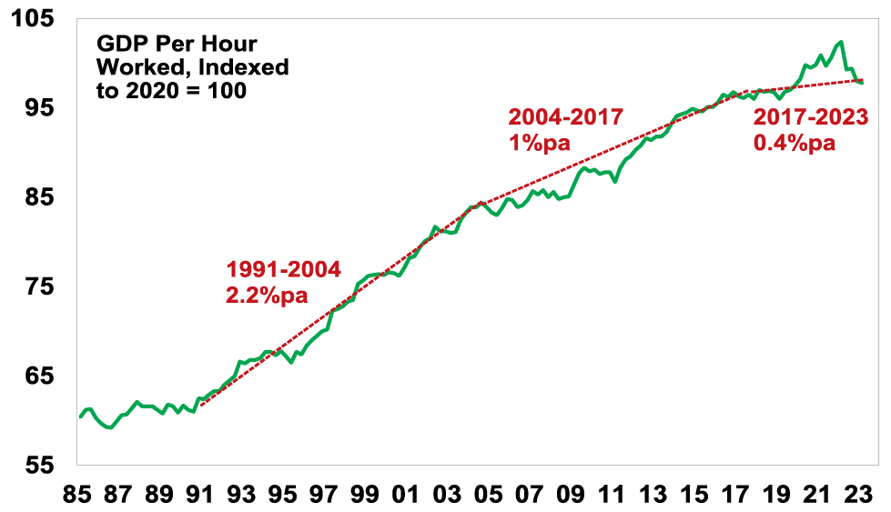
Source: ABS, AMP
The next chart shows the annual rate of labour productivity growth (ie, the change in GDP per hour worked). Productivity growth rose to over 2% p.a. through the 1990s into the 2000s, but it’s slowed to less than one percent over the last decade. And since 2019 it’s stalled (see the first chart).
Australian Labour Productivity Growth
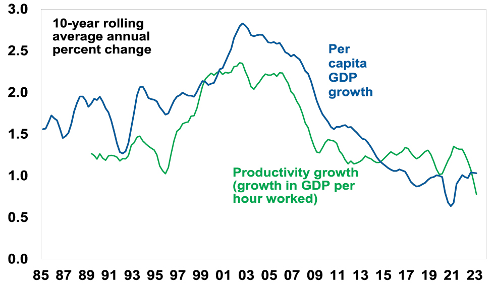
Source: ABS, AMP
Why does productivity matter?
Productivity matters because as Paul Krugman points out “a country’s ability to improve its standard of living over time depends almost entirely on its ability to raise its output per worker”. As evident in the last chart, the longer-term pattern in labour productivity growth has correlated with a similar pattern in growth in GDP per capita (or GDP per person). Roughly speaking the slowdown in productivity growth from 2.2% pa in the 1990s to 0.8% pa over the last 10 years means that after a 10-year period annual GDP will be 13% (or $350bn) less than otherwise, which means lower material living standards than otherwise. Of course, we can make up for this by faster population growth as has been the case since the mid-2000s but this does not address the negative impact on living standards per person. Likewise in Australia the slump in productivity has been masked by the strong commodity prices and hence national income helped by the China boom – but medium-term threats to Chinese growth mean that we cannot rely on this indefinitely. Over time, lower productivity growth means lower real wages growth, slower growth in profits and a reduced ability for the government to provide services the community expects.
Why is it relevant for sustained decent wages growth?
If wages growth is 4% and output per worker goes up by 1.5% then the increase in labour costs for business is 2.5% which if passed on as higher prices is in line with the RBA’s 2-3% inflation objective. But if wages go up 4% and productivity growth is zero, business costs go up 4% and they will pass this on to their customers likely resulting in inflation above the RBA’s target. Hence 4% wages growth is consistent with the inflation target but only if productivity growth picks up to its long-term average of 1.5% pa.
So why the slump in productivity growth?
After the malaise of the high inflation/high unemployment 1970s, there was a focus in the 1980s on supply side economic reforms designed to improve productivity growth by making the economy more flexible and competitive, improving incentives and improving skills. This included financial deregulation, floating the $A, labour market deregulation, product market deregulation, reduced trade barriers, competition reforms, privatisation, tax reform and an improvement in educational attainment. Along with baby boomers reaching their peak productivity years, it saw productivity growth surge through the 1990s into the 2000s. But since then, a range of factors have contributed to slower productivity growth:
-
There has been little in the way of new reforms since the GST and some backsliding – eg, the labour market has become less flexible.
-
Very strong population growth with an inadequate infrastructure and housing supply response has led to urban congestion and poor housing affordability which contribute to poor productivity growth – notably via increased transport costs and increased speculative activity around housing diverting resources from more productive uses.
-
The retirement of the baby boomer wave and replacement with a wave of less experienced millennials and Gen Z may drive slower productivity growth (just as baby boomers did in the 1970s).
-
Growth in real business investment stalled in the 2010s.
-
Market concentration has increased, reducing competition.
-
Confusion regarding climate policies has contributed to underinvestment in power supply and high energy costs, and we have rejected an efficient market-based mechanism (carbon pricing and trading) to determine the best way to eliminate carbon emissions in favour of a “hotchpotch of measures” (according to former Productivity Commission chair Gary Banks).
-
The services sector has grown as a share of the economy and it is more labour intensive and hence less productive.
-
And the pandemic distorted productivity by first boosting it as (low productivity) services activity was curtailed by lockdowns and then reducing it as services activity rebounded with reopening.
The last point is arguably a temporary distortion which should pass as the reopening boost in services demand subsides – so the recent slump in productivity is likely to be reversed to some degree enabling us to get back to pre-pandemic trends. However, even this was relatively slow and all the other factors in the list above are likely longer lasting.
How do we boost productivity?
Unfortunately, there are no quick fixes. The key is to acknowledge the problem, discuss the options and chart a path forward. Fortunately, as Governor Lowe has regularly pointed out there are plenty of good ideas. At a high level, key areas for action include the following:
-
Improving labour market flexibility and reviving Enterprise Bargaining.
-
Measures to boost workforce capability – including apprenticeships.
-
Maintain high levels of infrastructure spending to reduce congestion, lower transport costs & allow more to live away from expensive cities.
-
Boost the supply of housing to more than match underlying population driven demand for several years until the housing shortfall is removed.
-
Competition reforms to reduce market concentration.
-
Better healthcare by focussing on prevention & management.
-
More incentives to boost investment & adopt new technology, eg, AI.
-
Improving public sector productivity.
-
Reduce climate policy uncertainty and rely more on market signals as to how best to transition to net zero.
-
Simplify regulations and remove redundant regulation.
-
Limit the size of government.
-
Tax reform to rebalance from direct tax to a broader GST, compensate those adversely affected, and remove nuisance taxes like stamp duty.
The Productivity Commission has recently updated its detailed list of recommendations. The use of AI in services will help but will take time & we’re yet to see much boost in measured productivity from the internet.
So, what’s stopping us?
The main constraint to boosting productivity is arguably political. The Government is focussed on improving skills, fixing energy supply and encouraging the adoption of new technology. However, support for the economic rationalist policies of the 1980s that gave rise to the supply side reforms of the Thatcher, Reagan, Hawke and Keating era (of smaller government, fundamental tax cuts, deregulation and privatisation) has long faded. In the 1980s the political pendulum swung to centre right policies in reaction to the failure of big government policies in the 1970s. Now the political pendulum has swung back to the left and away from free market solutions. This reflects a combination of:
-
the feeling that the GFC showed de-regulation went too far;
-
stagnant and recently falling real wages for median households;
-
high household debt levels preventing individuals from taking on more debt as a way to boost living standards;
-
rising levels of inequality and perceptions that “it’s unfair”;
-
the perceived failure of the baby boomer generation to do much about climate change and housing affordability;
-
examples of big business doing the wrong thing;
-
a backlash against immigration in some countries;
-
a backlash against globalisation and increasing geopolitical tensions;
-
perceptions that government was able to protect us through the pandemic and if so it should be able to fix other problems too; and
-
the latter seems to have ushered in a permanently higher share of government spending and revenue in the economy.
Federal Government spending and revenue
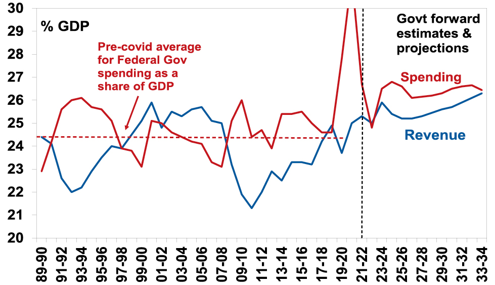
Source: Australian Treasury – 2023-24 Budget Papers, AMP
Of course, it’s being aided by a dimming of memories of the stagflation of the 1970s and its causes. So, government related solutions – often tied to addressing national security & climate issues – seem more attractive than free market solutions. This is resulting in more government intervention – notably across advanced countries in subsidies to develop electric car or battery industries – reminiscent of the protectionism of the post WW2 era.
Concluding comment and implications for investors
Australia is in far better shape than many comparable countries – public debt is relatively low; unemployment is low; and we are less politically polarised and more open to compromise. However, after nearly two decades of policy drift, declining productivity growth is weighing on growth in living standards and sustainable real wages growth. Some boost in productivity is likely as pandemic related distortions drop out and some government measures will help. However, the political will for the sort of economic reforms necessary (particularly around taxation and labour markets) for another 1990s style rebound in productivity growth looks unlikely. This in turn makes the RBA’s job in getting inflation down a little bit harder and will constrain medium term investment returns.
Source: AMP Capital August 2023
Important note: While every care has been taken in the preparation of this document, AMP Capital Investors Limited (ABN 59 001 777 591, AFSL 232497) and AMP Capital Funds Management Limited (ABN 15 159 557 721, AFSL 426455) make no representations or warranties as to the accuracy or completeness of any statement in it including, without limitation, any forecasts. Past performance is not a reliable indicator of future performance. This document has been prepared for the purpose of providing general information, without taking account of any particular investor’s objectives, financial situation or needs. An investor should, before making any investment decisions, consider the appropriateness of the information in this document, and seek professional advice, having regard to the investor’s objectives, financial situation and needs. This document is solely for the use of the party to whom it is provided.
Recession versus “goldilocks”
Dr Shane Oliver – Head of Investment Strategy and Chief Economist, AMP
IntroductionOver the last 18 months there has been much talk of recession globally and more recently in Australia. But, despite mild technical recessions (ie, two consecutive quarters of falling GDP in a row) in the US and Europe in the last
Read More– five reasons why we could still avoid recession
Dr Shane Oliver – Head of Investment Strategy and Chief Economist, AMP
Introduction
Over the last 18 months there has been much talk of recession globally and more recently in Australia. But, despite mild technical recessions (ie, two consecutive quarters of falling GDP in a row) in the US and Europe in the last 18 months, growth has generally been more resilient than expected and now with inflation falling many have started to give up on recession with increasing talk of Goldilocks (ie, where growth is okay and inflation is falling). So, have we dodged the recession bullet?

The case for a recession
The basic argument is that the most rapid monetary tightening in major countries in decades and cost-of-living pressures have set the scene for recession. This is supported by various signs that precede recessions:
-
The US yield curve started to invert, with short term interest rates rising above long-term rates, last year. And this has preceded all US recessions over the last 60 years.
US yield curve inversions and recessions
Source: Bloomberg, AMP
-
Leading economic indexes – which combine things like building permits and confidence – are at levels that often precede recession.
-
Monetary conditions as measured by bank lending standards have tightened significantly and this normally leads to a collapse in lending.
And in Australia a record level of household debt servicing costs to income add to the local risk of recession which we put at 50%. But after “predicting” 4 of the last two recessions in Australia – one of which was the pandemic recession which flowed from lockdowns so shouldn’t really count – and seeing lots of incorrect forecasts of global doom over the years, I am all too aware of recession calls turning out to be wrong. Which partly explains my reluctance to go beyond 50/50 at present for Australia.
Can recession be avoided?
The first point to note is things like yield curves and leading indicators can get it wrong in forecasting recession. Yield curves have several issues:
-
The lag from yield curve inversion in the US can be 18 months. Various versions of it first inverted between July last year and January this year. So given normal lags it may not eventuate until next year.
-
More positively though US yield curve inversions have given false signals in the past, eg, in 1998.
-
Inverted yields curves have been a poor indicator of recession since 1991 in Australia and right now it’s not decisively inverted anyway.
Australian yield curve inversions and recessions
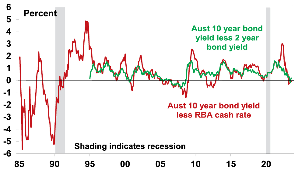
Source: Bloomberg, AMP
There are in fact several ways a recession might still be averted.
First, inflation could fall fast taking pressure off rates
This could occur in several ways: easing goods supply pressures and transport costs could continue to reduce goods inflation; falling job vacancies and an easing in reopening demand could take pressure off wages growth and services inflation; and a productivity surge as Artificial Intelligence is deployed in services industries could do the same. In other words, today’s low unemployment levels could turn out to be consistent with “full employment” and only a marginal cooling in demand may be necessary to return labour and product markets to balance. And so central banks may soon be able to move towards lowering interest rates.
Recently the news on this has been good. US inflation has fallen from a peak of 9%yoy to 3% and Australian inflation has fallen from 8% yoy to 6%. And this has occurred without a rise in unemployment. Our US and Australian Pipeline Inflation Indicators continue to point down. However, there are several reasons to be cautious here.
-
First, services price inflation may prove a bit sticky as in some countries wages growth is still picking up. This is clearly a risk in Australia with a faster rise in minimum and award wages this year resulting in a renewed surge in labour costs in the latest NAB survey.
-
Second, AI will take years to enhance productivity growth.
-
Third, it assumes that central banks can fine tune the economic cycle – the RBA has done this well in the post 1991 period but the Fed not so well. This is made hard by lags in the way monetary policy impacts the economy which risks central banks raising rates too much. Having lost credibility last year in assuming inflation was “transitory”, central banks are likely to err on the side of caution to make sure the inflation dragon is back in its cave before easing up. And of course, this time around RBA tightening has been faster than at any time since the 1980s and household ratios are three times higher now.
But fortunately, there are also other ways recession may be avoided.
Second, there is a lack of excess to unwind
Recessions are normally preceded by imbalances that are unwound and lead to a sharp fall in economic activity. For example, in the US prior to the tech wreck there was an investment boom and prior to the GFC there was a boom in home building. However, this time around beyond the problem with inflation there are little in the way of similar excesses: there has been no business investment boom; there has been no home building boom and housing vacancy rates are low; household debt has fallen from its pre-GFC high; and inventory to sales ratios are low. So given the absence of excess, recession may be avoided or if not it’s likely to be mild.
It’s similar in Australia with the exception that household debt to income ratios are nearly double US levels leaving the Australian household sector as an obvious increased source of recession risk here – particularly with household debt servicing costs now pushing around record levels.
Third, households still have pandemic savings buffers
Through the pandemic people were constrained from spending but most still received an income. The result was that household saving rates rose above normal levels resulting in excess saving. See the next chart. In Australia it has been run down but remains high at around $230bn. My concern has been and remains that it is not distributed equally and that for many younger (25-45 year old) households with high debt levels it has been rundown such that it’s no longer of any support in the face of the surge in interest payments. And for older households they are unlikely to use much of it for spending anyway. Nevertheless, at an average level it is a source of support that wasn’t around prior to past downturns.
Australia Accumulated Household Savings
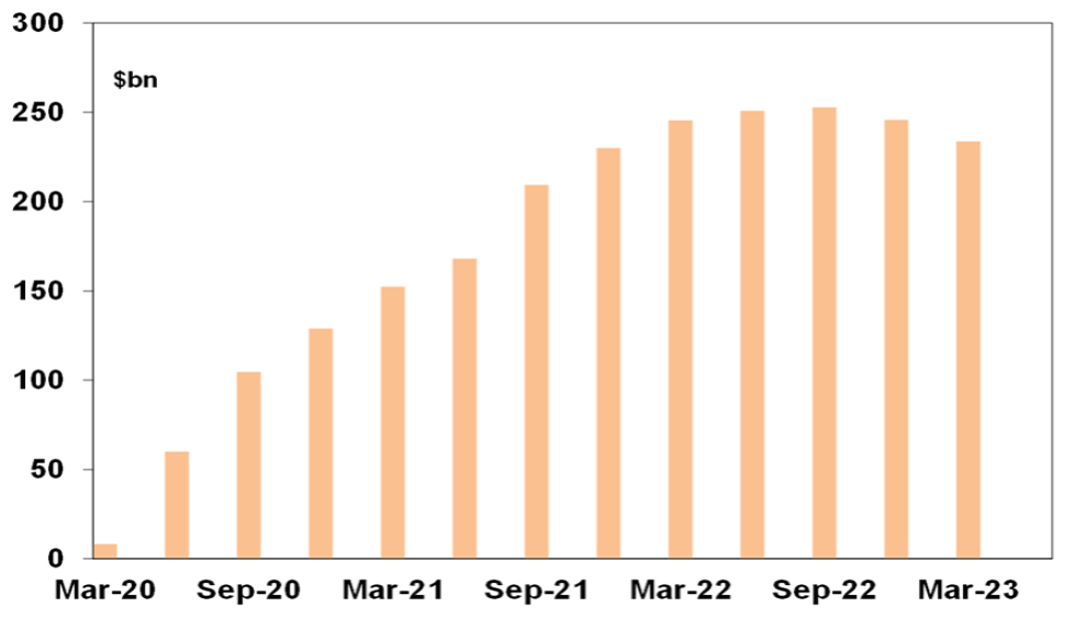
Source: ABS, AMP
Fourth, we could have rolling sectoral recessions
Different sectors of the economy are impacted at different times by shocks like tighter monetary policy. So various sectors of the economy may have “recessions” but at different times such that the overall economy never actually contracts. Something like this happened through the 1990s and 2000s to varying degrees providing support for the view that the environment back then was characterised by micro instability but overall macro stability and hence milder economic cycles.
In the US, in this cycle home building and technology, and more recently manufacturing, have arguably already had recessions but they are now starting to find a floor so if consumer spending on services turns down it may be offset by an improvement in home building, technology and manufacturing. Similarly in Australia, home building and retailing have been in recession for a while and conceivably could start to recover as consumer spending on services top out.
So far so good but the risk is high that currently weaker sectors don’t recover in time to offset weakness in lagging sectors like services.
Finally, strong population growth may mask recession
Strong population growth boosts demand and hence GDP growth and could enable a recession as defined as a fall in GDP to be avoided. In this regard it’s notable that while both the Australian Government and RBA are forecasting positive GDP growth this financial year on a year average basis at 1.5% and 1% respectively, this is expected to be below the rate of population growth at around 1.7% or more which means that both are forecasting a per capita (or per person) recession, but this is masked by strong population growth. Of course, what matters for living standards is per capita GDP growth but arguably for investors overall growth is more important as this is what will drive company profits.
Bottom line
Each of these considerations has qualifications but together they suggest recession can still be avoided. But it’s a high risk with the lagged impact of rate hikes still feeding through – particularly in Australia where we put the risk of recession at 50% given the vulnerability of the household sector. Weak growth in China is also adding to the risks of recession.
But what if growth is too strong?
Of course, the flipside is that we get too much of a good thing – growth takes off again before inflation has fallen back to earth. This would be a problem as it would likely mean a further fall in unemployment and so even tighter jobs markets, more upwards pressure on wages growth, higher for longer inflation and central banks keeping interest rates high for longer or even raising them further (to the point where recession comes anyway). This has been concerning investment markets in the last week or two with bond yields rising which has in turn has pressured share markets as higher bond yields make investment in shares look less attractive. This in turn has been made worse by:
-
Japan taking another mini step towards removing its ultra easy monetary policy and allowing a further rise in its bond yields which in time may reduce Japanese investment in US/global bonds; and
-
Fitch’s downgrade of US debt which has refocused attention on US’ high public debt and worsening budget deficit.
But while recession could still be avoided, a rebound in global & especially Australian growth seems unlikely until after central banks cut rates.
Implications for investors
We remain of the view that shares will do well on a 12-month view, but the risks around recession and higher bond yields mean that share market volatility will remain high with a high risk of a correction.
Source: AMP Capital August 2023
Important note: While every care has been taken in the preparation of this document, AMP Capital Investors Limited (ABN 59 001 777 591, AFSL 232497) and AMP Capital Funds Management Limited (ABN 15 159 557 721, AFSL 426455) make no representations or warranties as to the accuracy or completeness of any statement in it including, without limitation, any forecasts. Past performance is not a reliable indicator of future performance. This document has been prepared for the purpose of providing general information, without taking account of any particular investor’s objectives, financial situation or needs. An investor should, before making any investment decisions, consider the appropriateness of the information in this document, and seek professional advice, having regard to the investor’s objectives, financial situation and needs. This document is solely for the use of the party to whom it is provided.
The confusing economic picture
Dr Shane Oliver – Head of Investment Strategy and Chief Economist, AMP
IntroductionI reckon many must be confused about the current economic situation. We hear constant talk about how high interest rates and cost of living pressures are causing economic pain for many households, consumer confidence is at
Read More– why you need to know the difference between leading and lagging economic indicators
Dr Shane Oliver – Head of Investment Strategy and Chief Economist, AMP
Introduction
I reckon many must be confused about the current economic situation. We hear constant talk about how high interest rates and cost of living pressures are causing economic pain for many households, consumer confidence is at recessionary levels and various companies are expressing concern about the economic outlook. But at the same time the unemployment rate remains very low, lots of Australians seem to be holidaying in Europe and restaurants and cafes are doing well. While perplexing, it’s not that unusual at turning points in the economy for various indicators to be conflicting. Much of it comes down to the difference between leading, coincident and lagging economic indicators. This note looks at the differences and why it’s important to allow for them.

Leading versus lagging economic indicators
Economic indicators can be divided based on whether they lead, lag or are coincident with the economic cycle measured by GDP growth. It’s important to be mindful of this when the economy is turning down. The next table lists examples of the most common indicators in each:
-
Leading economic indicators are economic indicators which lead the economic cycle often by 6-18 months. This is because they reflect changes in monetary policy – like the yield curve which is the gap between long term bond yields and short-term interest rates which are a guide to whether monetary policy is tight or loose and money supply growth – or they respond quickly to changes in interest rates – like share markets, confidence and building approvals.
-
Coincident indicators move with the economic cycle, so GDP growth by definition is coincident as are retail sales and household income.
-
Lagging indicators tend to turn after the economic cycle has turned. Unemployment and inflation are lagging indicators because companies are invariably slow to adjust hiring and pricing decisions. They persist with decisions to hire or raise prices after demand has slowed because it takes a while to recognise that any downturn is permanent and turnaround the mechanisms by which they hire and raise prices.
Of course, leads and lags for various indicators may vary for each cycle so it’s often best to focus on an average of them.
Economic indicators
|
Type |
Economic indicator |
|
Leading |
|
|
|
Yield curves |
|
|
Money supply |
|
|
Share prices |
|
|
Building approvals |
|
|
Consumer and business confidence |
|
|
New manufacturing orders |
|
|
Sales to inventory ratio |
|
Coincident |
|
|
|
GDP |
|
|
Retail sales |
|
|
Home building |
|
|
Household income |
|
|
Industrial production |
|
|
Job vacancies |
|
Lagging |
|
|
|
Unemployment |
|
|
Business credit |
|
|
Debt delinquencies/insolvencies |
|
|
Unit labour costs |
|
|
Inflation rate |
Source: AMP
Various organisations publish indexes based on each. For example, the next chart shows indexes of all three produced by the Conference Board. As can be seen the Leading Index (blue line) tends to lead going into downturns/recessions whereas the Lagging Index (red line) follows.
Conference Board US Economic Indicators YoY (%)
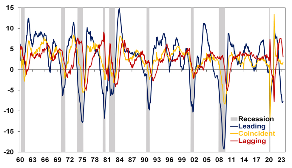
Source: Bloomberg, AMP
Current conditions
And so it is right now in the US with leading indicators depressed, coincident indicators having slowed but still growing and lagging indicators having slowed recently but still around pre-pandemic levels. It’s a similar story in Australia with the Westpac/Melbourne Institute leading index having slowed but GDP growth still positive.
Australia Melbourne Institute Leading Index
Source: Macrobond, AMP
This is particularly relevant now in relation to unemployment & inflation.
Jobs leading indicators are pointing down
Recent Australian jobs data has been strong with employment up 3%yoy, hours worked up 4.7%yoy and unemployment around a near 50 year low of 3.5%. For much of the last thirty years, Australia has not had a lot of clearly defined economic cycles and unemployment was in a downtrend. The pandemic also distorted normal economic relationships. However, as can be seen in the next chart significant swings in unemployment around the early 1990s recession and the early 2000s and 2008 growth slowdowns saw unemployment tend to lag swings in GDP growth (eg, see the green arrows). This was particularly evident around the early 1990s recession with unemployment still going down as GDP slowed in 1989 and only starting to rise in earnest once the economy was in recession. After the recession ended in mid-1991, unemployment did not peak until late 1992.
Australian Unemployment & GDP Growth
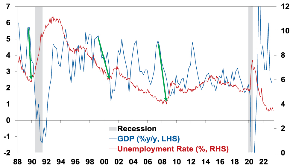
Source: ABS, AMP
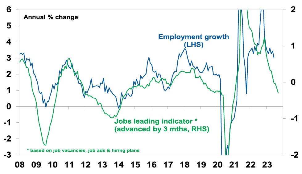
Our leading indicator of jobs growth – based on vacancies and hiring plans – points to a sharp slowing in jobs growth ahead.
Australian employment vs Jobs Leading Indicator
Source: ABS, NAB, ANZ, AMP
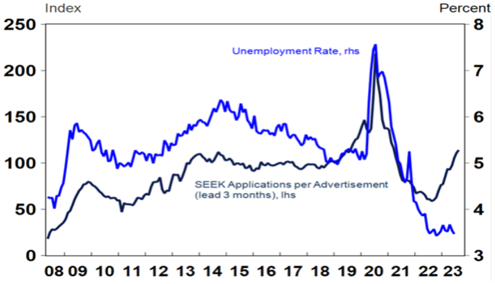
Consistent with this, data from Seek shows a rising trend in applications per job ad and consumer surveys also show a rising trend in unemployment expectations which tends to lead the unemployment rate at turning points.
Australia Labour Market Indicators
Source: Macrobond, AMP
On current trends our Jobs Leading Indicator suggests employment growth is likely to fall below the 1% growth the RBA is forecasting over the next year suggesting upside risks to their forecast for a rise in unemployment to 4.5%. Roughly 3% jobs growth now is needed to keep unemployment stable given the surge in population growth with high immigration.
Inflation also lags
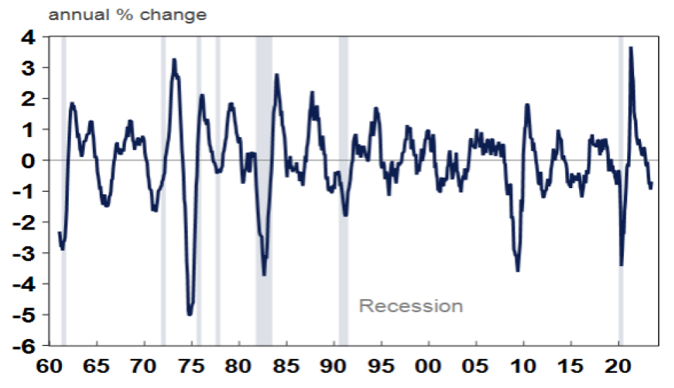
As with unemployment, major swings in inflation also tend to lag major swings in GDP growth. Of course, as already noted Australia didn’t have a lot of clear economic cycles over the last 30 years, but the lag was clearly evident in the early 1990s (see the green arrows below). Of course, the pandemic distorted things pushing inflation down very quickly in 2020 and the combination of pandemic related distortions, floods and the war in Ukraine which depressed supply helped boost inflation since 2021 but the supply side is now normalising.
Australian Inflation & GDP Growth
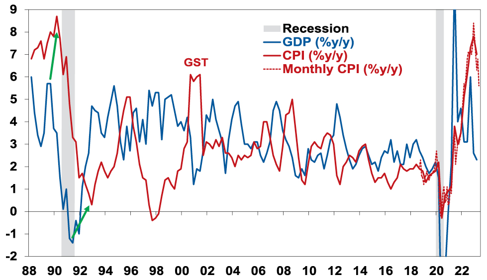
Source: ABS, AMP
While inflation is still too high, the increasing signs of a sharp slowdown in growth and a high risk of recession (which we put at 50% with the biggest risk being RBA overtightening) point to a further sharp fall in inflation as weaker growth means less demand relative to supply in the economy.
Concluding comment
To conclude, the key points are that:
-
Still low unemployment and still high inflation are not that unusual despite slowing growth because they both normally lag big swings in the economic cycle – running the economy with too much focus on them is a bit like driving a car with the rear-view mirror.
-
As such the RBA and other central banks need to tread carefully from here and allow for the lags from the rapid rise in interest rates to work through lest they end up pushing unemployment far higher than they need to in order to return inflation to target. Fortunately, the minutes from the last RBA board meeting suggests it’s aware of the risks.
Source: AMP Capital July 2023
Important note: While every care has been taken in the preparation of this document, AMP Capital Investors Limited (ABN 59 001 777 591, AFSL 232497) and AMP Capital Funds Management Limited (ABN 15 159 557 721, AFSL 426455) make no representations or warranties as to the accuracy or completeness of any statement in it including, without limitation, any forecasts. Past performance is not a reliable indicator of future performance. This document has been prepared for the purpose of providing general information, without taking account of any particular investor’s objectives, financial situation or needs. An investor should, before making any investment decisions, consider the appropriateness of the information in this document, and seek professional advice, having regard to the investor’s objectives, financial situation and needs. This document is solely for the use of the party to whom it is provided.
Seven key charts for investors to keep an eye on
Dr Shane Oliver – Head of Investment Strategy and Chief Economist, AMP
IntroductionAt the start of this year, we thought shares would have reasonable returns albeit it wouldn’t be smooth sailing given ongoing issues around inflation, interest rates, the risk of recession and geopolitics. So far so good. This note updates seven key charts we see as
Read More– where are they now?
Dr Shane Oliver – Head of Investment Strategy and Chief Economist, AMP
Introduction
At the start of this year, we thought shares would have reasonable returns albeit it wouldn’t be smooth sailing given ongoing issues around inflation, interest rates, the risk of recession and geopolitics. So far so good. This note updates seven key charts we see as critical for the investment outlook.

Chart 1 – global business conditions PMIs
A big determinant of whether share markets can continue to move higher or resume the bear market in US and global shares that started last year, will be whether major economies slide into recession and, if so, how deep that is. Our assessment is that the risk of a mild recession is high (particularly in Australia), but that at least a deep recession should be avoided. Global business conditions indexes (PMIs) – which are surveys of purchasing managers at businesses – will be a key warning indicator.
Global Composite PMI vs World GDP
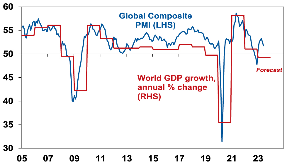
Source: Bloomberg, AMP
So far, they have proven resilient. While slowing again after a bounce – partly due to China – they are at levels consistent with okay global growth.
Chart 2 (and 2b) – inflation
Of course, a lot continues to ride on how far key central banks raise interest rates. And as has been the case for the last 18 months or so the path of inflation will play a key role in this. Over the last six months the news on this front has continued to improve with inflation rates in key countries rolling over. US inflation has now fallen from 9.1%yoy a year ago to 3% in June and our US Pipeline Inflation Indicator – reflecting a mix of supply and demand indicators – continues to point to a further decline. This reflects a combination of lower commodity prices, improved supply, lower transport costs and easing demand. Just as goods price inflation led on the way up, it’s now leading on the way down with services inflation rolling over as well. The Fed is likely to hike once more this month but the fall in inflation suggests that may be the peak with rate cuts next year.
AMP Pipeline Inflation Indicator
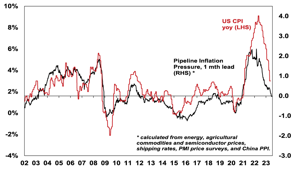
Source: Bloomberg, AMP
Australian inflation is lagging the US by 6 months, but our Australian Pipeline Inflation Indicator suggests inflation here will continue to fall. The RBA has started to soften its tightening bias & while we are allowing for a bit more on rates (given RBA worries about still high services inflation & the high risk of stronger wages growth), our assessment is that the RBA is either at or close to the top with rate cuts starting in February next year.
Australia Pipeline Inflation Indicator
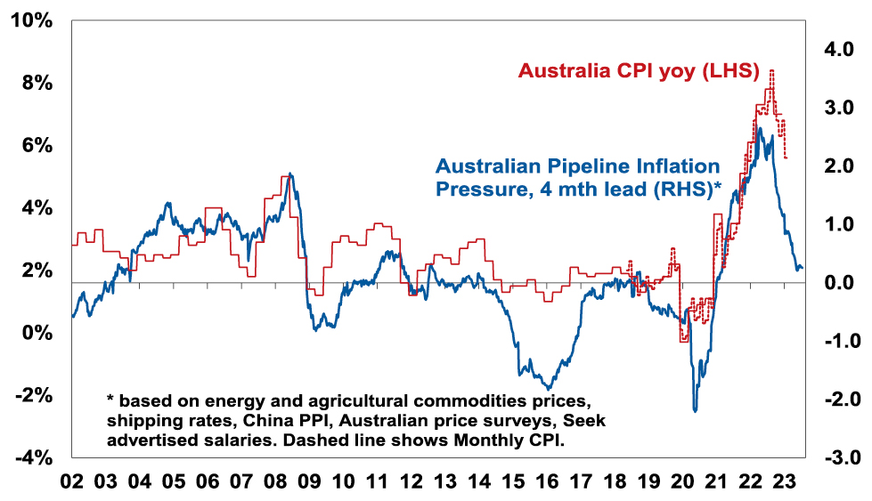
Source: Bloomberg, AMP
Chart 3 – unemployment and underemployment
Also critical is the tightness of labour markets as this will determine wages growth which has a big impact on services inflation. If wages growth accelerates too much in response to high inflation, it risks locking in high inflation with a wage-price spiral which would make it harder to get inflation down. Unemployment and underemployment are key indicators of whether this will occur or not. Both remain low in the US & Australia (putting upwards pressure on wages), but there is increasing evidence that labour markets are cooling. Wages growth is still rising in Australia (with the announcement effect of faster increases in minimum and award wages adding to this) but wages growth in the US looks to have peaked.
Labour market underutilisation rates
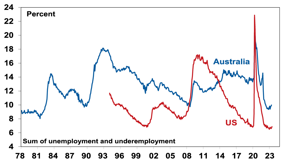
Source: Bloomberg, AMP
Chart 4 – longer term inflation expectations
The 1970s experience tells us the longer inflation stays high, the more businesses, workers and consumers expect it to stay high and then they behave in ways which perpetuate it – in terms of wage claims, price setting and tolerance for price rises. The good news is that short term (1-3 years ahead) inflation expectations have fallen sharply & longer-term inflation expectations remain in the low range they have been in for the last three decades. This is very different from 1980 when inflation expectations were around 10% and deep recession was required to get inflation back down.
US University of Michigan Consumer Inflation Expectations
Source: Macrobond, AMP
Chart 5 – earnings revisions
Consensus US and global earnings growth expectations for this year have been downgraded to around zero with a 10% rise next year and for Australia the consensus expects a 3% fall this financial year.
Earnings Revision Ratio
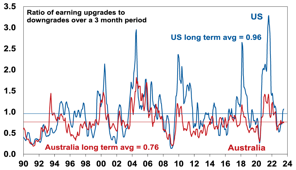
Source: Reuters, AMP
A recession resulting in an earnings slump like those seen in the early 1990s, 2001-03 in the US and 2008 would be the biggest risk but recently revisions to earnings expectations have been moving up.
Chart 6 – the gap between earnings and bond yields
Since 2020, rising bond yields have weighed on share market valuations. As a result, the gap between earnings yields and bond yields (which is a proxy for shares’ risk premium) has narrowed to its lowest since the GFC in the US and Australia. Compared to the pre-GFC period shares still look cheap relative to bonds, but this is not the case compared to the post GFC period suggesting valuations may be a bit of a constraint to share market gains as current uncertainties suggests investors may demand a risk premium over bonds similar to that seen post GFC as opposed to what was seen pre GFC. Australian share valuations look a bit more attractive than those in the US though helped by a higher earnings yield (or lower PEs). Ideally bond yields need to decline and earnings downgrades need to be limited.
Shares offering a lower risk premium over bonds
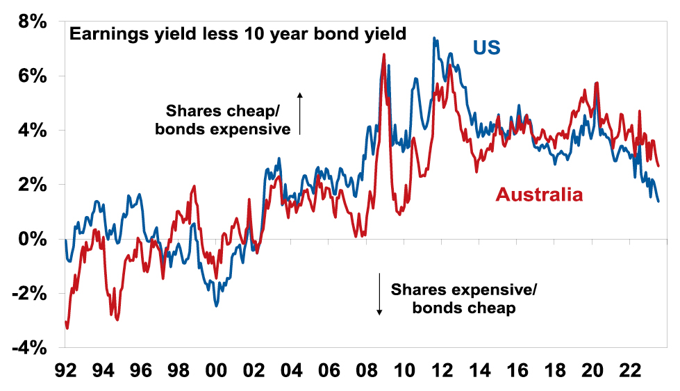
Source: Reuters, AMP
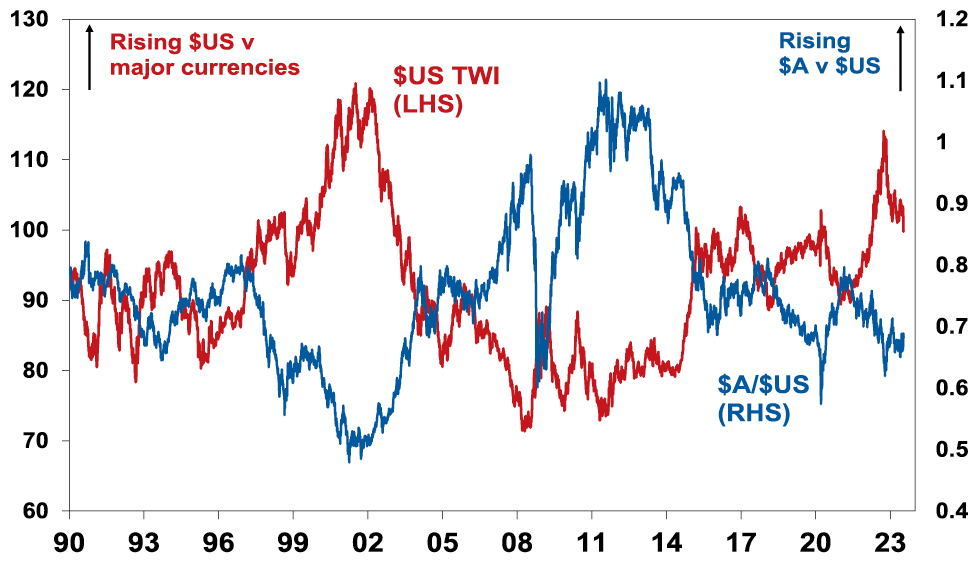
Chart 7 – the US dollar
Due to the relatively low exposure of the US economy to cyclical sectors (like manufacturing), the $US tends to be a “risk-off” currency. In other words, it goes up when there are worries about global growth and down when the outlook brightens. An increasing $US is also bad news for those with $US denominated debt in the emerging world. So, moves in it bear close watching as a key bellwether of the investment cycle. Last year the $US surged with safe haven demand in the face of worries about recession, war and aggressive Fed tightening. Since September though it has fallen back as inflation and Fed rate hike fears eased and geopolitical risks receded. And after stalling over the last six months, it’s since broken down again. A further downtrend in the $US would be a positive sign for investment markets this year, whereas a sustained new upswing would suggest they may be vulnerable. So far it’s going in the right direction.
The $US v major currencies & the $A
Source: Bloomberg, AMP
Source: AMP Capital July 2023
Important note: While every care has been taken in the preparation of this document, AMP Capital Investors Limited (ABN 59 001 777 591, AFSL 232497) and AMP Capital Funds Management Limited (ABN 15 159 557 721, AFSL 426455) make no representations or warranties as to the accuracy or completeness of any statement in it including, without limitation, any forecasts. Past performance is not a reliable indicator of future performance. This document has been prepared for the purpose of providing general information, without taking account of any particular investor’s objectives, financial situation or needs. An investor should, before making any investment decisions, consider the appropriateness of the information in this document, and seek professional advice, having regard to the investor’s objectives, financial situation and needs. This document is solely for the use of the party to whom it is provided.