Olivers Insights
Australia’s productivity challenge – why it matters and what to do about it
Dr Shane Oliver – Head of Investment Strategy and Chief Economist, AMP Capital
“Productivity isn’t everything, but, in the long run, it is almost everything”. Paul Krugman
IntroductionA hot topic in recent years in Australia amongst economists and policy makers has been the slowdown in productivity growth. This matters because as Paul Krugman points out “a country’s ability to improve
Read MoreDr Shane Oliver – Head of Investment Strategy and Chief Economist, AMP Capital
“Productivity isn’t everything, but, in the long run, it is almost everything”. Paul Krugman
Introduction
A hot topic in recent years in Australia amongst economists and policy makers has been the slowdown in productivity growth. This matters because as Paul Krugman points out “a country’s ability to improve its standard of living over time depends almost entirely on its ability to raise its output per worker.” Productivity is the key to driving real wages growth, real profit growth and asset price growth over long periods of time. It enables governments to boost service provision – in health, aged care, disability, defence etc – without raising the overall tax burden. And it can help keep inflation down. But its rate of increase has been slowing down leading to much angst about what to do about it. Despite lots of talk there hasn’t been a lot of action in addressing the problem over the last 15 years. This may be changing.

What is productivity growth
Productivity refers to the level of economic output for a given level of labour and capital inputs. Increased productivity means more is being produced for a given level of inputs. The concept of output usually referred to is Gross Domestic Product (GDP) and at its broadest inputs are both labour (hours worked) and capital (ie, buildings, structures & machinery). Dividing these inputs into the former gives “multi factor productivity”. However, its more common to see measures of labour productivity referred to – ie, GDP per hour worked – as they relate to growth in material living standards.
Productivity growth over time
The next chart shows the annual rate of labour productivity growth (ie, the change in GDP per hour worked) since the mid-1980s. It’s shown as a 10-year trailing average so we can focus on the trend. Productivity growth rose to over 2% pa through the 1990s into the 2000s, but it’s slowed to 1.2%pa over the last decade.
Slowing Australian Productivity Growth
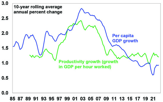
Source: ABS, AMP
Productivity growth and living standards
As can be seen in the last chart, the longer-term pattern in labour productivity growth has correlated with a similar pattern in growth in GDP per capita (or GDP per person). Roughly speaking the slowdown in productivity growth from 2.2% pa in the 1990s to 1.2% pa over the last ten years means that after a 10-year period annual GDP will be 9% (or $300bn less in today’s dollars) than would otherwise have been the case, which means much lower average material living standards compared to what otherwise could have happened. Of course, we can make up for the drag on GDP growth by growing the population faster as has been the case since the mid-2000s but this does not address the negative impact on material living standards per person. Lower productivity growth translates to lower real wages growth, slower growth in profits and a reduced ability for the government to provide services that the community expects without taking on more debt.
What’s driven the slowdown in productivity growth?
After the malaise of the 1970s which saw high inflation, high unemployment and low productivity growth, the 1980s, 1990s and early 2000s saw a range of economic reforms in Australia designed to improve productivity growth – by making the economy more flexible and competitive, improving incentives and improving skills. These were often referred to as supply side reforms. This included financial deregulation, floating the $A, labour market deregulation, product market deregulation, reduced trade barriers, competition reforms, privatisation, tax reform and an improvement in educational attainment. This, along with baby boomers reaching their peak productivity years, saw productivity growth surge through the 1990s into the 2000s. But since then, a range of factors have contributed to slower productivity growth:
-
The boost to productivity from the economic reforms of the 1980s to the early 2000s have worn off.
-
Since the introduction of the GST there has been little in the way of significant new reforms and, in some areas, backsliding – eg, labour market changes which introduced a better off overall test for new Enterprise Bargaining Agreements have a seen a decline in the Enterprise Bargaining system, which is likely to have slowed productivity growth.
-
Very strong population growth from the mid-2000s with an inadequate infrastructure and housing supply response led to urban congestion and poor housing affordability which contribute to poor productivity growth (via increased transport costs, increased speculative activity around housing diverting resources from more productive uses, households trapped with excessive debt and financial stability issues).
-
Just as the entry of the baby boomer wave into the workforce in the 1970s slowed productivity (as new workers are usually less productive) their retirement and replacement with a wave of millennials and Gen Z may drive slower productivity growth.
-
Growth in real business investment growth fell from 5% pa in the 1990s and 9.5% pa in the 2000s to just 0.6% pa in the 2010s and the last 15-20 years have seen declines in research and development investment as a share of GDP.
Slowing Growth in Australian Investment
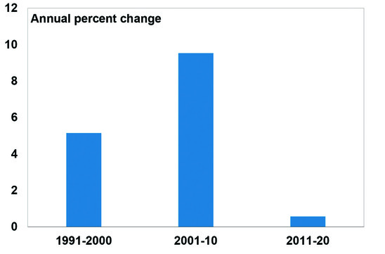
Source: ABS, AMP
-
The services sector has grown as a share of the economy and its harder to raise productivity in services industries.
-
Market concentration has increased, reducing competition.
-
Confusion regarding climate policies has likely contributed to underinvestment in power supply, driving high energy costs.
The impact of this may have been masked through the mining boom years. But given increased risks around China – geopolitical risks and medium-term threats to Chinese growth from its property downturn and increased government involvement in its economy – we cannot rely on strong Chinese demand and commodity prices boosting national income indefinitely. And mining sector strength seems to have had a less beneficial impact recently (as measured by a rising mining sector profit share of GDP but a falling wages and non-mining profit share) which may lead to increased social tensions. And now real wages are falling rapidly.
What to do about it?
There are no quick and easy fixes. Simply boosting wages growth to match or exceed current high inflation may provide a short-term feel-good factor, but as we saw in the 1970s this would just run the risk of a wage-price spiral, the end result of which would likely be higher unemployment. The key is to acknowledge the problem, explain the options to Australians and then chart a path forward to boost productivity and growth in living standards. In recent years numerous reports – notably the Productivity Commission’s 2017 productivity review – have looked at what needs to be done. Key areas for action include the following:
-
Labour market reform to relax the “better off overall test” to reboot Enterprise Bargaining.
-
Fortunately, the Government, following the Jobs Summit, is moving down this path.
-
Measures to boost workforce capability – with more skills training and reforms to raise education standards. This could involve more incentives for training by companies and a greater focus on teacher proficiency.
-
Maintain high levels of infrastructure spending to reduce urban congestion, lower transport costs and allow more Australians to relocate expensive housing in big capital cities.
-
Boost the supply of housing to more than match underlying population driven demand for several years – this is limited in the short term by building supply constraints, but longer term requires a focus on more efficient planning and approvals, making it easier for institutional involvement in the provision of social build to rent housing and decentralisation. Housing affordability and supply should be key considerations when setting immigration levels.
-
Competition reforms to reduce market concentration.
-
Better healthcare by focussing on prevention & management.
-
More incentives to boost investment and innovation – although such policies have not been overly successful in the past.
-
Reduce climate policy uncertainty – in order to encourage more energy investment. The Government is moving down this path which should boost investment in renewable energy.
-
More efforts to simplify regulations and remove redundant regulation. The tendency is for regulation to mount whenever there are problems in an industry, but this seems to replace one problem (say poor advice from some financial advisers) with another (eg, unaffordable financial advice for many).
- Remove areas of protection that remain but serve no purpose other than to raise taxation revenue.
-
Limit the size of government – disability insurance and more spending on the aged, health and defence are all generally supported by society. But it also needs to be recognised that the progression to ever high government spending as a share of GDP (as we have seen lately) can lead to lower productivity growth so a tight rein may need to be kept on other areas of government spending.
-
Tax reform – the Australian tax system has a high reliance on inefficient income taxes, a GST levied on a declining portion of the economy, distorting taxes like stamp duty and the absence of super profits tax on resources. So ideally tax reform should include: a rebalancing from direct tax to a broader GST, compensation for those adversely affected, and the removal of nuisance taxes like stamp duty. But as we have seen in recent times, tax reform is hard to get done.
Concluding comment
Australia is in far better shape than many comparable countries – public debt, while up, is relatively low; inflationary pressures are weaker here than in the US and Europe; unemployment is very low; and we are politically less polarised and more open to compromise than the US and parts of Europe. After 15 years of policy drift though, declining productivity growth is contributing to falling real wages, high inflation and rising social tensions. This will weigh on investment returns if not adequately addressed. The best way to address these issues is to build a consensus and commitment for reform. Fortunately, the new Federal Government appears to be heading down this path, albeit there is a way to go.
Source: AMP Capital September 2022
Important note: While every care has been taken in the preparation of this document, AMP Capital Investors Limited (ABN 59 001 777 591, AFSL 232497) and AMP Capital Funds Management Limited (ABN 15 159 557 721, AFSL 426455) make no representations or warranties as to the accuracy or completeness of any statement in it including, without limitation, any forecasts. Past performance is not a reliable indicator of future performance. This document has been prepared for the purpose of providing general information, without taking account of any particular investor’s objectives, financial situation or needs. An investor should, before making any investment decisions, consider the appropriateness of the information in this document, and seek professional advice, having regard to the investor’s objectives, financial situation and needs. This document is solely for the use of the party to whom it is provided.
Seven key charts for investors to keep an eye on in assessing the investment outlook
Dr Shane Oliver – Head of Investment Strategy and Chief Economist, AMP Capital
IntroductionShares remain vulnerable in the short term. They had a nice rebound from their June lows into their mid-August highs recovering just over half of their earlier decline (which was -24% for US shares and -16% for Australian shares) helped by mostly good earnings reports and hopes
Read MoreDr Shane Oliver – Head of Investment Strategy and Chief Economist, AMP Capital
Introduction
Shares remain vulnerable in the short term. They had a nice rebound from their June lows into their mid-August highs recovering just over half of their earlier decline (which was -24% for US shares and -16% for Australian shares) helped by mostly good earnings reports and hopes some central banks, including the Fed, may be getting closer to a “dovish pivot”. But as the US share market got overbought and hit resistance at its 200-day moving average, shares then became vulnerable to ongoing central bank hawkishness and recession risks and so have pulled back. While we are optimistic on a 12-month horizon, shares are at high risk of further falls and a re-test of their June lows in the short term: central banks including the RBA remain hawkish & a long way from a “dovish pivot” – as evident in recent comments by various central banks and their officials; recession risks remain high running the risk of more earnings downgrades; September has been the weakest month of the year for US and Australian shares particularly when markets are in a downtrend; and geopolitical risks remain high over Taiwan, Ukraine and the US mid-terms. This note takes a look at seven charts we see as critical for the outlook.

Chart 1 – global business conditions PMIs
US and global shares have already entered a bear market (as defined by a top to bottom fall of 20% or more). But whether that bear is deep or mild and whether Australian shares will be drawn into it, critically depends on the severity of the economic downturn. For Australian shares, severe setbacks (or “grizzly bear” markets) tend to be associated with US recession, particularly over the last 50 years, with the exception of the 1987 crash. Of course, it’s the same for the US share market. So whether global recession and in particular US recession can be avoided or if not that its mild will have a significant impact on how far share markets fall. Our assessment is that global growth will slow (to around 2% next year) – but while Europe will probably go into recession the US and global economy overall can probably avoid it. Global Purchasing Managers Indexes (PMIs) – surveys of purchasing managers at businesses – will be a key warning indicator. They have slowed but are not at levels associated with recession. For our upbeat 12-month view they need to stabilise around 45 to 50, as opposed to falling below that.
Global Composite PMI vs World GDP
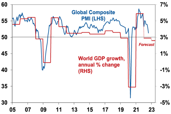
Source: Bloomberg, AMP Capital
Chart 2 – global/US inflation
A lot depends on how far central banks – and in particular the Fed – raise interest rates. For now, central banks remain hawkish. But there is some light at the end of tunnel as pipeline inflation pressures (outside of the Eurozone energy crisis) are moderating: global business surveys show improving delivery times, falling order backlogs and falling price and cost pressures; and freight rates, metal, oil and food prices are off their highs. This is consistent with an ongoing decline in our Pipeline Inflation Indicator which in turn is consistent with US inflation having peaked. The key is that our Inflation Indicator continues to fall leading a further decline in US inflation – if so, this should start to allow the Fed to slow down its tightening in the next six months and then turn dovish. Europe and Australia are about six months behind the US.
AMP Pipeline Inflation Indicator
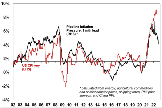
Source: Bloomberg, AMP
Chart 3 – unemployment and underemployment
Also critical in this regard is unemployment and underemployment. Both have fallen to levels in the US and Australia, suggestive of very tight labour markets and accelerating wages pressure. This is already clear in the US, with wages growth rising to around 5-6%, and starting to become evident in Australia. Stronger wages growth is desirable but if it goes too far it could run the risk of a wage price spiral which would make it harder to get inflation back down without much higher interest rates. So ideally, we need to see some cooling of jobs markets with ideally a stabilisation in unemployment. Not too hot, not too cold. This might be starting to become apparent in the US.
Labour market underutilisation rates
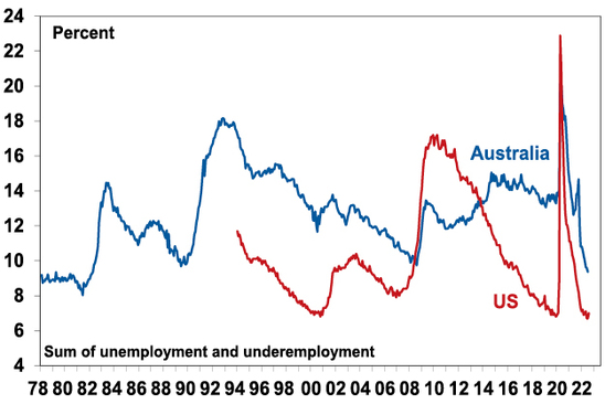
Source: Bloomberg, AMP
Chart 4 – longer term inflation expectations
The concept of inflation expectations or inflation psychology sounds rather academic but the experience of the 1970s tells us that the longer inflation stays high, the more businesses, workers and consumers expect it to stay high and then they start to behave in ways – in terms of wage demand, price setting and tolerance for price increases – which can perpetuate it (in the absence of a deep recession). Short-term (1-2 years ahead) inflation expectations are now clearly high, but the good news is that longer-term inflation expectations remain reasonably low. In the US, a long-watched survey of consumers by the University of Michigan shows that inflation expectations for five years or more ahead are around 3%. This is consistent with 2% or so inflation and suggests the job of central banks is far easier today than say in 1980 when the same measure was around 10%. The key is that it stays low.
US University of Michigan Consumer Inflation Expectations
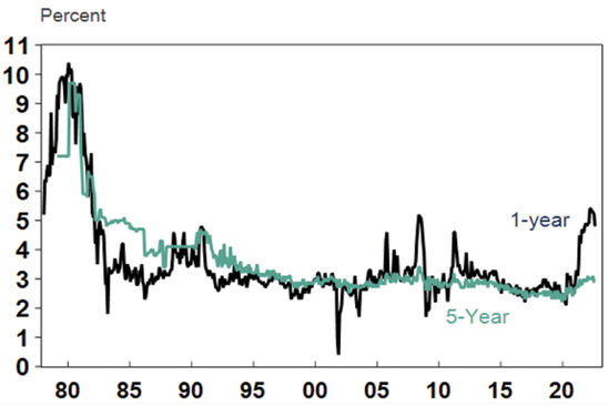
Source: Macrobond, AMP
Chart 5 – earnings revisions
Consensus earnings growth expectations for the year ahead are currently around 8% for the US and globally and around 6.5% for Australia. This marks an understandable slowdown from the last year. They have been getting revised down lately – see the next chart. They still look a bit too high though, so a further deterioration in earnings revisions is likely, but a deterioration on the scale seen in the early 1990s, 2001-03 in the US and 2008 would be bad news.
Earnings Revision Ratio
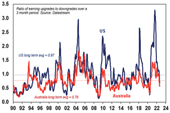
Source: Bloomberg, AMP
Chart 6 – the gap between earnings yields & bond yields
So far this year the continuing strength in company profits and a fall back in share prices has left share market valuations relative to bonds (as measured by the gap between earnings yields and bond yields – which is a proxy for shares’ risk premium) looking ok, despite the rise in bond yields. However, the gap has narrowed to its lowest since the GFC in the US. Compared to the pre-GFC period shares still look cheap. It will be key to watch bond yields (where further rises will make shares less attractive) and earnings downgrades (which would also make shares less attractive).
Shares still offer a reasonable risk premium over bonds
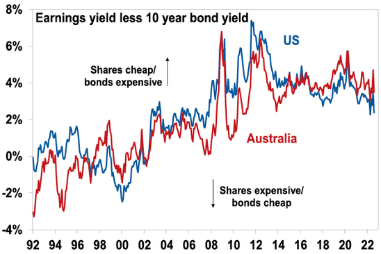
Source: Thomson Reuters, AMP
Chart 7 – the US dollar
The US dollar is a counter cyclical currency, so big moves in it are of global significance and bear close watching. Due to the relatively low exposure of the US economy to cyclical sectors like manufacturing, the $US tends to be a “risk-off” currency, ie, it goes up when there are worries about global growth and down when the outlook brightens. Over the last year the US dollar has surged with safe haven demand in the face of worries about recession and war. This has been accentuated by the Fed raising rates ahead of some other major central banks. If the global outlook starts to improve again this will likely be confirmed by a downswing in the US dollar and a rise in the $A.
The $US v major currencies & the $A
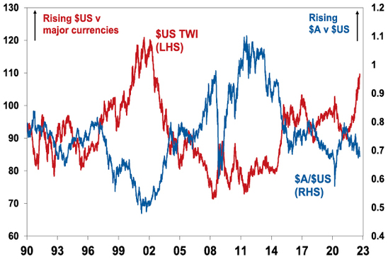
Source: Bloomberg, AMP
Source: AMP Capital September 2022
Important note: While every care has been taken in the preparation of this document, AMP Capital Investors Limited (ABN 59 001 777 591, AFSL 232497) and AMP Capital Funds Management Limited (ABN 15 159 557 721, AFSL 426455) make no representations or warranties as to the accuracy or completeness of any statement in it including, without limitation, any forecasts. Past performance is not a reliable indicator of future performance. This document has been prepared for the purpose of providing general information, without taking account of any particular investor’s objectives, financial situation or needs. An investor should, before making any investment decisions, consider the appropriateness of the information in this document, and seek professional advice, having regard to the investor’s objectives, financial situation and needs. This document is solely for the use of the party to whom it is provided.
Home price falls accelerated in August – three reasons why this property downturn will likely be different
Dr Shane Oliver – Head of Investment Strategy and Chief Economist, AMP Capital
Key pointsAustralian home prices fell another 1.6% in August and are now down by 3.5% from their high.
Rising mortgage rates are the main driver and there is likely more to go. We continue to expect a 15-20% top to bottom fall in home prices out to the
Read MoreDr Shane Oliver – Head of Investment Strategy and Chief Economist, AMP Capital
Key points
-
Australian home prices fell another 1.6% in August and are now down by 3.5% from their high.
-
Rising mortgage rates are the main driver and there is likely more to go. We continue to expect a 15-20% top to bottom fall in home prices out to the second half of next year, followed by a gradual recovery.
-
There are three reasons why this downturn will likely be deeper and the recovery slower than in past cycles: higher home price to income levels; higher debt levels; and an end to the long-term decline in interest rates.

Introduction
“This time is different” have been described as the four most dangerous words in investing by Sir John Templeton. But there is good reason to believe this Australian home price downturn cycle will be different. Most assets (cash is an obvious exception) benefited from the downtrend in inflation and hence interest rates since the 1980s and are vulnerable to its reversal. While unlisted assets like property are slower to respond than listed assets, they are not immune. And residential property particularly so, as exposure to it is highly geared. Residential property price downturns in the last 25 years have mostly been mild, with prices falling less than 10% and brief, with prices quickly rebounding to new record highs as rates fell to new lows. This cycle may be different – both in terms of being deeper and taking longer to recover – thanks to a combination of high household debt levels, high home price to income levels and an end in the long-term downtrend in interest rates.
The slide in prices continues and is now broad based
Australian dwelling prices fell another 1.6% on average in August according to CoreLogic, their fourth monthly decline in a row, and their fastest monthly decline since the early 1980s recession. After surging 28.6% between their pandemic low in September 2020 to their high in April, average property prices have now fallen 3.5%, which is comparable to the pace of decline over four months going into the 1980s & 1990s recessions and the GFC. Prices fell 2.3% in Sydney for the sixth monthly decline in a row and they are now down 7.4% from their high. Seven of the eight capitals saw declines.
The drivers of the falls are: rising mortgage rates; poor affordability; a rotation in spending from goods back to services; cost of living pressures; higher listings; & poor confidence. The property boom is well and truly over as the surge in mortgage rates is pulling the rug out from under it.
Australian dwelling price growth, to August
|
|
Aug % chg |
Annual % chg |
% chg v high |
|
Sydney |
-2.3 |
-2.5 |
-7.4 |
|
Melbourne |
-1.2 |
-2.1 |
-4.6 |
|
Brisbane |
-1.8 |
17.5 |
-2.6 |
|
Adelaide |
-0.1 |
21.8 |
-0.1 |
|
Perth |
-0.2 |
4.9 |
-0.2 |
|
Hobart |
-1.7 |
5.8 |
-3.3 |
|
Darwin |
0.9 |
6.3 |
NA |
|
Canberra |
-1.7 |
7.8 |
-2.9 |
|
Capital city avg |
-1.6 |
2.2 |
-4.2 |
|
Regional avg |
-1.5 |
13.4 |
-2.2 |
|
National avg |
-1.6 |
4.7 |
-3.5 |
Source: CoreLogic, AMP
Capital city home prices
Source: CoreLogic, AMP
The long-term historical context
The past 100 years has seen a rising trend in real home prices. But there have been three major long-term booms – in the late 1920s, the post WW2 period and since the late 1990s. In between were weak periods in the 1930s-40s and 1970s.
Aust house prices relative to their long-term trend
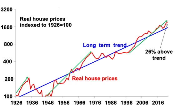
Source: ABS, AMP
The boom over the last 25 years has seen real property prices rise from about 23% below their very long-term trend to 26% above. It has been largely driven by the shift to low interest rates and a surge in population relative to housing supply.
Lower rates led to more debt and higher prices
The next chart highlights the relationship between mortgage rates and the level of home prices. It can be seen that setbacks in home prices (highlighted with arrows) have generally been preceded by periods of rising rates (or tightening lending standards in the 2017-19 pullback). But it can also be seen that the big downswing in interest rates over the last 30 years has been associated with a long-term surge in Australian home prices as, while periods of monetary tightening drove price falls, this was quickly reversed as interest rates resumed their downtrend, seeing new record highs in home prices.
Australian property prices and interest rates
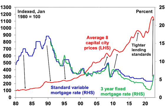
Source: RBA, CoreLogic, AMP
Put simply, the downtrend in interest rates between 1990 and 2021 enabled home buyers to borrow more & hence pay more for homes, pushing up prices. A poor dwelling supply response in the face of strong population growth since the mid-2000s enabled rapid price gains to persist. And it became self-feeding as rising home prices necessitated each new cohort of buyers to take on more debt to buy a home. The end result has been progressively higher home prices and debt relative to incomes.
The rise in household debt has gone hand in hand with higher home prices relative to incomes in Australia
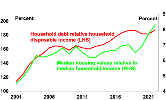
Source: ABS, RBA, CoreLogic, AMP
Looked at from a purely investment perspective, lower inflation drove lower interest rates which in turn pushed up home prices relative to rents leading to a collapse in property rental yields – just as bond yields and yields on shares fell over the last few decades into their recent lows as inflation fell. The gross rental housing yield has fallen from over 8% in the early 1980s to a recent low of around 2.2%. The next chart breaks down the contribution to rolling gross 10-year housing property returns in Australia from rents (ie, the gross rental yield) and capital growth “due to” rental growth and changes in valuations (ie, the rise in prices relative to rents). Of course, this is a rough guide only as it assumes that rents from rental property are a good guide to the underlying services owner-occupied property provides. But it indicates that the decline in rental yields since the 1980s on the back of lower inflation and interest rates has boosted house prices by around 3% pa, or around 45% of the total increase in house prices. In other words, if inflation hadn’t fallen, driving interest rates down, which in turn drove home prices up and rental yields down annual home price growth since the 1980s may have been up to 3% pa lower.
Contribution to gross residential property return – houses
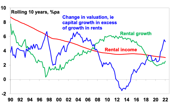
Source: REIA, AMP
Three things that make this housing cycle different
So, the three things that make this property downturn different compared to past downturns in the last 25 years are that:
-
First, home price to income ratios are now very high, which will limit their upside, unlike 30 years ago. Increased community concern about affordability may also limit upside.
-
Similarly, household debt to income ratios are now very high – with less scope for a further increase, and in recent times there has been an increasing focus from bank regulators on limiting high debt to income ratio lending.
-
Finally, the 32-year falling trend in mortgage rates from 17% in 1989 to 2% – which enabled new buyers to borrow & pay more for property and drove strong investor “search for yield” demand, is likely over. The world is now more inflation prone (with globalisation reversing, increased defence spending, decarbonisation & bigger government), so a return to a 0.1% cash rate & 2% fixed rates looks unlikely.
The long-term bull market in property prices from the 1990s was underpinned by a shift from low to high home prices to incomes, a similar shift in household debt relative to incomes and a long-term downtrend in interest rates. These are likely to have run their course. So we may now be seeing both a cyclical slump in property prices & a weakening in the long-term trend in property prices of the last 25 years or so. Together these point to a deeper fall in prices & a slower recovery through this cycle.
Expect average property prices to fall 15 to 20%
We expect national average property prices to fall further over the next 12 months as rising mortgage rates continue to impact. Increased listings in the spring selling season will likely add to pressure on prices and a surge in fixed rate loan expiries next year risks driving a sharp rise in distressed selling (as up to a quarter of home borrowers roll over into much higher mortgage rates) which will further add to downwards pressure on prices. Assuming the cash rate tops out around 2.6% early next year then average prices are likely to fall 15-20% top to bottom, of which we have so far seen 3.5%, with the low likely being reached in the second half of next year after interest rates peak and start to fall back. However, for the reasons noted above the recovery in prices is likely to be slower than seen in past cycles.
Risks
The main downside risk to our forecasts would be if the cash rate is raised to the 4% level the money market is assuming – this would more than double household interest payments and push total mortgage repayments to record highs relative to incomes & likely drive a 30% or so fall in prices. The resilience of spending to rate hikes so far (due to lags to when hikes impact) runs the risk that the RBA overtightens. There are two main upside risks. The first would be if inflation quickly subsides allowing the RBA to soon start easing. This looks unlikely. The second would be a rapid rebound in immigration exacerbating the shortage of housing evident in very tight rental markets.
Source: AMP Capital September 2022
Important note: While every care has been taken in the preparation of this document, AMP Capital Investors Limited (ABN 59 001 777 591, AFSL 232497) and AMP Capital Funds Management Limited (ABN 15 159 557 721, AFSL 426455) make no representations or warranties as to the accuracy or completeness of any statement in it including, without limitation, any forecasts. Past performance is not a reliable indicator of future performance. This document has been prepared for the purpose of providing general information, without taking account of any particular investor’s objectives, financial situation or needs. An investor should, before making any investment decisions, consider the appropriateness of the information in this document, and seek professional advice, having regard to the investor’s objectives, financial situation and needs. This document is solely for the use of the party to whom it is provided.
Booms, busts and investor psychology
Dr Shane Oliver – Head of Investment Strategy and Chief Economist, AMP Capital
IntroductionUp until the 1980s the dominant theory was that financial markets were efficient – in other words all relevant information was reflected in asset prices in a rational manner. While some think it was the Global
Read More– why investors need to be aware of the psychology of investing
Dr Shane Oliver – Head of Investment Strategy and Chief Economist, AMP Capital
Introduction
Up until the 1980s the dominant theory was that financial markets were efficient – in other words all relevant information was reflected in asset prices in a rational manner. While some think it was the Global Financial Crisis that caused faith in the so-called Efficient Markets Hypothesis (EMH) to begin unravelling, this actually occurred in the 1980s. In fact, it was the October 1987 crash that drove the nail in the coffin of the EMH as it was impossible to explain why US shares fell over 30% and Australian shares fell 50% in a two-month period when there was very little in the way of new information to justify such a move. It’s also hard to explain the 80% slump in the tech heavy Nasdaq index between 2000 and 2002 on the basis of just fundamentals. Study after study has shown share market volatility is too high to be explained by investment fundamentals alone. Something else is at play, & that is investor psychology.

Investor psychology
Several aspects of investor psychology interact in helping drive bull and bear phases in investment markets, including individual lapses of logic and crowd psychology.
Individuals are not rational
Numerous studies by psychologists have shown that – apart from me and you! – people are not always rational and tend to suffer from various lapses of logic. The most significant examples are as follows.
-
Extrapolating the present into the future – people tend to downplay uncertainty and assume recent trends, whether good or bad, will continue.
-
Giving more weight to recent spectacular or personal experiences in assessing the probability of events occurring. This results in an emotional involvement with an investment strategy – if an investor has experienced a winning investment lately he or she is likely to expect that it will remain so. Once a bubble gets underway, investors’ emotional commitment to it continuing steadily rises, thus helping to perpetuate it.
-
Overconfidence – people tend to be overconfident in their own investment abilities.
-
Too slow in adjusting expectations – people tend to be overly conservative in adjusting their expectations to new information and do so slowly over time. This partly reflects what is called “anchoring” where people latch on to the first piece of inflation they come across and regard it as the norm. This partly explains why bubbles and crashes in share markets normally unfold over long periods.
-
Selective use of information – people tend to ignore information that conflicts with their views. In other words, they make their own reality and give more weight to information that confirms their views. This again helps to perpetuate a bubble once it gets underway.
-
Wishful thinking – people tend to require less information to predict a desirable event than an undesirable one. Hence, asset price bubbles normally precede crashes.
-
Myopic loss aversion – people tend to dislike losing money more than they like gaining it. Various experiments have found that a potential gain must be twice the potential loss before an investor will consider accepting the risk. An aversion to any loss probably explains why shares traditionally are able to provide a relatively high return (or risk premium) relative to “safer” assets like cash or bonds.
The madness of crowds
As if individual irrationality is not enough, it tends to get magnified and reinforced by “crowd psychology”. Investment markets have long been considered as providing examples of crowd psychology at work. Collective behaviour in investment markets requires the presence of several things:
-
a means where behaviour can be contagious – mass communication with the proliferation of electronic media are a perfect example of this. More than ever, investors are drawing their information from the same sources, which in turn results in an ever-increasing correlation of views amongst investors, thus reinforcing trends;
-
pressure for conformity – interaction with friends, monthly performance comparisons, industry standards and benchmarking, can result in “herding” amongst investors;
-
a precipitating event or displacement that gives rise to a general belief that motivates investors. The IT revolution of the late 1990s, the growth in China in the 2000s and crypto currencies more recently are classic examples of this on the positive side. The demise of Lehman Brothers and problems with some crypto currencies/markets are examples of displacements on the negative side; and
-
a general belief which grows and spreads – eg, share prices can only go up – this helps reinforce the trend set off by the initial displacement.
Bubbles and busts
The combination of lapses of logic by individuals in making investment decisions being magnified by crowd psychology go a long way to explaining why speculative surges in asset prices develop (usually after some good news) and how they feed on themselves (as individuals project recent price gains into the future, exercise “wishful thinking” & get positive feedback via the media, their friends, etc). Of course, the whole process goes into reverse once buying is exhausted, often triggered by contrary news to that which drove the rise initially.
Investor psychology through a market cycle looks like what Russell Investments called the roller coaster of investor emotion. When times are good, investors move from optimism to excitement, and eventually euphoria as an investment’s price – be it shares, housing, gold, cryptos or whatever – moves higher and higher. So by the time the market tops out investors as group are maximum bullish and fully invested, often with no one left to buy. This ultimately sets the scene for a bit of bad news to push prices lower. As selling intensifies and prices fall further, investor emotion goes from anxiety to desperation, and eventually capitulation and depression. By the time the market bottoms out investors are maximum bearish and many are out of the market. This then sets the scene for the market to bottom as it only requires a bit of good news (or less bad news) to bring back buying, and then the cycle repeats.
The roller coaster of investor emotion though a mkt cycle
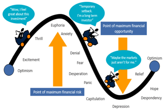
Source: Russell Investments, AMP
This pattern has been repeated time again over the years: in the early/mid 1990s with emerging markets; the late 1990s tech boom; late 2000s with the focus on credit, US housing; and arguably more recently with crypto currencies and yield plays.
Points to note
Firstly, confidence and investor psychology do not act in a vacuum. The move from depression at the bottom of a cycle to euphoria at the top is usually underpinned by fundamental developments, eg, strong economic growth and easy money.
Second, at market extremes confidence is best read in a contrarian fashion – major bull markets do not start when investors are feeling euphoric and major bear markets do not start when they are depressed. By the time investor confidence has reached these extremes, all those who wish to buy (or sell) have done so meaning it only requires a small amount of bad news (or good news) to tip investors the other way. So extreme low points in confidence are often associated with market bottoms, and vice versa for extreme highs.
Third, ideally one needs to look at what investors are thinking (sentiment) and what they are actually doing (positioning).
Finally, negative crowd sentiment at market bottoms can tend to be associated fairly quickly with market bottoms reflecting the steep declines associated with panics as a market falls. But during bull markets positive sentiment or even euphoria can tend to persist for a while as it takes investors longer to build exposures to assets than to sell them.
So where are we now in relation to shares?
The next charts shows the US share markets and a measure of US investor sentiment that includes surveys of investment newsletter writers and individual investors and the ratio of puts (options to sell shares) to calls (options to buy). It shows that extreme levels of pessimism tend to be associated with major market bottoms (indicated by the green arrows) and extreme measures of optimism tend to be associated with market tops (red arrows) although, as noted above, sentiment can be less reliable at tops.
Currently, the high levels of optimism seen last year are long gone after the plunge in shares, which left sentiment very negative and now sentiment is still negative but not extreme. If anything, this is mildly bullish from a contrarian perspective but after the rally since June it’s not a strong signal either way.
Composite Investor Sentiment vs US shares
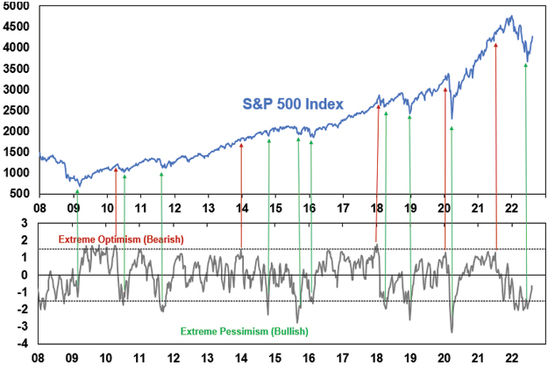
Source: Bloomberg, Sentimentrader, Investors Intelligence, AMP
What does this mean for investors?
There are several implications for investors.
-
First, recognise that investment markets are not only driven by fundamentals, but also by the often-irrational and erratic behaviour of an unstable crowd of investors. The key here is to be aware of past market booms and busts, so that when they arise in the future you understand them and do not overreact (piling into unstable bubbles near the top or selling everything during busts and locking in a loss at the bottom).
-
Second, try and recognise your own emotional responses. In other words, be aware of how you are influenced by lapses in your own logic and crowd influences like those noted above. For example, you could ask yourself: “am I highly affected by recent developments? Am I too confident in my expectations? Can I bear a paper loss?”
-
Thirdly, to guard against emotional responses choose an investment strategy which can withstand inevitable crises whilst remaining consistent with your financial objectives and risk tolerance. Then stick to this even when surging share prices tempt you into a more aggressive approach, or when plunging values suck you into a defensive approach.
-
Fourthly, if you are tempted to trade, do so on a contrarian basis. Buy when the crowd is bearish, sell when it is bullish. Extremes of bullishness often signal eventual market tops, and extremes of bearishness often signal bottoms. Successful investing requires going against the crowd at extremes. Various investor sentiment and positioning surveys can help. But also recognise contrarian investing is not fool-proof – just because the crowd looks irrationally bullish (or bearish) doesn’t mean it can’t get more so.
Source: AMP Capital August 2022
Important note: While every care has been taken in the preparation of this document, AMP Capital Investors Limited (ABN 59 001 777 591, AFSL 232497) and AMP Capital Funds Management Limited (ABN 15 159 557 721, AFSL 426455) make no representations or warranties as to the accuracy or completeness of any statement in it including, without limitation, any forecasts. Past performance is not a reliable indicator of future performance. This document has been prepared for the purpose of providing general information, without taking account of any particular investor’s objectives, financial situation or needs. An investor should, before making any investment decisions, consider the appropriateness of the information in this document, and seek professional advice, having regard to the investor’s objectives, financial situation and needs. This document is solely for the use of the party to whom it is provided.
Investment cycles – why investors need to be aware and wary of them
Dr Shane Oliver – Head of Investment Strategy and Chief Economist, AMP Capital
Like a circle in a spiral, like a wheel within a wheel, Never ending or beginning, on an ever spinning wheel. As the images unwind, like the circles that you find, In the windmills of your mind.
IntroductionCycles are part of life. Whether it be the
Read MoreDr Shane Oliver – Head of Investment Strategy and Chief Economist, AMP Capital
Like a circle in a spiral, like a wheel within a wheel, Never ending or beginning, on an ever spinning wheel. As the images unwind, like the circles that you find, In the windmills of your mind.

Introduction
Cycles are part of life. Whether it be the cycle of day and night, seasons, tides, weather cycles from the almost weekly cycles of cold fronts that regularly blow across southeast Australia to the longer La Nina and El Nino cycles, fertility cycles, birth and death, etc. And so, cycles are also endemic to economies and investment markets. Some are regular, some just rhyme. Despite attempts to end or subdue them via economic policy and regulation the cycle lives on. Usually when we declare investment cycles dead they come back to bite us. Sometimes they bring much joy to investors but they can also bring much angst. But what are they? What causes them? And why do investors need to be aware of them?
Cycles within (investment) cycles
Cycles in investment markets invariably refer to swings between good and bad returns. They usually take their lead from fundamental economic/financial developments but tend to be magnified by waves of investor optimism and pessimism. There are three cycles of particular relevance to investors.
The long term or secular cycle – share markets go through long term or secular bull and bear phases, often lasting between 10 to 20 years. This is most clearly evident in the US share market and illustrated by the following chart. It shows the cumulative real value of $100 invested in 1900. Secular bull markets – or 10-20 year periods where the trend in shares is up – can be seen in the 1920s, 1950s and 60s, the 1980s and 90s and arguably over the past decade. In between in the 1930s and 1940s, 1970s and 2000s are secular bear markets – which are long periods where shares have poor and volatile returns.
Long term bull and bear phases in US shares
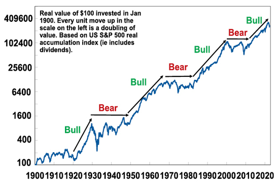
Source: Bloomberg, R.Shiller, AMP
Secular bull and bear phases are often related to what is known as Kondratiev waves, named after Russian economist Nikolai Kondratiev who identified them and received the death penalty for his conclusions as they didn’t align with Stalin’s views. Kondratiev waves take their lead from waves of technological innovation. Starting in the 1780s, water power, textiles and iron drove the first industrial revolution; steam, rail and steel drove the second industrial revolution; electricity, chemicals and the internal combustion engine drove a third Kondratiev wave into the 1920s; petro chemicals, electronics and aviation drove a fourth wave in the 1950s & 1960s; the IT revolution helped drive a fifth wave in the 1990s and another spurt more recently. These were associated with secular bull markets in the 1920s, the 1950s & 60s, the 1980s & 90s and over the last decade, although the move to ever lower interest rates & the search for yield & speculation it drove also played big roles in the last two.
At the end of each long-term upswing, share markets reached overvalued extremes and investors had become excessively exposed as optimism that good times would roll on forever reached extremes. This left shares vulnerable as excesses such as too much debt (1930s and 2000s), excessive inflation (1970s) and excessive speculation in tech shares and then housing in the late 1990s and 2000s became overwhelming, giving way to economic weakness and secular bear markets.
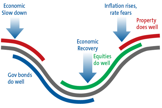
The business cycle – this is the best known economic cycle and has a duration of 3 to 5 years. It tends to relate to the standard economic cycle where after a few years of economic expansion, inflation or other imbalances build up which results in monetary tightening, which leads to a downturn or recession, then falling inflation and monetary easing, which then sets the scene for the next expansion. It tends to underpin a 3 to 5 year cycle in investment markets with the stylised link to share markets, property and government bonds shown in the next chart. Shares tend to lead the business cycle – bottoming several months before an economic trough and vice versa at the top. Property markets tend to be more coincident.
The standard 3 to 5 year investment cycle
Source: AMP
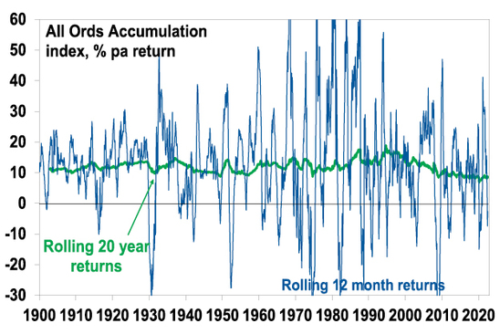
In terms of actual share market fluctuations, the 3-5 year investment cycle is evident in the swings in rolling 12 month changes in Australian share prices. Periods of poor returns are invariably followed by periods of strong returns (and vice versa) but trying to time this can be very hard. See the next chart.
Australian share returns over rolling 12 mth (& 20 yr) periods
Source: ASX, Bloomberg, AMP
Short term sentiment cycles – within the 3 to 5 year investment cycle there are also short-term swings (weekly, monthly) between overbought and oversold for things like shares and currencies driven by sentiment, but which can relate to the tendency for economic and profit data to run through hot and cold periods, particularly relative to market expectations. They often give rise to corrections in share markets.
Some observations
There are several points to note regarding investment cycles:
-
No two cycles are the same but they do have common features, usually being set off by economic or financial developments accentuated by swings in investor sentiment. As such, while history doesn’t repeat, it rhymes.
-
There are cycles within cycles. For example, even though US shares were in long-term secular bear markets in the 1970s and 2000s they still saw periodic investment cycle swings up and down in economies and share markets.
-
When several cycles combine the impact can be huge. For example, a business cycle downturn in 2000 coincided with an end to the secular boom of the 1980s & 1990s and saw 50% falls in global shares in 2000 to 2003.
-
Despite various attempts to smooth them out (via economic policies) or declare them dead, cycles live on.
-
Cycles can be self-limiting as economic downturns lead to lower inventories, pent up demand and lower interest rates, which sow the seeds of recoveries. Share slumps result in cheap shares which entice bargain hunters and sow the seeds of a new bull market.
-
Investment cycles provide opportunities for investors to vary their asset allocation through the cycle, eg, buying more shares into downturns and cutting exposure into upswings.
-
But timing investment cycles is difficult. No one rings the bell at the top or bottom. And given the natural psychological tendency of individual investors to project recent market moves into the future and find safety in what the crowd of other investors are doing, the main risk is that investors, in seeking to time investment cycles, end up wrong footed by selling after big falls & buying after big gains. So, for most investors its important to be aware of cycles and understand that they are normal, but then to take a long-term approach to investing that looks through them and makes the most of the compounding of returns over long periods.
Where are we now?
The surge in inflation and aggressive monetary tightening by major central banks have knocked us into the downturn phase of the investment cycle. Economic indicators have generally started to slow and recession is a high risk, with central banks continuing to raise interest rates. US and global shares have already seen greater than 20% falls into their lows in June (and Australian shares fell 16%) and have since recovered just over a third of their decline. It’s possible we have seen the low in shares (as they lead the economic cycle) but the risk of a resumption of the bear market is high given central banks are yet to stop raising rates and the risk of recession remains high, which would drive earnings downgrades.
The shift to higher inflation may see the US share market move into a weaker more volatile phase of its long-term investment cycle. Australian shares with their greater exposure to resources may be better placed in a longer-term context.
Other cycles of relevance
Political cycles – these are less relevant in countries with an irregular political cycle like Australia. However, the US has a precise four-year federal political cycle and this has given rise to a fairly regular pattern. This sees below average returns in the first two years after an election but well above average returns in the third year (as the President seeks to stimulate the economy to help his parties’ re-election), and to a lesser degree in the fourth year. Right now, we are in the second year which is known for sub-par returns – particularly prior to the mid-term elections. The US political cycle for share returns normally improves once the mid-terms are out of the way in November and as we move into the third year of the US presidential cycle.
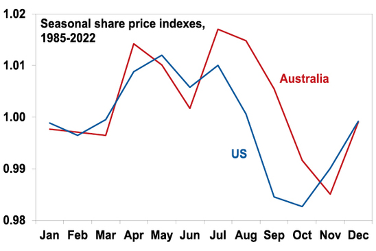
Seasonal patterns – There is also a well-known seasonal pattern in shares that sees strength from November reflecting the ending of US tax loss selling, a wind down in new equity raisings, new year cheer and the reinvestment of bonuses – continue after a brief pause around February into mid-year, before weakness from around May to October. Right now, we are in a period of seasonal weakness that runs into October.
The seasonal pattern in US and Australian shares
Source: Bloomberg, AMP
Concluding comment
Being aware of investment cycles, and how they influence ones’ investment psychology, is of critical importance for investors.
Source: AMP Capital August 2022
Important note: While every care has been taken in the preparation of this document, AMP Capital Investors Limited (ABN 59 001 777 591, AFSL 232497) and AMP Capital Funds Management Limited (ABN 15 159 557 721, AFSL 426455) make no representations or warranties as to the accuracy or completeness of any statement in it including, without limitation, any forecasts. Past performance is not a reliable indicator of future performance. This document has been prepared for the purpose of providing general information, without taking account of any particular investor’s objectives, financial situation or needs. An investor should, before making any investment decisions, consider the appropriateness of the information in this document, and seek professional advice, having regard to the investor’s objectives, financial situation and needs. This document is solely for the use of the party to whom it is provided.
Five reasons why the RBA cash rate is likely to peak (or should peak) with a 2 in front of it rather than a 3 (or more)
Dr Shane Oliver – Head of Investment Strategy and Chief Economist, AMP Capital
IntroductionAs widely expected, the RBA has increased the cash rate again by 0.5% taking it to 1.85%. This is more than double the 0.75% rate that applied before the pandemic started. The 175 basis points in rate hikes since April is the fastest back-to-back series of rate
Read MoreDr Shane Oliver – Head of Investment Strategy and Chief Economist, AMP Capital
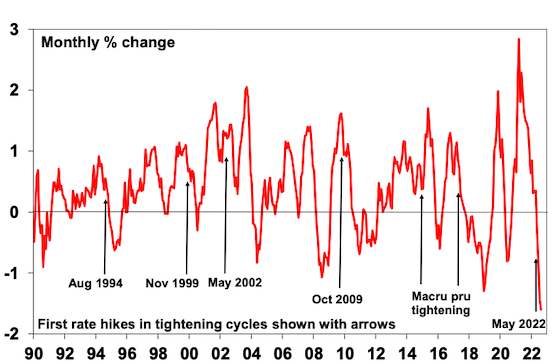
Introduction
As widely expected, the RBA has increased the cash rate again by 0.5% taking it to 1.85%. This is more than double the 0.75% rate that applied before the pandemic started. The 175 basis points in rate hikes since April is the fastest back-to-back series of rate hikes since increases of 0.25%, 0.75% and 1% in October, November and December 1994 respectively.
In justifying another 0.5% hike the RBA noted that: inflation is the highest its been since the early 1990s and set to rise further with strong demand and a tight labour market playing a role; the labour market remains tight and businesses are pointing to a lift in wages growth; and it is important that medium term inflation expectations remain “well anchored”. While the RBA downgraded its growth forecasts to 3.25% for this year and to 1.75% for the subsequent two years it revised up its inflation forecast for this year from 6% to 7.75% and to 4% in 2023.

The RBA’s rapid rate hikes reflect a desire to bring demand back into line with constrained supply and to contain inflation expectations by reinforcing its commitment to its inflation target. Containing inflation expectations is critical as the 1960s and 1970s experience tells us the longer high inflation persists the more inflation expectations will rise and get built into price and wage setting making it even harder to get inflation back down.
Australian interest rates on the rise
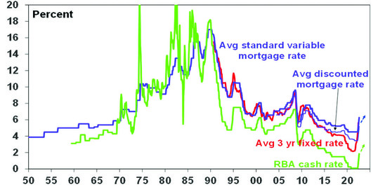
Source: RBA, Bloomberg, AMP
The RBA’s commentary remained hawkish reiterating that it will do “what is necessary” to return inflation to target and it indicated that it expects to raise interest rates further. Banks are likely to pass the RBA’s rate hike on in full to their variable rate customers and deposit rates will rise further.
Five reasons why the cash rate will likely peak with a 2 in front of it rather than a 3 or more
Getting inflation back under control is critical as a rerun of the 1970s experience of high inflation will be disastrous for Australians, the economy and investment markets. So the RBA is right to sound tough and act aggressively now. However, we remain of the view that the cash rate won’t have to go as high for the RBA to cool demand enough to take pressure off inflation and keep inflation expectations down as the futures market and some economists are expecting. The futures market has lowered its expectations for the cash rate from above 4% two months ago but it and the consensus of economists is still factoring in a rise over 3% and some economists see it rising to 3.6% next year. There are five reasons why this is too hawkish:
#1 Global supply bottlenecks are easing and this will take pressure off inflation. This is evident in various global business surveys showing reduced delivery times, falling work backlogs, lower freight costs, lower metal and grain prices, and falling input and output prices. As a result, our Pipeline Inflation Indicator for the US is trending down. Core inflation in the US is showing signs of having peaked and Australia appears to be following the US by about six months, pointing to a peak in inflation here later this year. A return to more normal weather after the floods should also help lower local food prices.
AMP Pipeline Inflation Indicator
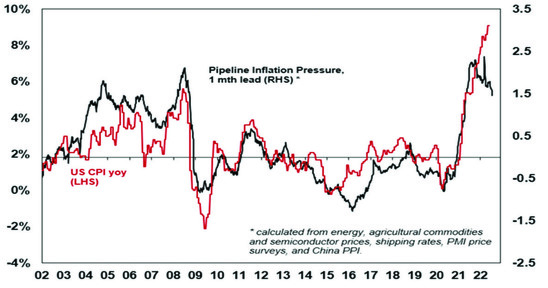
Source: Bloomberg, AMP
Related to this, while global energy prices (for oil, coal and gas) are likely to remain high, they may be at or close to their peak so their contribution to ongoing inflation may go to zero later this year. In Australia, some pressure may also come off electricity prices next year as the number of generators offline due to maintenance and breakdowns decline.
#2 Don’t read too much into what the RBA is saying. Some have interpreted the RBA’s recent comments – describing households as a whole as being in a “fairly good position” to withstand higher interest rates based on scenarios involving a 3% rise in interest rates and rates being well below estimates of “neutral” – as consistent with the cash rate likely rising above 3%. While the RBA has to sound tough to keep inflation expectations down, there is a danger in reading too much into its commentary regarding the path for interest rates. RBA commentary late last year indicating that it did not expect the cash rate to start rising before 2024 based on their then forecasts was not so reliable as it changed tack quickly once it was clear that it was wrong on inflation. It could easily do the same again.
-
The neutral rate of interest concept – which is the rate at which monetary policy is neither expansionary nor contractionary – is fine in theory but has numerous problems. We won’t know where it really is until we have gone past it. Its impacted by things like the level of debt and it was of little use in the pre-pandemic period when rates were below estimates of neutral and yet growth slowed.
-
It’s hawkish rhetoric now is designed to reinforce its seriousness about getting inflation down, but will quickly change tack once its confident its getting what it wants. Just like it’s very dovish guidance from a year ago was designed to push up inflation expectations but then span on a dime.
-
Its sanguine comments on the financial health of the household sector sound just a bit too sanguine – see below.
The RBA is just another forecasting outfit – albeit with more resources, but this does not make it any more accurate than other commentators when it comes to interest rates. It also has a role in influencing expectations that other commentators don’t have. So reading too much into its guidance can be misplaced.
#3 Medium term Australian inflation expectations remain reasonably low. See “What are inflation expectations telling us?”. This makes the RBA’s task a bit easier – albeit it has to sound tough for a while to make sure it remains the case.
#4 Many households will see significant mortgage stress with a 3% or more rise in interest rates. On average, the household sector is in reasonable shape once the rise in wealth, a build up in excess saving and mortgage buffers (people being ahead on their repayments) is allowed for. But averages can be deceiving – a bit like having one arm in the freezer and one in the oven and saying on average you are okay. While RBA analysis shows that just over one third of households with a variable rate mortgage will see no increase in their payments with a 3% rise in interest rates, more than a third of all households with a mortgage – whether variable or fixed – will see a greater than 40% increase (and much more so for those on fixed rates). Roughly speaking, this is about 1.3 million households. This, at a time of falling real wages, will have a huge impact on spending in the economy and risk a significant rise in forced property sales. Coming at a time when home prices are already falling rapidly due the impact of rising rates on home buyer demand it will only add to home price falls, which will weigh further on consumer spending.
Looked at another way – a new borrower with an average $600,000 mortgage will have seen around a $600 a month increase in their monthly repayment since April once the latest rate hike is passed through. That is roughly an extra $7000 a year. Taking the cash rate to 3.1% would imply an extra $12,300 a year since April in mortgage payments. This is a huge hit to the household budget and spending power.
The surge in house prices and hence household debt levels over the last 30 years was made possible by falling interest rates. A rise in the cash rate to 3% or more would push total mortgage repayments (ie, interest and principal) to record highs relative to household income.
#5 It looks like the RBA is getting traction in slowing demand – far earlier than normal. While job indicators are still strong these are lagging indicators. By contrast consumer confidence is at recessionary levels & well below where it’s been at this point in past RBA rate hiking cycles.
Consumer confidence
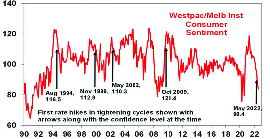
Source: Westpac/MI, AMP
Likewise, national average home prices are falling with the pace of decline accelerating in July, with the 3-month rate of decline comparable to that seen in the GFC and the recessions of the early 1980s and 1990s. This will depress consumer spending via negative wealth effects.
Capital city home prices
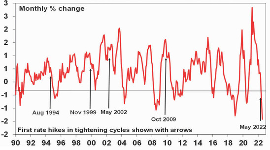
Source: Core Logic, AMP
The earlier than normal hit to confidence and house prices reflects a combination of: higher household debt levels compared to what was the case in past rate hiking cycles; the fact that this tightening cycle started with the sharp rise in fixed mortgage rates that started last year; and cost of living pressures that have seen an unprecedented plunge in real wages. There is tentative evidence that this is starting to show up in slowing consumer spending with credit and debit card transactions looking like they are slowing, hotel and restaurant bookings looking like they are rolling over and July retail sales implying now falling retail sales in real terms. So, RBA monetary tightening appears to be getting traction earlier than would normally occur in an interest rate tightening cycle. All of which will start to take pressure off demand and hence inflation.
Concluding comment
For these reasons, our assessment remains that the RBA won’t need to raise the cash rate above 3% and that the peak will be around 2.6% either later this year or early next. By late next year rates are likely to be falling. This implies a slowing in the pace of rate hikes ahead which should help head off worst case scenarios for the property market and the economy.
Source: AMP Capital August 2022
Important note: While every care has been taken in the preparation of this document, AMP Capital Investors Limited (ABN 59 001 777 591, AFSL 232497) and AMP Capital Funds Management Limited (ABN 15 159 557 721, AFSL 426455) make no representations or warranties as to the accuracy or completeness of any statement in it including, without limitation, any forecasts. Past performance is not a reliable indicator of future performance. This document has been prepared for the purpose of providing general information, without taking account of any particular investor’s objectives, financial situation or needs. An investor should, before making any investment decisions, consider the appropriateness of the information in this document, and seek professional advice, having regard to the investor’s objectives, financial situation and needs. This document is solely for the use of the party to whom it is provided.