Olivers Insights
The perils of forecasting in investing – three things for investors to consider
Dr Shane Oliver – Head of Investment Strategy and Chief Economist, AMP Capital
IntroductionThe latest client note by Howard Marks, the co-founder and co-chair of Oaktree Capital, an alternative investment manager focussing on distressed debt, on The Illusion of Knowledge about the futility of forecasting to drive investment decisions, inspired me to revisit what I had already written on this
Read MoreDr Shane Oliver – Head of Investment Strategy and Chief Economist, AMP Capital
Introduction
The latest client note by Howard Marks, the co-founder and co-chair of Oaktree Capital, an alternative investment manager focussing on distressed debt, on The Illusion of Knowledge about the futility of forecasting to drive investment decisions, inspired me to revisit what I had already written on this subject.i Particularly so given the extreme moves in economic activity, inflation and interest rates associated with the pandemic and its aftermath, along with increasing geopolitical issues, all at a time of increasing access to information, and opinion via social media, and the flow on of all this to investment markets.
I am regularly called on to provide forecasts for economic and investment variables like growth, interest rates, currencies and shares. These usually come in the form of point forecasts as to where the variable will be in, say, a year’s time or its rate of return. Such point forecasts are part & parcel of the investment industry. In fact, forecasts – from the environment to economics to politics to coronavirus – have become part of everyday life.
Economic and investment forecasts are useful as a means of communicating a view, as an input to the construction of budgets and as a base case against which to assess risks and formulate economic policy. But relying too much on precise forecasts can be dangerous. This was demonstrated through the pandemic and now with the surge in inflation globally and rise of geopolitical uncertainty, but it’s nothing new.

If forecasting was easy you wouldn’t be reading this…
…and I wouldn’t have written it! We would be very rich and sipping champagne in the south of France. My first manager drummed it into me that “forecasting is difficult because it concerns the future”. The difficulty of getting economic forecast right is reflected in the long list of jokes and quotes about economists and forecasters. Here’s some:
-
Three economists went target shooting. The first missed by a metre to the right, the second missed by a metre to the left and the third exclaimed “we got it!”.
-
Economists exist to make weather forecasters & astrologers look good. Maybe epidemiologists fall in there too now.
-
An economist is a trained professional paid to guess wrong about the economy.
-
An economist will know tomorrow why the things she or he predicted yesterday didn’t happen.
-
Economic forecasting is like driving blindfolded with instruction from a person looking out the rear window.
-
Economics is the only field in which two people can share a Nobel Prize for saying the complete opposite.
-
For every economist there exists an equal and opposite economist.
-
Economists have predicted six of the last two recessions.
-
There are two classes of forecasters: those who don’t know and those who don’t know they don’t know (J.K. Galbraith).
-
Forecasters create the mirage the future is knowable (Peter Bernstein).
-
It ain’t what you don’t know that gets you into trouble. It’s what you know for sure that just ain’t so (Mark Twain).
Hit and miss – particularly around dislocations
Surveys of economic forecasts are regularly compiled and published. It is well known that when the consensus (or average) forecast is compared to the actual outcome, it is often wide of the mark. This is particularly so when there has been a major change in direction (or dislocation) for the variable being forecast – such as around events like the tech wreck in the early 2000s, the GFC and the recent surge in inflation. So just when you rely most on forecasts can be when they get it most wrong. This applies not only to economists’ forecasts for economic variables, but also to share analysts’ forecasts for company profits and to most forecasts across most disciplines. Where precise linear relationships apply – where A = B, eg, in predicting the date and time of the next eclipse – forecasting is easy. But where relationships can be non-linear and complex as in economics, investing and in most things people like to forecast – where a slight shift in the balance can result in A = B or C or ? – forecasting is far more difficult.
And of course, the bigger the call, invariably the bigger the miss.ii There are numerous examples of gurus using grand economic, demographic or financial theories – usually resulting in forecasts of “new eras” or “great depressions” or with assessments like “too much debt will cause an implosion”, “house or share prices are too high and are guaranteed to crash” or “the Eurozone will break up” – who may get their time in the sun but who also usually spend years before, or after, losing money. For example, the gurus who foresaw a “new era” in the late 1990s – with books like Dow 36,000 – looked crazy in the early 2000’s tech wreck. And many of those who did get the tech wreck or GFC “right” were bearish for years before and would have lost their fortune if they had shorted shares when they first got bearish.
Grand prognostications of doom can be particularly alluring, and wrong. Calls that the world is about to bump into some physical limit, causing some sort of “great disruption” (famine, economic catastrophe!), have been made with amusing regularity over the last two hundred years: Thomas Malthus; Paul Ehrlich’s The Population Bomb of 1968; the Club of Rome report on The Limits to Growth in 1972; and the “peak oil” fanatics who have been telling us for decades that global oil production will soon peak and when it does the world will be plunged into chaos. Such Malthusian analyses underestimate resources, the role of price increases in driving change and human ingenuity in facilitating it. (Hopefully, worst case predictions of a “climate catastrophe” will prove wrong for similar reasons!)
And when you’re reading books like those from Harry S Dent about The Great Depression Ahead (2009), etc, all of which had disaster happening well before now, just recall there has been a long list of prognostications for a great depression, often linked to a debt-related implosion, the bulk of which turned out to be wrong. Amongst my favourites are Ravi Batra’s The Great Depression of 1990 – well, that didn’t happen so it was just delayed to The Crash of the Millennium that foresaw an inflationary depression, which didn’t happen either. Google “the coming depression” and you’ll find 370 million search results (up from 72.3 million five years ago)!
The psychology of forecasting
Forecasts need to be treated with care for several reasons:
-
Forecasters, like everyone, suffer from psychological biases: the tendency to assume the current state of the world will continue; the tendency to look mostly for confirming evidence; the tendency to only slowly adjust forecasts to new information; and excessive confidence in their ability to forecast accurately. As Warren Buffett has said “forecasters usually tell us more of the forecaster than of the future”.
-
Point forecasts – eg, that the ASX200 will be 7000 by December 31 – convey no information about risks. They are conditional upon information available when the forecast is made. As new information appears, the forecast should change. Setting an investment strategy for the year based on forecasts at the start of the year and not adjusting for new information is a great way to lose money. This is particularly a problem if you only access forecasts periodically.
-
In investment management, what counts is the relative direction of one investment alternative versus others – precisely where they end up is of less consequence in the short term.
-
The difficulty in forecasting financial variables is made harder by the need to work out what is already factored into markets. Sometimes the market sets sensible share prices based on economic developments. At other times it is unstable, swinging from euphoria to pessimism. Trying to distil that into a precise forecast is not easy.
In the quest to be right, the danger is that clinging to a forecast will end up losing money. As Ned Davis has pointed out, for investors the key is to make money, not to be right with some forecast.
So why are forecasts treated with such reverence?
First, many see the world through the rear-view mirror where everything seems clear and obvious and so assume that the future must be easy to forecast too for anyone who has expertise. Second, and more fundamentally, people hate uncertainty and will try to remove it. So, precise quantified forecasts seem to provide a degree of certainty in an otherwise uncertain world. And if we don’t have the expertise, the experts must know. And finally, prognostications of doom can be alluring as investors suffer from a behavioural trait known as “loss aversion” in that a loss in financial wealth is felt more keenly than the beneficial impact of the same sized gain. This leaves us more risk averse, and it also leaves us more predisposed to bad news stories as opposed to good. Flowing from this, prognosticators of gloom are more likely to be revered as “deep thinkers”.
What to do? Three things for investors to consider
If we simply relied on point forecasts for key investment market variables (like the share market, bond yields and the exchange rate) to set our investment strategy, I know it won’t be the best way to make money for our clients. By the same token, it’s not possible to avoid some sort of forecasting all together: investors who rely on charting are assuming that patterns in past asset price moves are a guide to the future; value investors are relying on implicit assumptions that things will mean revert over some time frame; and long-term investors in growth assets are assuming that economic progress will favour growth assets over the long term as they have historically. All of which, despite claims to the contrary, are some form of forecasting. So, what should one do? In my opinion, there are three things to consider in the light of issues raised in this note.
First, minimise the reliance on expert forecasts – particularly point forecasts and grand prognostications – when undertaking investment decisions. While point forecasts can help communicate a view, the real value in investment experts – the good ones at least – is to provide a better understanding of the issues around investing, a better understanding of what’s going on now and to put things in context so as to help avoid silly investment mistakes. While financial history does not repeat, it does rhyme and so in many cases we have seen a variant of what may be currently concerning the market before. This is particularly important in being able to turn down the noise and focus on a long-term investment strategy to meet your investment goals.
Second, invest for the long term. In the 1970s, Charles Ellis, a US investment professional, observed that for most of us investing is a loser’s game. A loser’s game is where bad play by the loser determines the victor. Amateur tennis is an example where the trick is to avoid stupid mistakes and win by not losing. The best way for most investors to avoid losing at investments is to invest for the long term. Get a long-term plan that suits your level of wealth, age, tolerance of volatility, etc, & stick to it.
Finally, if you are going to actively manage your investments, make sure you have a disciplined process. Ideally, this should rely on a wide range of indicators, such as: valuation measures (ie, whether markets are expensive or cheap); indicators that relate to where we are in the economic and profit cycle; measures of liquidity (or some guide to the flow of funds available to invest); measures of market sentiment (the crowd is often wrong); and technical readings based on historic price patterns. The key to having a disciplined process is to stick to it and let the “weight of indicators” filter the information that swirls around investment markets, so you are not distracted by the day-to-day soap opera engulfing them. Forecasting should not be central to your process. My preference is to focus on key themes as opposed to precise point forecasts.
Conclusion
It is tempting to believe that you or someone else can perfectly forecast the market. Getting markets right is hard enough and even then, there are plenty of investors who have been “right” on some market call but lost a bundle by executing too early or hanging on to it for too long. The key is to know where expert views can be of use, be humble and stick to a long-term investment strategy designed to attain your goals and, if you are going to actively manage your investments, have a disciplined process.
i See “Making money versus being right in the loser’s game”, Oliver’s Insights, September 2006 and “The Perils of forecasting and the need for a disciplined investment process”, Oliver’s Insights, May 2017.
ii Future Babble by Dan Gardner, Plume, 2011 is an excellent and entertaining read on the issues around forecasting.
Source: AMP Capital October 2022
Important note: While every care has been taken in the preparation of this document, AMP Capital Investors Limited (ABN 59 001 777 591, AFSL 232497) and AMP Capital Funds Management Limited (ABN 15 159 557 721, AFSL 426455) make no representations or warranties as to the accuracy or completeness of any statement in it including, without limitation, any forecasts. Past performance is not a reliable indicator of future performance. This document has been prepared for the purpose of providing general information, without taking account of any particular investor’s objectives, financial situation or needs. An investor should, before making any investment decisions, consider the appropriateness of the information in this document, and seek professional advice, having regard to the investor’s objectives, financial situation and needs. This document is solely for the use of the party to whom it is provided.
The RBA hikes rates by 0.25%
Dr Shane Oliver – Head of Investment Strategy and Chief Economist, AMP Capital
IntroductionThe RBA has increased its cash rate again but slowed the pace to 0.25% which took the cash rate to 2.6%. This was in line with our view and a slowing
Read MoreHere are five reasons why the RBA was right to slowdown and the top is near
Dr Shane Oliver – Head of Investment Strategy and Chief Economist, AMP Capital
Introduction
The RBA has increased its cash rate again but slowed the pace to 0.25% which took the cash rate to 2.6%. This was in line with our view and a slowing “at some point” had been flagged by the RBA. In justifying another hike, the RBA noted inflation is still too high and expected to rise further due to global factors and strong demand and that it’s important that medium term inflation expectations remain “well anchored”. But the 250 basis points in rate hikes over six months is still the fastest series of hikes since 1994, so it made sense to slow the pace down “as it assesses the outlook for inflation and growth”.

RBA hike cycles compared
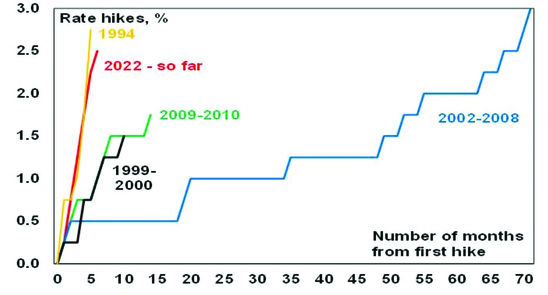
Source: RBA, AMP
Of course the slowdown in rate hikes to a “business as usual” 0.25% move does not mean the RBA has finished hiking as it repeated that it will do “what is necessary” to get inflation to target and it still expects to raise rates further. Banks are likely to pass the hike on in full to variable rate customers which will take mortgage rates to their highest in ten years.
Australian interest rates on the rise
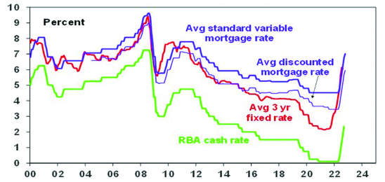
Source: RBA, Bloomberg, AMP
Five reasons why the RBA was right to slowdown and expectations for a 4% plus cash rate are too hawkish
Getting inflation back under control is critical as a rerun of the 1970s experience of high inflation will be disastrous. So the RBA has been right to sound tough and act aggressively. However, after the most aggressive run of rate hikes since 1994, the RBA was right to slow down the pace of hikes to better assess their impact and avoid overtightening. Here are five reasons why the RBA is likely to remain in the slow lane in the months ahead and why the cash rate won’t have to go as high as the 4% plus the money market has been factoring in.
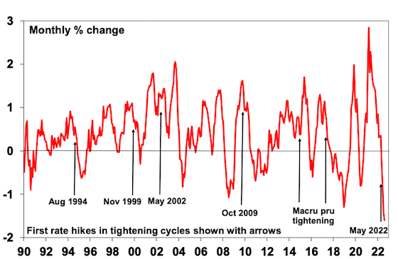
#1 Monetary policy impacts the economy with a lag.
This is because it takes 2-3 months for RBA rate hikes to impact actual variable rate mortgage payments and then several months before this impacts spending. There are then flow on effects to jobs and business investment with feedback impacts on household which can take up to a year. And this lag may have been lengthened by the rise in fixed rate lending around 2020-21 that saw it rise from 15% of total mortgages to around 40%. The lag was clearly evident in the late 1980s and early 1990s – see the next chart.
RBA rate hikes & unemployment in the late 1980s/early 1900s
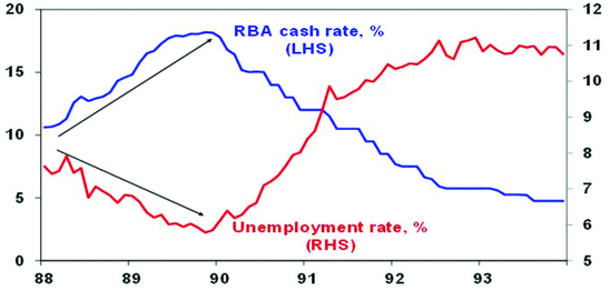
Source: ABS, AMP
Unemployment kept falling through 1988 and 1989 – to 5.8% which was considered low at the time after it rose above 10% in the early 1980s – as the RBA progressively hiked rates to 18%. But by then it was too late as the impact of past rate hikes hit the economy hard in 1990 and it went into deep recession, with the RBA then having to rapidly reverse course as unemployment surged. Of course, things were different back then with very low debt & very high inflation expectations resulting in much higher interest rates than are needed today – but the lags are still relevant. To avoid overtightening as in 1989, the key is to slow down the pace of hikes to allow time for the lags to work – and this is what the RBA now appears to be.
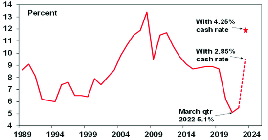
#2 Many households will see significant mortgage stress, which will hit spending from later this year. The 2.75% in RBA rate hikes have already blown through the 2.5% interest rate serviceability buffer that applied up until last October and are close to bursting through the 3% buffer applying since then. While RBA analysis shows that just over one third of households with a variable rate mortgage will see no increase in their payments with a 3% rise in interest rates as they were already paying more than they need to they will still be worse off because they will be paying down their debt more slowly. But it also shows that more than a third of households with a mortgage will see a greater than 40% increase payments. This is about 1.3 million households and would cover those most likely to have to cut back their spending, ie new home owners often with a young family.
Looked at another way, a variable rate borrower on an existing $500,000 mortgage will see about $75 added to their monthly payment from today’s RBA hike which will take the total increase in monthly payments since April to $740 a month. That’s nearly $9,000 a year which is already a massive hit to household spending power. And there is roughly a quarter of mortgaged households with fixed rates who will see a three-fold increase in their payments when their fixed term expires over the next two years – many of whom are next year.
The surge in house prices, household debt levels and debt principal repayments as a share of household income to record levels over the last 30 years was made possible by falling interest rates to record lows which took household interest payments down to levels not seen over the past 45 years or so as a share of household income. A rise in the cash rate to 4% or more would push total mortgage repayments (ie, interest and principal) to record highs relative to household income.
Household interest payments relative to disposable income
Source: ABS, RBA, AMP
The combination of a household debt to income ratio nearly double US levels and greater sensitivity to interest rate changes (with 60% of mortgages on variable rates and 40% on short dated fixed rates compared to US borrowers on 30-year fixed rates) means that the household sector in Australia is far more vulnerable to interest rate changes than US households. This means that the RBA can afford to be less hawkish than the Fed.
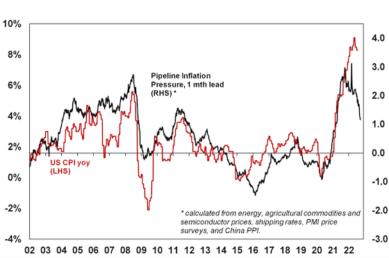
#3 Global inflationary pressures are continuing to ease. This is evident in global business surveys showing reduced delivery times and falling work backlogs, lower freight costs, lower metal and grain prices, and falling input and output prices.
As a result, our Pipeline Inflation Indicator is well down from its highs. Consistent with this US money supply which surged ahead of the US inflation spike is falling. Combined this points to downwards pressure on US inflation, which looks to have peaked. Australia appears to be following the US by about six months, pointing to a peak in inflation here later this year.
AMP Pipeline Inflation Indicator
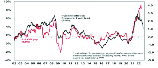
Source: Bloomberg, AMP
Related to this, medium-term inflation expectations remain reasonably low suggesting that the task of central bankers should be a lot easier than in the 1970s and 1980s.
#4 Inflation pressures are less in Australia than elsewhere with inflation now around 7%yoy compared to over 8% in the US and 10% in Europe and wages growth about half US levels. So there is no need to match other central banks rate hikes.
#5 Rising global recession risk. The 23% plunge in global share markets, falling commodity prices, central banks including the Fed willing to risk recession, the Fed’s record of tightening cycles ending in a crisis (next chart), the rising skittishness of financial markets, the deteriorating global growth outlook and domestically very low consumer confidence and rapidly weakening housing indicators warn of much weaker conditions ahead which will hit jobs & drive weaker inflation. Aggressively tightening into all this without pausing for breath risks knocking the Australian economy into a recession we don’t have to have.
Fed tightening cycles usually end in a circle
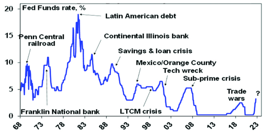
Source: Bloomberg, AMP
Concluding comment
Given the need to assess the lagged impact of rate hikes and the rising risk of recession globally the RBA was right to break from the hawkish global central bank consensus and slow down the pace of hikes. We see another 0.25% rate hike next month taking the cash rate to 2.85% which we still expect will be the peak in the cash rate, albeit the risk is on the upside to 3.1%. We still see rates falling late next year.
Source: AMP Capital October 2022
Important note: While every care has been taken in the preparation of this document, AMP Capital Investors Limited (ABN 59 001 777 591, AFSL 232497) and AMP Capital Funds Management Limited (ABN 15 159 557 721, AFSL 426455) make no representations or warranties as to the accuracy or completeness of any statement in it including, without limitation, any forecasts. Past performance is not a reliable indicator of future performance. This document has been prepared for the purpose of providing general information, without taking account of any particular investor’s objectives, financial situation or needs. An investor should, before making any investment decisions, consider the appropriateness of the information in this document, and seek professional advice, having regard to the investor’s objectives, financial situation and needs. This document is solely for the use of the party to whom it is provided.
Shares sliding again – what’s driving it and is there any light at the end of the tunnel?
Dr Shane Oliver – Head of Investment Strategy and Chief Economist, AMP Capital
IntroductionInvestors could be forgiven for looking back on the pandemic years of 2020 and 2021 with fond memories – because after the initial shock in February-March 2020 it was a period of strong returns and relative calm in investment markets. This year has been anything but. After
Read MoreDr Shane Oliver – Head of Investment Strategy and Chief Economist, AMP Capital
Introduction
Investors could be forgiven for looking back on the pandemic years of 2020 and 2021 with fond memories – because after the initial shock in February-March 2020 it was a period of strong returns and relative calm in investment markets. This year has been anything but. After falling sharply into mid-June (at which point US shares had fallen 24% from their highs, global shares 21% and Australian shares 16%), share markets rallied into mid-August reversing half of their declines on the back of hopes the Fed would pivot towards an easier monetary stance and hopefully avoid a recession. Since mid-August though shares have fallen again and are now back to around their June lows.

Share markets back down
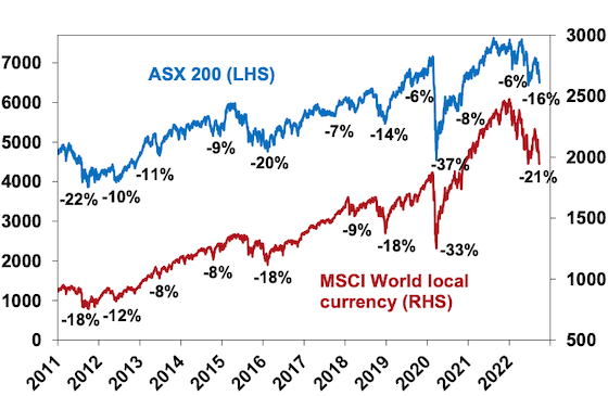
Source: Strategas, AMP
And, bond yields have pushed up again with US, UK, German 10-year yields rising to levels not seen in a decade.
What’s driving the renewed weakness
The plunge in shares back to their June lows mostly reflects the same concerns that drove the falls into June:
-
Inflation remains high or is still rising depending on the country. For example, US headline inflation is still 8.3%yoy and core inflation at 6.3%yoy in August is still under pressure from rising services inflation. Headline inflation is 8.9% in the UK, 9.1% in Europe, 9.9% in the UK and an estimated 7.2% in Australia.
-
Global central banks have become more hawkish noting that permanently high inflation will lead to lower living standards and the longer inflation stays high the greater the risk that inflation expectations move higher, making it harder to get down. As a result, they are committed to getting it back to target and have been flagging more rate hikes (eg with the dot plot of Fed interest rate forecasts around 1% higher than 3 months ago – next chart) and an implied tolerance for a recession in order to get it under control.
-
Increasingly hawkish central banks are bad for shares in the short term for two reasons. First higher interest rates and make shares less attractive from a valuation perspective. Second, a recession would weigh on company profits. Recession is now almost certain in Europe and about a 50% probability in the US. In Australia the probability of recession is now around 40% (if as we expect the cash rate peaks around 3%, but if it rises to 4.3% as predicted by the money market then recession is probable here). Historically deep bear markets in US and Australian shares have tended to be associated with a US recession.
Australian equity bear markets and US recessions
Source: ASX, Bloomberg, AMP
-
Fears of an escalation of the Ukraine war – after Russia’s troop mobilisation, “referenda” to incorporate occupied areas into Russia and a threat to use nuclear weapons. Ongoing tensions with China and the approaching November US mid-term elections are not helping.
-
A large fiscal stimulus in the UK has caused a surge in UK bond yields & plunge in the pound adding to fears of a crisis. While the new Government’s tax cuts and deregulation may have supply side merit the benefits of this tend to take years to become apparent and in the meantime the risk is that it adds to inflation and fears about runaway debt.
-
We are in a weak period of the year seasonally for shares – with September being the weakest month of the year on average for shares and October known for volatility. This can be magnified when the trend in shares is down.
-
As seen in the first half the year, tech stocks and particularly crypto currencies remain the biggest losers of monetary tightening, after being the biggest winners of easy money.
Shares are oversold and on technical support at their June lows so could bounce from here. But the risks are skewed to the downside in the short term. While investor confidence is very negative, we have yet to see the sort of spike in put/call option ratios or VIX that normally signals major market bottoms. The RBA is fortunately starting to sound a bit more balanced and aware of the way monetary policy impacts with a lag, but the danger is that the Fed and central banks have become locked into supersized hikes based on backward looking inflation and jobs data, and a loss of confidence in their ability to forecast inflation at a time when they should be giving more attention to monetary policy lags. This increases the risk of overtightening driving a deep recession with earnings downgrades driving another leg down in share prices (after the first leg down which was driven by rising bond yields). A decisive break below the June low for the US share market could open up another 10% leg down with a similar flow through to Australian shares.
It’s not all doom and gloom
However, there is some light at the end of the tunnel on a 12-month view:
-
Central banks determination to stop high inflation becoming entrenched is good news from a longer-term perspective as the 1970s experience tells us that the alternative would be bad for economies, jobs and investment markets.
-
Producer price inflation looks to have peaked in the US, UK, China and Japan.
-
This is consistent with our Pipeline Inflation Indicator which is continuing to trend down given falling price and cost components in business surveys, falling freight rates and lower commodity prices (outside of gas and coal).
AMP Pipeline Inflation Indicator
Source: Bloomberg, AMP
-
Some of the key components that initially drove higher inflation in the US are starting to slow with weakening growth in new market rents (which with a lag drives about 33% of the US CPI) and softening used car prices.
-
Consumer inflation expectations have fallen in the US and Australia, helped by aggressive central bank moves and falling petrol prices. US 5 year plus inflation expectations have fallen back to 2.8% which is well below the near 10% level seen in 1980. This should make it easier for central banks to get inflation back down without having to take interest rates to exorbitant levels.
-
Money supply growth has slowed from its 2020 surge, and this is likely to contribute to lower inflation ahead.
-
Post US mid-term election returns tend to be strong, just as mid-term election year drawbacks tend to be more severe – with an average top to bottom fall of 17% in US shares in mid-term election years followed by an average 33% gain one year from the low.
US mid-term election year share market drawdowns
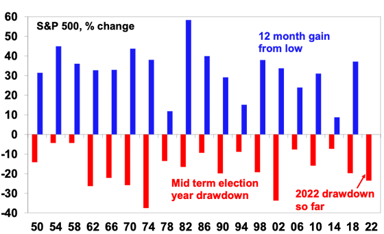
Source: Strategas, Bloomberg, AMP
The bottom line is that while short-term inflation remains high, these considerations are consistent with the US having reached peak inflation and point to lower inflation ahead which should enable central banks to slow the pace of hiking by year end, in time to avoid a severe recession. If this applies in the US, then Australia should follow as its lagging the US by about six months with respect to inflation. (Although we expect the RBA to slow the pace of rate hikes well ahead of the US – given the greater sensitivity of the Australian household sector to higher rates than in the US and lower inflation pressures in Australia.) For this reason, while short term risks around shares remain high, we remain optimistic on shares on a 12-month horizon.
Key things for investors to bear in mind
Sharp share market falls are stressful for investors as no one likes to see their investments fall in value. And try as one may, it’s never easy to accurately predict economies and shares. So, at times like these it’s important to focus on basic investment principles. In particular, these things are worth keeping in mind:
-
share market pullbacks are healthy and normal – their volatility is the price we pay for the higher returns they provide over the long term;
-
it’s very hard to time market moves so the key is to stick to an appropriate long-term investment strategy;
-
selling shares after a fall locks in a loss;
-
share pullbacks provide opportunities for investors to buy them more cheaply;
-
shares invariably bottom with maximum bearishness;
-
Australian shares still offer an attractive income (or cash) flow relative to bank deposits; and
-
to avoid getting thrown off a long-term strategy – it’s best to turn down the noise around all the negative news flow.
Source: AMP Capital September 2022
Important note: While every care has been taken in the preparation of this document, AMP Capital Investors Limited (ABN 59 001 777 591, AFSL 232497) and AMP Capital Funds Management Limited (ABN 15 159 557 721, AFSL 426455) make no representations or warranties as to the accuracy or completeness of any statement in it including, without limitation, any forecasts. Past performance is not a reliable indicator of future performance. This document has been prepared for the purpose of providing general information, without taking account of any particular investor’s objectives, financial situation or needs. An investor should, before making any investment decisions, consider the appropriateness of the information in this document, and seek professional advice, having regard to the investor’s objectives, financial situation and needs. This document is solely for the use of the party to whom it is provided.
Australia’s productivity challenge – why it matters and what to do about it
Dr Shane Oliver – Head of Investment Strategy and Chief Economist, AMP Capital
“Productivity isn’t everything, but, in the long run, it is almost everything”. Paul Krugman
IntroductionA hot topic in recent years in Australia amongst economists and policy makers has been the slowdown in productivity growth. This matters because as Paul Krugman points out “a country’s ability to improve
Read MoreDr Shane Oliver – Head of Investment Strategy and Chief Economist, AMP Capital
“Productivity isn’t everything, but, in the long run, it is almost everything”. Paul Krugman
Introduction
A hot topic in recent years in Australia amongst economists and policy makers has been the slowdown in productivity growth. This matters because as Paul Krugman points out “a country’s ability to improve its standard of living over time depends almost entirely on its ability to raise its output per worker.” Productivity is the key to driving real wages growth, real profit growth and asset price growth over long periods of time. It enables governments to boost service provision – in health, aged care, disability, defence etc – without raising the overall tax burden. And it can help keep inflation down. But its rate of increase has been slowing down leading to much angst about what to do about it. Despite lots of talk there hasn’t been a lot of action in addressing the problem over the last 15 years. This may be changing.

What is productivity growth
Productivity refers to the level of economic output for a given level of labour and capital inputs. Increased productivity means more is being produced for a given level of inputs. The concept of output usually referred to is Gross Domestic Product (GDP) and at its broadest inputs are both labour (hours worked) and capital (ie, buildings, structures & machinery). Dividing these inputs into the former gives “multi factor productivity”. However, its more common to see measures of labour productivity referred to – ie, GDP per hour worked – as they relate to growth in material living standards.
Productivity growth over time
The next chart shows the annual rate of labour productivity growth (ie, the change in GDP per hour worked) since the mid-1980s. It’s shown as a 10-year trailing average so we can focus on the trend. Productivity growth rose to over 2% pa through the 1990s into the 2000s, but it’s slowed to 1.2%pa over the last decade.
Slowing Australian Productivity Growth
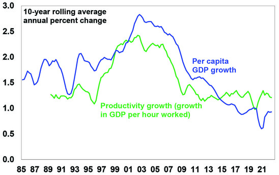
Source: ABS, AMP
Productivity growth and living standards
As can be seen in the last chart, the longer-term pattern in labour productivity growth has correlated with a similar pattern in growth in GDP per capita (or GDP per person). Roughly speaking the slowdown in productivity growth from 2.2% pa in the 1990s to 1.2% pa over the last ten years means that after a 10-year period annual GDP will be 9% (or $300bn less in today’s dollars) than would otherwise have been the case, which means much lower average material living standards compared to what otherwise could have happened. Of course, we can make up for the drag on GDP growth by growing the population faster as has been the case since the mid-2000s but this does not address the negative impact on material living standards per person. Lower productivity growth translates to lower real wages growth, slower growth in profits and a reduced ability for the government to provide services that the community expects without taking on more debt.
What’s driven the slowdown in productivity growth?
After the malaise of the 1970s which saw high inflation, high unemployment and low productivity growth, the 1980s, 1990s and early 2000s saw a range of economic reforms in Australia designed to improve productivity growth – by making the economy more flexible and competitive, improving incentives and improving skills. These were often referred to as supply side reforms. This included financial deregulation, floating the $A, labour market deregulation, product market deregulation, reduced trade barriers, competition reforms, privatisation, tax reform and an improvement in educational attainment. This, along with baby boomers reaching their peak productivity years, saw productivity growth surge through the 1990s into the 2000s. But since then, a range of factors have contributed to slower productivity growth:
-
The boost to productivity from the economic reforms of the 1980s to the early 2000s have worn off.
-
Since the introduction of the GST there has been little in the way of significant new reforms and, in some areas, backsliding – eg, labour market changes which introduced a better off overall test for new Enterprise Bargaining Agreements have a seen a decline in the Enterprise Bargaining system, which is likely to have slowed productivity growth.
-
Very strong population growth from the mid-2000s with an inadequate infrastructure and housing supply response led to urban congestion and poor housing affordability which contribute to poor productivity growth (via increased transport costs, increased speculative activity around housing diverting resources from more productive uses, households trapped with excessive debt and financial stability issues).
-
Just as the entry of the baby boomer wave into the workforce in the 1970s slowed productivity (as new workers are usually less productive) their retirement and replacement with a wave of millennials and Gen Z may drive slower productivity growth.
-
Growth in real business investment growth fell from 5% pa in the 1990s and 9.5% pa in the 2000s to just 0.6% pa in the 2010s and the last 15-20 years have seen declines in research and development investment as a share of GDP.
Slowing Growth in Australian Investment
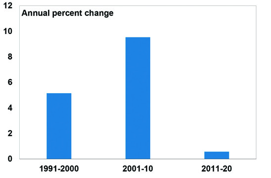
Source: ABS, AMP
-
The services sector has grown as a share of the economy and its harder to raise productivity in services industries.
-
Market concentration has increased, reducing competition.
-
Confusion regarding climate policies has likely contributed to underinvestment in power supply, driving high energy costs.
The impact of this may have been masked through the mining boom years. But given increased risks around China – geopolitical risks and medium-term threats to Chinese growth from its property downturn and increased government involvement in its economy – we cannot rely on strong Chinese demand and commodity prices boosting national income indefinitely. And mining sector strength seems to have had a less beneficial impact recently (as measured by a rising mining sector profit share of GDP but a falling wages and non-mining profit share) which may lead to increased social tensions. And now real wages are falling rapidly.
What to do about it?
There are no quick and easy fixes. Simply boosting wages growth to match or exceed current high inflation may provide a short-term feel-good factor, but as we saw in the 1970s this would just run the risk of a wage-price spiral, the end result of which would likely be higher unemployment. The key is to acknowledge the problem, explain the options to Australians and then chart a path forward to boost productivity and growth in living standards. In recent years numerous reports – notably the Productivity Commission’s 2017 productivity review – have looked at what needs to be done. Key areas for action include the following:
-
Labour market reform to relax the “better off overall test” to reboot Enterprise Bargaining.
-
Fortunately, the Government, following the Jobs Summit, is moving down this path.
-
Measures to boost workforce capability – with more skills training and reforms to raise education standards. This could involve more incentives for training by companies and a greater focus on teacher proficiency.
-
Maintain high levels of infrastructure spending to reduce urban congestion, lower transport costs and allow more Australians to relocate expensive housing in big capital cities.
-
Boost the supply of housing to more than match underlying population driven demand for several years – this is limited in the short term by building supply constraints, but longer term requires a focus on more efficient planning and approvals, making it easier for institutional involvement in the provision of social build to rent housing and decentralisation. Housing affordability and supply should be key considerations when setting immigration levels.
-
Competition reforms to reduce market concentration.
-
Better healthcare by focussing on prevention & management.
-
More incentives to boost investment and innovation – although such policies have not been overly successful in the past.
-
Reduce climate policy uncertainty – in order to encourage more energy investment. The Government is moving down this path which should boost investment in renewable energy.
-
More efforts to simplify regulations and remove redundant regulation. The tendency is for regulation to mount whenever there are problems in an industry, but this seems to replace one problem (say poor advice from some financial advisers) with another (eg, unaffordable financial advice for many).
- Remove areas of protection that remain but serve no purpose other than to raise taxation revenue.
-
Limit the size of government – disability insurance and more spending on the aged, health and defence are all generally supported by society. But it also needs to be recognised that the progression to ever high government spending as a share of GDP (as we have seen lately) can lead to lower productivity growth so a tight rein may need to be kept on other areas of government spending.
-
Tax reform – the Australian tax system has a high reliance on inefficient income taxes, a GST levied on a declining portion of the economy, distorting taxes like stamp duty and the absence of super profits tax on resources. So ideally tax reform should include: a rebalancing from direct tax to a broader GST, compensation for those adversely affected, and the removal of nuisance taxes like stamp duty. But as we have seen in recent times, tax reform is hard to get done.
Concluding comment
Australia is in far better shape than many comparable countries – public debt, while up, is relatively low; inflationary pressures are weaker here than in the US and Europe; unemployment is very low; and we are politically less polarised and more open to compromise than the US and parts of Europe. After 15 years of policy drift though, declining productivity growth is contributing to falling real wages, high inflation and rising social tensions. This will weigh on investment returns if not adequately addressed. The best way to address these issues is to build a consensus and commitment for reform. Fortunately, the new Federal Government appears to be heading down this path, albeit there is a way to go.
Source: AMP Capital September 2022
Important note: While every care has been taken in the preparation of this document, AMP Capital Investors Limited (ABN 59 001 777 591, AFSL 232497) and AMP Capital Funds Management Limited (ABN 15 159 557 721, AFSL 426455) make no representations or warranties as to the accuracy or completeness of any statement in it including, without limitation, any forecasts. Past performance is not a reliable indicator of future performance. This document has been prepared for the purpose of providing general information, without taking account of any particular investor’s objectives, financial situation or needs. An investor should, before making any investment decisions, consider the appropriateness of the information in this document, and seek professional advice, having regard to the investor’s objectives, financial situation and needs. This document is solely for the use of the party to whom it is provided.
Seven key charts for investors to keep an eye on in assessing the investment outlook
Dr Shane Oliver – Head of Investment Strategy and Chief Economist, AMP Capital
IntroductionShares remain vulnerable in the short term. They had a nice rebound from their June lows into their mid-August highs recovering just over half of their earlier decline (which was -24% for US shares and -16% for Australian shares) helped by mostly good earnings reports and hopes
Read MoreDr Shane Oliver – Head of Investment Strategy and Chief Economist, AMP Capital
Introduction
Shares remain vulnerable in the short term. They had a nice rebound from their June lows into their mid-August highs recovering just over half of their earlier decline (which was -24% for US shares and -16% for Australian shares) helped by mostly good earnings reports and hopes some central banks, including the Fed, may be getting closer to a “dovish pivot”. But as the US share market got overbought and hit resistance at its 200-day moving average, shares then became vulnerable to ongoing central bank hawkishness and recession risks and so have pulled back. While we are optimistic on a 12-month horizon, shares are at high risk of further falls and a re-test of their June lows in the short term: central banks including the RBA remain hawkish & a long way from a “dovish pivot” – as evident in recent comments by various central banks and their officials; recession risks remain high running the risk of more earnings downgrades; September has been the weakest month of the year for US and Australian shares particularly when markets are in a downtrend; and geopolitical risks remain high over Taiwan, Ukraine and the US mid-terms. This note takes a look at seven charts we see as critical for the outlook.

Chart 1 – global business conditions PMIs
US and global shares have already entered a bear market (as defined by a top to bottom fall of 20% or more). But whether that bear is deep or mild and whether Australian shares will be drawn into it, critically depends on the severity of the economic downturn. For Australian shares, severe setbacks (or “grizzly bear” markets) tend to be associated with US recession, particularly over the last 50 years, with the exception of the 1987 crash. Of course, it’s the same for the US share market. So whether global recession and in particular US recession can be avoided or if not that its mild will have a significant impact on how far share markets fall. Our assessment is that global growth will slow (to around 2% next year) – but while Europe will probably go into recession the US and global economy overall can probably avoid it. Global Purchasing Managers Indexes (PMIs) – surveys of purchasing managers at businesses – will be a key warning indicator. They have slowed but are not at levels associated with recession. For our upbeat 12-month view they need to stabilise around 45 to 50, as opposed to falling below that.
Global Composite PMI vs World GDP
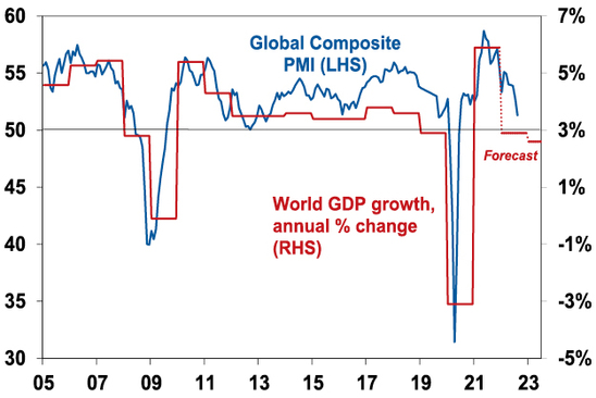
Source: Bloomberg, AMP Capital
Chart 2 – global/US inflation
A lot depends on how far central banks – and in particular the Fed – raise interest rates. For now, central banks remain hawkish. But there is some light at the end of tunnel as pipeline inflation pressures (outside of the Eurozone energy crisis) are moderating: global business surveys show improving delivery times, falling order backlogs and falling price and cost pressures; and freight rates, metal, oil and food prices are off their highs. This is consistent with an ongoing decline in our Pipeline Inflation Indicator which in turn is consistent with US inflation having peaked. The key is that our Inflation Indicator continues to fall leading a further decline in US inflation – if so, this should start to allow the Fed to slow down its tightening in the next six months and then turn dovish. Europe and Australia are about six months behind the US.
AMP Pipeline Inflation Indicator
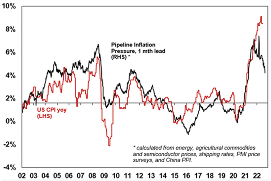
Source: Bloomberg, AMP
Chart 3 – unemployment and underemployment
Also critical in this regard is unemployment and underemployment. Both have fallen to levels in the US and Australia, suggestive of very tight labour markets and accelerating wages pressure. This is already clear in the US, with wages growth rising to around 5-6%, and starting to become evident in Australia. Stronger wages growth is desirable but if it goes too far it could run the risk of a wage price spiral which would make it harder to get inflation back down without much higher interest rates. So ideally, we need to see some cooling of jobs markets with ideally a stabilisation in unemployment. Not too hot, not too cold. This might be starting to become apparent in the US.
Labour market underutilisation rates
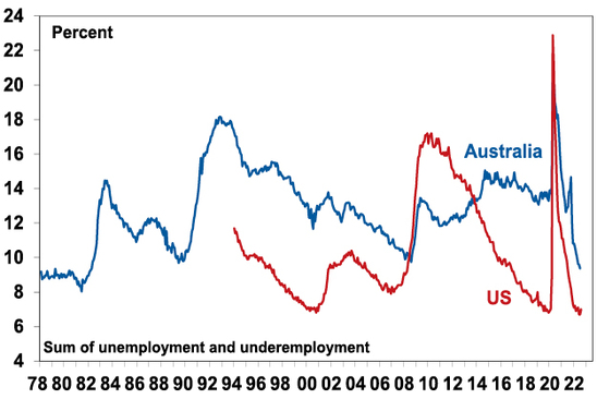
Source: Bloomberg, AMP
Chart 4 – longer term inflation expectations
The concept of inflation expectations or inflation psychology sounds rather academic but the experience of the 1970s tells us that the longer inflation stays high, the more businesses, workers and consumers expect it to stay high and then they start to behave in ways – in terms of wage demand, price setting and tolerance for price increases – which can perpetuate it (in the absence of a deep recession). Short-term (1-2 years ahead) inflation expectations are now clearly high, but the good news is that longer-term inflation expectations remain reasonably low. In the US, a long-watched survey of consumers by the University of Michigan shows that inflation expectations for five years or more ahead are around 3%. This is consistent with 2% or so inflation and suggests the job of central banks is far easier today than say in 1980 when the same measure was around 10%. The key is that it stays low.
US University of Michigan Consumer Inflation Expectations
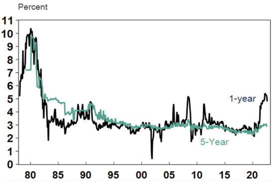
Source: Macrobond, AMP
Chart 5 – earnings revisions
Consensus earnings growth expectations for the year ahead are currently around 8% for the US and globally and around 6.5% for Australia. This marks an understandable slowdown from the last year. They have been getting revised down lately – see the next chart. They still look a bit too high though, so a further deterioration in earnings revisions is likely, but a deterioration on the scale seen in the early 1990s, 2001-03 in the US and 2008 would be bad news.
Earnings Revision Ratio
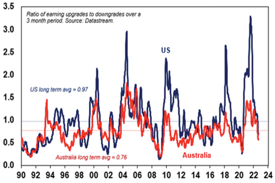
Source: Bloomberg, AMP
Chart 6 – the gap between earnings yields & bond yields
So far this year the continuing strength in company profits and a fall back in share prices has left share market valuations relative to bonds (as measured by the gap between earnings yields and bond yields – which is a proxy for shares’ risk premium) looking ok, despite the rise in bond yields. However, the gap has narrowed to its lowest since the GFC in the US. Compared to the pre-GFC period shares still look cheap. It will be key to watch bond yields (where further rises will make shares less attractive) and earnings downgrades (which would also make shares less attractive).
Shares still offer a reasonable risk premium over bonds
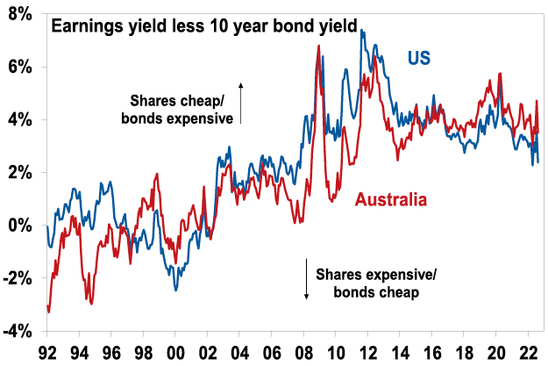
Source: Thomson Reuters, AMP
Chart 7 – the US dollar
The US dollar is a counter cyclical currency, so big moves in it are of global significance and bear close watching. Due to the relatively low exposure of the US economy to cyclical sectors like manufacturing, the $US tends to be a “risk-off” currency, ie, it goes up when there are worries about global growth and down when the outlook brightens. Over the last year the US dollar has surged with safe haven demand in the face of worries about recession and war. This has been accentuated by the Fed raising rates ahead of some other major central banks. If the global outlook starts to improve again this will likely be confirmed by a downswing in the US dollar and a rise in the $A.
The $US v major currencies & the $A
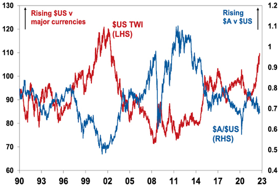
Source: Bloomberg, AMP
Source: AMP Capital September 2022
Important note: While every care has been taken in the preparation of this document, AMP Capital Investors Limited (ABN 59 001 777 591, AFSL 232497) and AMP Capital Funds Management Limited (ABN 15 159 557 721, AFSL 426455) make no representations or warranties as to the accuracy or completeness of any statement in it including, without limitation, any forecasts. Past performance is not a reliable indicator of future performance. This document has been prepared for the purpose of providing general information, without taking account of any particular investor’s objectives, financial situation or needs. An investor should, before making any investment decisions, consider the appropriateness of the information in this document, and seek professional advice, having regard to the investor’s objectives, financial situation and needs. This document is solely for the use of the party to whom it is provided.
Home price falls accelerated in August – three reasons why this property downturn will likely be different
Dr Shane Oliver – Head of Investment Strategy and Chief Economist, AMP Capital
Key pointsAustralian home prices fell another 1.6% in August and are now down by 3.5% from their high.
Rising mortgage rates are the main driver and there is likely more to go. We continue to expect a 15-20% top to bottom fall in home prices out to the
Read MoreDr Shane Oliver – Head of Investment Strategy and Chief Economist, AMP Capital
Key points
-
Australian home prices fell another 1.6% in August and are now down by 3.5% from their high.
-
Rising mortgage rates are the main driver and there is likely more to go. We continue to expect a 15-20% top to bottom fall in home prices out to the second half of next year, followed by a gradual recovery.
-
There are three reasons why this downturn will likely be deeper and the recovery slower than in past cycles: higher home price to income levels; higher debt levels; and an end to the long-term decline in interest rates.

Introduction
“This time is different” have been described as the four most dangerous words in investing by Sir John Templeton. But there is good reason to believe this Australian home price downturn cycle will be different. Most assets (cash is an obvious exception) benefited from the downtrend in inflation and hence interest rates since the 1980s and are vulnerable to its reversal. While unlisted assets like property are slower to respond than listed assets, they are not immune. And residential property particularly so, as exposure to it is highly geared. Residential property price downturns in the last 25 years have mostly been mild, with prices falling less than 10% and brief, with prices quickly rebounding to new record highs as rates fell to new lows. This cycle may be different – both in terms of being deeper and taking longer to recover – thanks to a combination of high household debt levels, high home price to income levels and an end in the long-term downtrend in interest rates.
The slide in prices continues and is now broad based
Australian dwelling prices fell another 1.6% on average in August according to CoreLogic, their fourth monthly decline in a row, and their fastest monthly decline since the early 1980s recession. After surging 28.6% between their pandemic low in September 2020 to their high in April, average property prices have now fallen 3.5%, which is comparable to the pace of decline over four months going into the 1980s & 1990s recessions and the GFC. Prices fell 2.3% in Sydney for the sixth monthly decline in a row and they are now down 7.4% from their high. Seven of the eight capitals saw declines.
The drivers of the falls are: rising mortgage rates; poor affordability; a rotation in spending from goods back to services; cost of living pressures; higher listings; & poor confidence. The property boom is well and truly over as the surge in mortgage rates is pulling the rug out from under it.
Australian dwelling price growth, to August
|
|
Aug % chg |
Annual % chg |
% chg v high |
|
Sydney |
-2.3 |
-2.5 |
-7.4 |
|
Melbourne |
-1.2 |
-2.1 |
-4.6 |
|
Brisbane |
-1.8 |
17.5 |
-2.6 |
|
Adelaide |
-0.1 |
21.8 |
-0.1 |
|
Perth |
-0.2 |
4.9 |
-0.2 |
|
Hobart |
-1.7 |
5.8 |
-3.3 |
|
Darwin |
0.9 |
6.3 |
NA |
|
Canberra |
-1.7 |
7.8 |
-2.9 |
|
Capital city avg |
-1.6 |
2.2 |
-4.2 |
|
Regional avg |
-1.5 |
13.4 |
-2.2 |
|
National avg |
-1.6 |
4.7 |
-3.5 |
Source: CoreLogic, AMP
Capital city home prices
Source: CoreLogic, AMP
The long-term historical context
The past 100 years has seen a rising trend in real home prices. But there have been three major long-term booms – in the late 1920s, the post WW2 period and since the late 1990s. In between were weak periods in the 1930s-40s and 1970s.
Aust house prices relative to their long-term trend
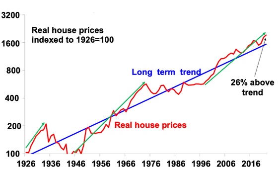
Source: ABS, AMP
The boom over the last 25 years has seen real property prices rise from about 23% below their very long-term trend to 26% above. It has been largely driven by the shift to low interest rates and a surge in population relative to housing supply.
Lower rates led to more debt and higher prices
The next chart highlights the relationship between mortgage rates and the level of home prices. It can be seen that setbacks in home prices (highlighted with arrows) have generally been preceded by periods of rising rates (or tightening lending standards in the 2017-19 pullback). But it can also be seen that the big downswing in interest rates over the last 30 years has been associated with a long-term surge in Australian home prices as, while periods of monetary tightening drove price falls, this was quickly reversed as interest rates resumed their downtrend, seeing new record highs in home prices.
Australian property prices and interest rates
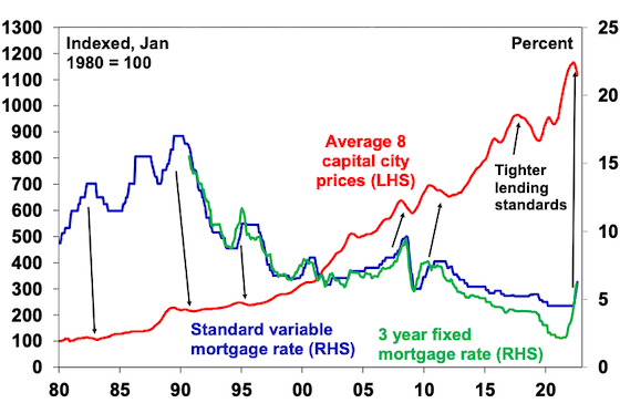
Source: RBA, CoreLogic, AMP
Put simply, the downtrend in interest rates between 1990 and 2021 enabled home buyers to borrow more & hence pay more for homes, pushing up prices. A poor dwelling supply response in the face of strong population growth since the mid-2000s enabled rapid price gains to persist. And it became self-feeding as rising home prices necessitated each new cohort of buyers to take on more debt to buy a home. The end result has been progressively higher home prices and debt relative to incomes.
The rise in household debt has gone hand in hand with higher home prices relative to incomes in Australia
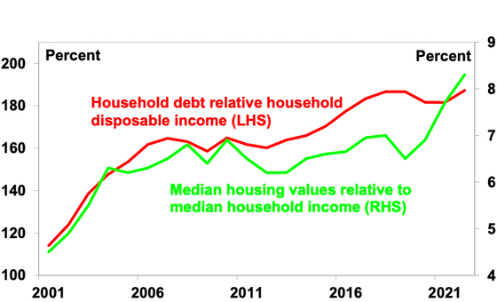
Source: ABS, RBA, CoreLogic, AMP
Looked at from a purely investment perspective, lower inflation drove lower interest rates which in turn pushed up home prices relative to rents leading to a collapse in property rental yields – just as bond yields and yields on shares fell over the last few decades into their recent lows as inflation fell. The gross rental housing yield has fallen from over 8% in the early 1980s to a recent low of around 2.2%. The next chart breaks down the contribution to rolling gross 10-year housing property returns in Australia from rents (ie, the gross rental yield) and capital growth “due to” rental growth and changes in valuations (ie, the rise in prices relative to rents). Of course, this is a rough guide only as it assumes that rents from rental property are a good guide to the underlying services owner-occupied property provides. But it indicates that the decline in rental yields since the 1980s on the back of lower inflation and interest rates has boosted house prices by around 3% pa, or around 45% of the total increase in house prices. In other words, if inflation hadn’t fallen, driving interest rates down, which in turn drove home prices up and rental yields down annual home price growth since the 1980s may have been up to 3% pa lower.
Contribution to gross residential property return – houses
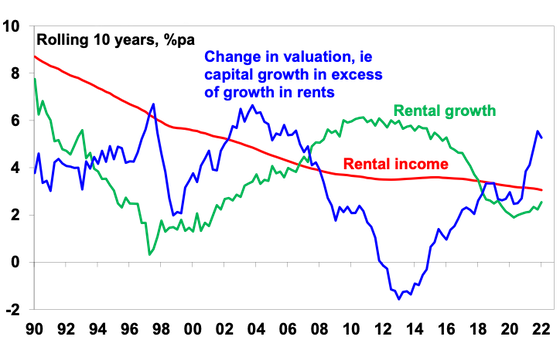
Source: REIA, AMP
Three things that make this housing cycle different
So, the three things that make this property downturn different compared to past downturns in the last 25 years are that:
-
First, home price to income ratios are now very high, which will limit their upside, unlike 30 years ago. Increased community concern about affordability may also limit upside.
-
Similarly, household debt to income ratios are now very high – with less scope for a further increase, and in recent times there has been an increasing focus from bank regulators on limiting high debt to income ratio lending.
-
Finally, the 32-year falling trend in mortgage rates from 17% in 1989 to 2% – which enabled new buyers to borrow & pay more for property and drove strong investor “search for yield” demand, is likely over. The world is now more inflation prone (with globalisation reversing, increased defence spending, decarbonisation & bigger government), so a return to a 0.1% cash rate & 2% fixed rates looks unlikely.
The long-term bull market in property prices from the 1990s was underpinned by a shift from low to high home prices to incomes, a similar shift in household debt relative to incomes and a long-term downtrend in interest rates. These are likely to have run their course. So we may now be seeing both a cyclical slump in property prices & a weakening in the long-term trend in property prices of the last 25 years or so. Together these point to a deeper fall in prices & a slower recovery through this cycle.
Expect average property prices to fall 15 to 20%
We expect national average property prices to fall further over the next 12 months as rising mortgage rates continue to impact. Increased listings in the spring selling season will likely add to pressure on prices and a surge in fixed rate loan expiries next year risks driving a sharp rise in distressed selling (as up to a quarter of home borrowers roll over into much higher mortgage rates) which will further add to downwards pressure on prices. Assuming the cash rate tops out around 2.6% early next year then average prices are likely to fall 15-20% top to bottom, of which we have so far seen 3.5%, with the low likely being reached in the second half of next year after interest rates peak and start to fall back. However, for the reasons noted above the recovery in prices is likely to be slower than seen in past cycles.
Risks
The main downside risk to our forecasts would be if the cash rate is raised to the 4% level the money market is assuming – this would more than double household interest payments and push total mortgage repayments to record highs relative to incomes & likely drive a 30% or so fall in prices. The resilience of spending to rate hikes so far (due to lags to when hikes impact) runs the risk that the RBA overtightens. There are two main upside risks. The first would be if inflation quickly subsides allowing the RBA to soon start easing. This looks unlikely. The second would be a rapid rebound in immigration exacerbating the shortage of housing evident in very tight rental markets.
Source: AMP Capital September 2022
Important note: While every care has been taken in the preparation of this document, AMP Capital Investors Limited (ABN 59 001 777 591, AFSL 232497) and AMP Capital Funds Management Limited (ABN 15 159 557 721, AFSL 426455) make no representations or warranties as to the accuracy or completeness of any statement in it including, without limitation, any forecasts. Past performance is not a reliable indicator of future performance. This document has been prepared for the purpose of providing general information, without taking account of any particular investor’s objectives, financial situation or needs. An investor should, before making any investment decisions, consider the appropriateness of the information in this document, and seek professional advice, having regard to the investor’s objectives, financial situation and needs. This document is solely for the use of the party to whom it is provided.