Provision Newsletter
Have Australian home prices bottomed? Probably not.
Dr Shane Oliver – Head of Investment Strategy and Chief Economist, AMP Capital
IntroductionFrom their high in April to their low last month national average home prices have fallen 9.1% making it their biggest fall in CoreLogic records going back to 1980. Capital city average prices were down 9.7% which is their second biggest fall, after the 10.2% fall in 2017-19.
Read MoreDr Shane Oliver – Head of Investment Strategy and Chief Economist, AMP Capital

Introduction
From their high in April to their low last month national average home prices have fallen 9.1% making it their biggest fall in CoreLogic records going back to 1980. Capital city average prices were down 9.7% which is their second biggest fall, after the 10.2% fall in 2017-19. However, average price falls had slowed to a crawl and CoreLogic data shows that this has morphed into price gains across several cities so far in March with Sydney prices tracking up 1.1% at a monthly rate and five capital city average prices tracking up 0.6%. See the next chart. If home prices have bottomed this would leave them short of our expectation for a 15-20% top to bottom fall. So are property prices doing it again? – falling less than expected and then rising more than expected. This note looks at the positives and negatives for the residential property market outlook.
Average capital city home prices
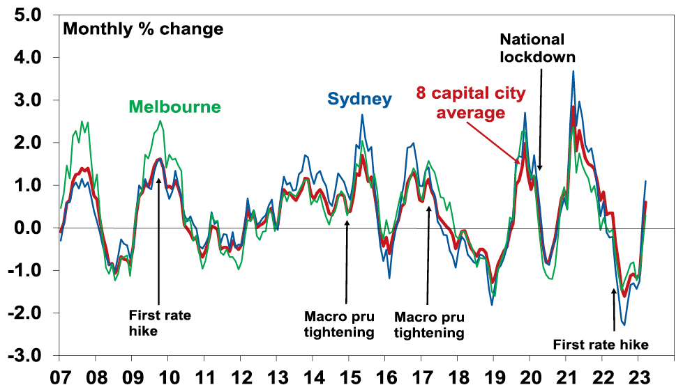
Source: CoreLogic, AMP
The positives for the property market
Here are the main positives for the property market.
-
RBA analysis shows a decline in household average household size since the start of 2020 of around 1%, which it estimates has added around 120,000 households to underlying dwelling demand partly offsetting the negative impact on demand from the hit to immigration through the pandemic lockdown.
Average Household Size*
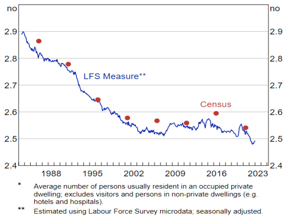
Source: RBA Bulletin, March 2023, based on ABS data
-
Immigrants are returning boosting underlying demand for housing. Net immigration was around 320,000 last year up from just 5940 in lockdown impacted 2021. This roughly equates to demand for an extra 125,000 dwellings. Its likely to remain strong this year. This is seeing a rise in the cumulative undersupply of housing again.
Home construction versus population growth
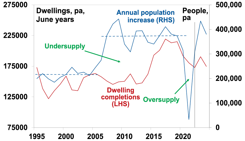
Source: ABS, AMP
-
Partly reflecting this, capital city rental vacancy rates below 1% are driving a surge in rents. This should be positive for investor demand.
Falling vacancy rates, rising rents
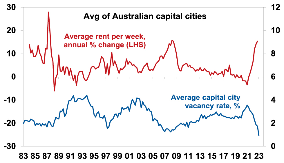
Source: REIA, Domain, AMP
-
The record plunge in home prices and high inflation have pushed real home prices from well above their long term trend to back in line. This may have attracted bargain hunters back into the market given the past experience of price falls being quickly followed by rebounds.
-
Allowing first home buyers to opt for land tax in NSW and other government support programs will be boosting demand.
-
Listings are very low, running around 25-30% down on a year ago.
-
Our assessment is that we are at or close to the top on interest rates and the problems in global banks add support to this assessment.
-
Auction clearance rates have improved from their lows, and they usually have a directional correlation with home prices.
Auction clearance rates
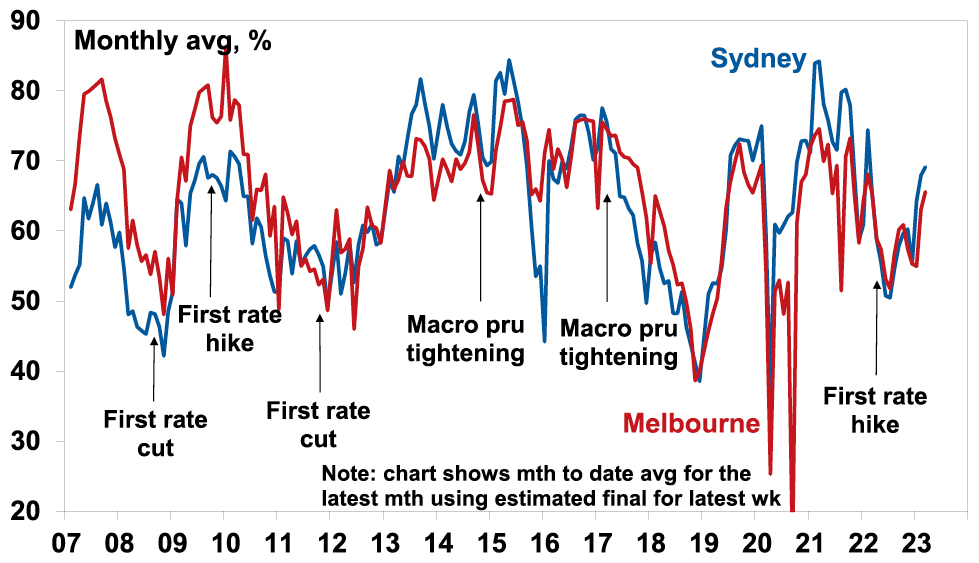
Source: Domain, AMP
So maybe the combination of bargain hunters motivated by the historical record that shows prices rebounding quickly, low listings, backed by expectations for strong demand as immigrants return are driving a recovery in prices. More fundamentally, the ongoing supply short fall provides some sort of floor under prices.
The negatives for the property market
However, the headwinds facing the property market are significant:
-
The full impact of variable rate hikes has yet to be fully felt as it takes 2-3 months for RBA hikes to show up in actual mortgage payments;
-
Roughly 880,000 fixed rate loans will expire this year which will see mortgage rates reset from around 2% to around 5 or 6%. RBA analysis indicates that while fixed rate borrowers may have similar liquid assets to variable rate borrowers they have higher risk characteristics;
-
While we think rates are at or close to peaking numerous economists still see the cash rate rising above 4%;
-
Household debt servicing payments as a share of income have already risen to their highest in more than a decade resulting in a large squeeze on household cashflows but will rise further given the lagged flow through of variable rates and the fixed rate reset. A rise in the cash rate to 4.1% would see them pushed to record levels. This will remove roughly 5% of household cashflow in relation to income.
Household principal and interest payments relative to disposable income
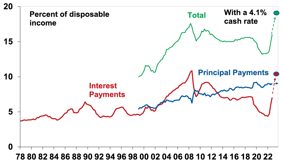
Source: ABS, BIS, AMP
-
Australian economic conditions will deteriorate this year as weaker global growth impacts demand for our exports, rate hikes bear down on domestic demand as pent up demand from the pandemic is exhausted & this all combines to push up unemployment. Higher unemployment will likely add to mortgage stress.
-
The hit to home buying capacity from rate hikes – of around 27% for a buyer with a 20% deposit and average full-time earnings – remains even if rates have stopped rising. See the next chart.
Australian Average Home Prices
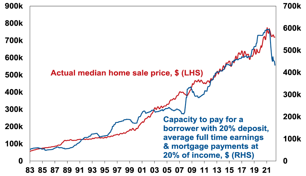
Source: RBA, CoreLogic, AMP
-
Property down cycles into 2009, 2012 and 2019 only saw prices sustainably bottom once interest rates started falling. See the purple ovals in the next chart. And rate cuts are still a way off yet.
Australian property prices and interest rates
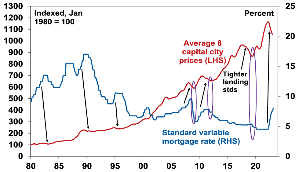
Source: CoreLogic, RBA, AMP
The combination will likely constrain demand and cause a potential increase in supply as some financially stressed homeowners sell.
Our base case
Our base case remains that the current bounce in home prices will be short lived as demand from bargain hunters runs its course, the impact of higher interest rates reasserts itself and listings increase in response to distressed selling. So we continue to see average home prices having a top to bottom fall of 15-20% to later this year of which we are half way through, and we don’t see a sustained recovery until next year.
While Australia’s fundamental housing shortage is now reasserting itself again – with rising underlying demand on the back of returning immigration and insufficient supply as evident in very low rental vacancy rates – it was the shift to ever lower interest rates over many years into the pandemic that allowed the supply shortfall to drive ever higher home price to income ratios over the last few decades. Now higher interest rates make this more difficult suggesting that the supply shortfall should take place at lower price to income ratios.
However, the current environment is very hard to read, so there is a chance that prices have bottomed, particularly if rates have peaked and if the Australian economy has a soft landing. But even if this is the case, in the absence of much lower interest rates the recovery is likely to be constrained as buyer capacity to pay for homes will be constrained.
Source: AMP Capital March 2023
Important note: While every care has been taken in the preparation of this document, AMP Capital Investors Limited (ABN 59 001 777 591, AFSL 232497) and AMP Capital Funds Management Limited (ABN 15 159 557 721, AFSL 426455) make no representations or warranties as to the accuracy or completeness of any statement in it including, without limitation, any forecasts. Past performance is not a reliable indicator of future performance. This document has been prepared for the purpose of providing general information, without taking account of any particular investor’s objectives, financial situation or needs. An investor should, before making any investment decisions, consider the appropriateness of the information in this document, and seek professional advice, having regard to the investor’s objectives, financial situation and needs. This document is solely for the use of the party to whom it is provided.
Shares hit another bout of turbulence – US banks, inflation, interest rates and recession risk
Dr Shane Oliver – Head of Investment Strategy and Chief Economist, AMP Capital
IntroductionShares have hit turbulence again with worries about inflation, interest rates, recession and, now, problems in US banks. After rallying strongly at the start of the year the US share market has reversed much of its year to date gain leaving it down
Read More– what it means for investors?
Dr Shane Oliver – Head of Investment Strategy and Chief Economist, AMP Capital
Introduction
Shares have hit turbulence again with worries about inflation, interest rates, recession and, now, problems in US banks. After rallying strongly at the start of the year the US share market has reversed much of its year to date gain leaving it down 20% from its January high last year and at risk of a retest of its October lows when it was down 25%. Non-US shares are holding up better with Eurozone shares down by 7% & Australian shares also down 9% from their record highs but are vulnerable to moves in US shares. This note looks at the key worries and what it means for investors.

Are we going to see systemic problems in US banks?
Three regional US lenders have collapsed or closed in recent days. Silicon Valley Bank, which had a deposit base from tech (and some crypto) companies and customers, collapsed after running into trouble as deposits were withdrawn in the face of tough conditions in the tech and crypto sectors. Silvergate Capital & Signature Bank, crypto friendly banks, also closed after they were made vulnerable after the collapse of FTX crypto exchange. These closures have led to concerns they may reflect the start of broader problems in US banks. This is quite possible as Fed rate hiking cycles by tightening financial conditions invariably trigger financial stresses – think the tech wreck and GFC. See the next chart.
That banks exposed to tech and crypto either for deposits or lending are in trouble is not surprising as both sectors benefitted from the pandemic and easy money but have been hard hit by reopening and rate hikes. And its made worse where banks have concentrated investments in long term bonds which have fallen in value as SVB did – so if they have to sell them to meet withdrawals it’s at a loss. For example, there are reported to be $US620bn of unrealised losses on securities at US banks – of course it’s only a problem if they have to sell them. But at this stage it’s too early to know if problems at these lenders reflect isolated problems in the tech & crypto sectors they’re exposed to, made worse by undiversified deposit bases & concentrated holdings of bonds that have fallen in value or are a sign of a broader problem in the US financial system.
Fed tightening cycles usually end in a circle
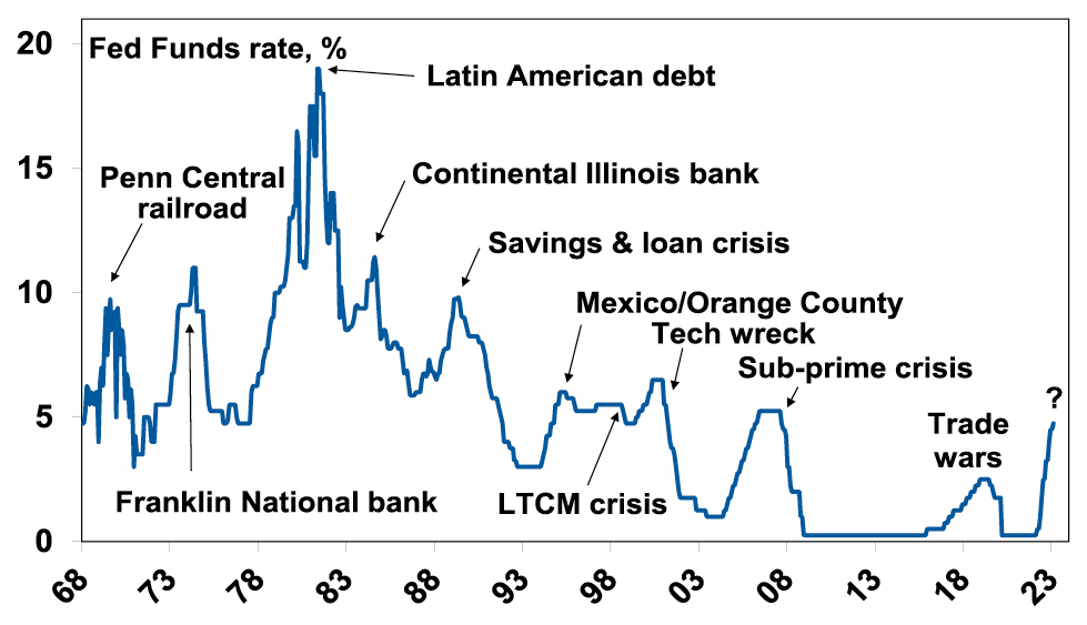
Source: Bloomberg, AMP
Fortunately, there are some reasons to suggest that worst case scenarios involving a flow on more broadly in the US and beyond may be limited:
-
US authorities have moved quickly to guarantee deposits (beyond the $US250,000 usually covered by deposit insurance) and the Fed has unveiled a Term Funding Facility that enables banks to borrow cheaply from the Fed in order to avoid selling their bonds at a loss. This should help reduce the risk of runs on banks and avoid a fire sale of bonds. And it should help minimise bigger problems for companies that had deposits at these banks – like layoffs & not paying creditors.
-
Following the GFC large US banks now have to maintain large capital buffers, have less risky exposures or at least less concentrated asset exposures and have more diverse deposit bases than regional banks. Unfortunately, restrictions were eased for smaller banks in 2018.
-
It should also be remembered that US regional bank failures are common – there were 8 in 2018-20 – albeit they were much smaller.
-
All Australian banks are required post GFC to maintain much stronger capital buffers and have tougher restrictions in terms of what they can invest in. They also have very diverse deposit bases so are less at risk of high deposit withdrawals than regional US banks. And they won’t have as much exposure to the vulnerable tech and crypto sectors. And Australian bank deposits are implicitly (if not explicitly) protected. But of course, they are vulnerable to defaults by Australian home borrowers particularly if the property market falls precipitously.
However, it will take a while to determine the full impact and for the dust to settle. And either way banks are likely to see a tougher environment ahead as growth slows and higher rates cause more financial stress for borrowers. It probably also means even tighter lending conditions for tech and crypto and for illiquid businesses like private equity and commercial property. And it’s a sign that Fed tightening has got traction!
But what about inflation?
As indicated in the chart above, past financial crisis in the US have resulted in an end to Fed tightening cycles. At this point its not clear that we are seeing a full-blown crisis unfold or not and high inflation is a bit of a barrier on what the Fed can do. As a result, so far it’s just gone down the path of making it easier for banks to access cheap funding so they don’t have to sell bonds at a loss. But how far the Fed and other central banks can support economies will at least partly be impacted by inflation.
Right now, it’s too high but it looks to have peaked. US and Canadian inflation peaked around mid-last year, inflation in Europe later last year. Australian inflation likely peaked in December. Supply bottlenecks have improved, freight costs have fallen and slowing demand will reduce demand side inflation. As is often the case goods price inflation is leading with services price inflation more sticky reflecting still tight labour markets – but these are showing signs of rolling over with job openings according to Indeed rolling over in the US, Europe and Australia. Wages growth is a key driver of services inflation – but in the US it looks to be slowing & in Australia there are no signs of a wages blowout. Easing inflation pressure is reflected in a declining trend in business surveys with respect to input and output prices and work backlogs & delivery times have fallen to normal levels. See the next chart. And if US bank sector problems depress economic activity, it will put more downwards pressure on inflation.
G3 Composite PMI & Price Pressure
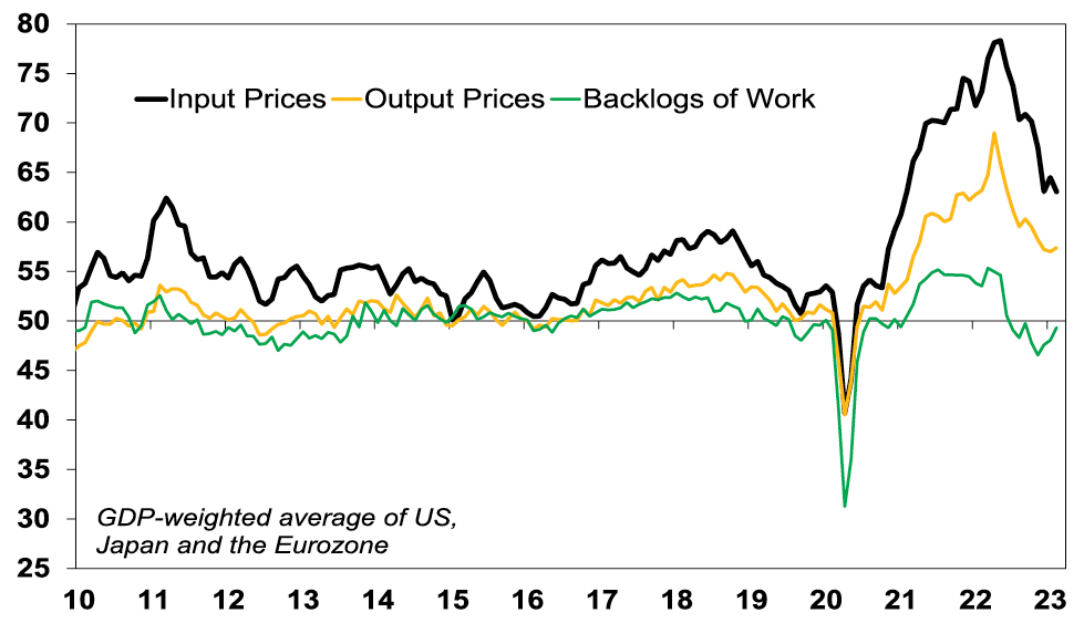
Source: Bloomberg, AMP
Does this mean central banks are nearly done?
If we are right and inflation will fall going forward, albeit with bumps along the way, then central banks are at or near the top and will have more flexibility to respond to financial crisis like the issues now in the US. Indeed, the US banking problems with the risk of a flow on to other countries (where banks also have losses on their bond portfolios) may put pressure on other central banks to provide liquidity support.
-
The ECB is lagging and has further to go than other central banks on rate hikes – but US problems may cause it to slow down.
-
The Bank of Canada has held rates at 4.5% at looks to have peaked.
-
The Fed has been signalling more rate hikes ahead following a recent run of stronger data – but leading US indicators point to slower demand with a high risk of recession (which would slow inflation) and there are tentative signs that the US jobs market is slowing. Bank problems – with the risk of more to come – should help slow the Fed at least heading off a 0.5% hike next week. Our base case is a 0.25% hike but if banking stresses remain high it’s likely to pause. In fact, based on past Fed hiking cycles the collapse in the US 2 year bond yield below the Fed Funds rates suggests the Fed is done!
-
The RBA has become less hawkish & has opened the door to a pause if data shows further cooling & slowing inflation. With total household debt servicing costs pushing to record levels our view is the RBA should and will soon pause. US financial problems add to the case.
What is the risk of recession?
This will likely be critical to how shares perform this year as the historical record shows that deep bear markets in US (and Australian) shares are invariably associated with US recessions. See the next chart. While the risk of recession has receded in Europe (with the collapse in gas prices) it remains high in the US with various leading indicators – including inverted yield curves (where short term interest rates are above long term yields) – warning of a high risk of US recession in the next 6-12 months. Problems in the financial system are adding to this risk which could easily push US shares down beyond the 25% top to bottom fall seen last year. However, if the Fed soon stops tightening a US recession could still be averted or it could be mild which would limit further downside in US shares.
Equity Bear Markets and Recessions
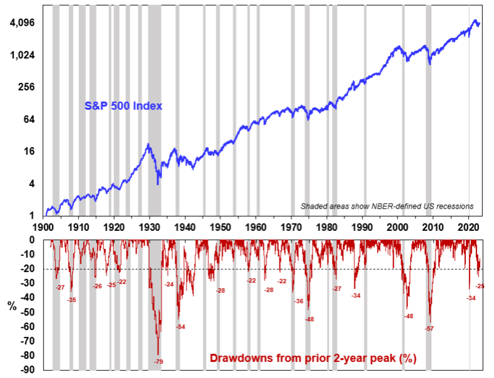
Source: Bloomberg, AMP
In Australia, the risk of recession is high. But our base case is that it will be avoided thanks to strong business investment, Chinese reopening and providing the RBA soon stops hiking and US financial contagion is limited.
What should all this mean for investors?
We see shares being stronger on a one-year view as inflation falls taking pressure of central banks hopefully enabling economies to avoid a deep recession. However, right now shares are at risk of more downside until some of the issues around the US financial system, inflation, recession and short-term interest rates are resolved. There are several implications for investors:
-
Unlike last year, investment in government bonds should provide more protection for investors as bond yields are now higher and have potential to fall if worries of recession rise as we saw in the last week.
-
Non-US shares are likely to outperform US shares as they are trading on lower price to earnings multiples and have a lower exposure to the tech sector. This includes the Australian share market.
-
For short term investors it’s a time to be cautious.
-
However, while times like these can be stressful, for superannuation members and most investors the best approach is to stick to basic investment principles. These things are worth keeping in mind:
-
share market pullbacks are healthy and normal – their volatility is the price we pay for the higher returns they provide over the long term;
-
it’s very hard to time market moves so the key is to stick to an appropriate long-term investment strategy;
-
selling shares after a fall locks in a loss;
-
share pullbacks provide opportunities for investors to invest cheaply;
-
shares invariably bottom with maximum bearishness;
-
Australian shares still offer attractive income versus bank deposits; &
-
to avoid getting thrown off a long-term strategy – it’s best to turn down the noise around all the negative news flow.
Source: AMP Capital March 2023
Important note: While every care has been taken in the preparation of this document, AMP Capital Investors Limited (ABN 59 001 777 591, AFSL 232497) and AMP Capital Funds Management Limited (ABN 15 159 557 721, AFSL 426455) make no representations or warranties as to the accuracy or completeness of any statement in it including, without limitation, any forecasts. Past performance is not a reliable indicator of future performance. This document has been prepared for the purpose of providing general information, without taking account of any particular investor’s objectives, financial situation or needs. An investor should, before making any investment decisions, consider the appropriateness of the information in this document, and seek professional advice, having regard to the investor’s objectives, financial situation and needs. This document is solely for the use of the party to whom it is provided.
Nine key lessons for today from the 1970s, 80s and 90s
Dr Shane Oliver – Head of Investment Strategy and Chief Economist, AMP Capital
IntroductionIn 1981 on a holiday with my parents to Hawaii we got into a discussion with some Americans about their new President, Ronald Reagan, and they said he had to deliver some tough economic medicine after years of policy mismanagement. At the time I dismissed them, but as
Read MoreDr Shane Oliver – Head of Investment Strategy and Chief Economist, AMP Capital
Introduction
In 1981 on a holiday with my parents to Hawaii we got into a discussion with some Americans about their new President, Ronald Reagan, and they said he had to deliver some tough economic medicine after years of policy mismanagement. At the time I dismissed them, but as the years went by I concluded that they had a point. The 1970s were an economic mess as inflation was allowed to get out of control. In fact, things were so bad that there was a wave of nostalgia for the 1950s and early 60s when things seemed a lot better – starting with American Graffiti, Happy Days, Laverne and Shirley and the rise of retro radio stations playing hits from the 50s and 60s. With inflation surging lately, what lessons can be drawn from the 1970s and its aftermath in terms of today’s problems. This is important because if we don’t learn the lessons of the past, we are bound to repeat them. This is particularly pertinent now as I often hear the comment “why are we so worried about a bit of inflation?” and “why is the RBA inflicting so much pain?”

What went wrong in the 1970s?
But first it’s worth a brief recap. From around the mid-1960s inflation started rising. First in the US and then in Australia. It was driven by a combination of tight labour markets, more militant workers demanding higher wages, a big expansion in the size of government, disruption from the Vietnam War, easy monetary policies, social unrest and years of industry protection reducing competition and pushing up prices. It really blew out after the OPEC oil embargo of 1973 and the second oil shock after the Iranian revolution of 1979. The surge in inflation came in waves, reaching double digit levels. It also combined with frequent recessions as policy makers tightened monetary policy in response to high inflation but were too quick to ease when growth slumped only to see inflation take off again driving more tightening and another economic downturn. The end result was a decade of high inflation, high unemployment and slow economic growth from which it took a long time to recover. For investors it was bad as high inflation meant high interest rates, high economic volatility & uncertainty and reduced earnings quality all of which demanded higher risk premiums to invest (& low PEs). The 1970s were one of the few decades to see poor real returns from both shares and bonds.
Aust inflation, wages grth & unemployment, 1960 – early 90s
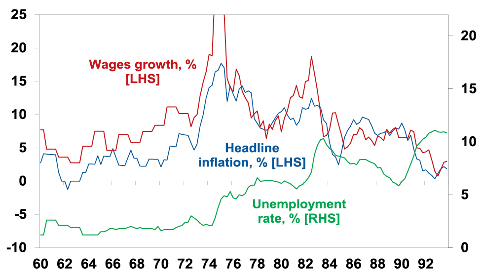
Source: ABS, AMP
So what broke it?
The malaise ultimately ended after voters turned to economically rationalist political leaders – like Thatcher, Reagan and Hawke and Keating in Australia. The policy response involved:
-
tight monetary policy which drove severe recessions, ultimately culminating in inflation targeting;
-
supply side reforms like deregulation, privatisation & competition laws to make it easier for the economy to meet demand;
-
this was aided by globalisation and then in the late 1990s the tech boom – which boosted the supply of low-cost goods and services;
-
in Australia, the prices and incomes Accord between Government, unions and business helped break the wage price spiral at the time.
This all broke the back of inflation with some in the 2000s calling it dead.
Key lessons
There are several lessons from the malaise of the 1970s and its aftermath and early 1990s recession in Australia for the inflation problem of today:
1. What won’t work. First, the experience of the 1970s and 1980s provides a clear list of things that won’t work to solve the problem:
-
Higher wage growth to keep up with inflation – this just perpetuates high inflation making it harder to get back down.
-
Price controls – these were tried, eg, in the early 1970s in the US. But they restrict supply and when removed inflation was worse than ever.
-
Replacing the RBA Governor – doing this mid-way through the problem would risk shaking confidence in the RBA’s anti-inflation commitment at the worst time likely resulting in even higher interest rates. The US saw something similar in the 1970s when it replaced William Martin at the Fed with Arthur Burns which just perpetuated high inflation.
-
·Raise the RBA’s inflation target – this would also reduce confidence in its ability to get inflation down and mean higher interest rates.
-
Shift responsibility for inflation control back to government – this sounds fine in theory as governments have more levers to pull (eg it could impose a 1% temporary income tax surcharge to cool demand which would spread the load more fairly beyond those with a mortgage). But unfortunately, politicians have shown an inability to inflict the pain necessary to slow inflation. So, it doesn’t work in practice. It was the way things were done in Australia in the 1970s and its failure led to the widespread adoption of central bank independence focussed on meeting an inflation target.
2. Containing inflation expectations is key. Once inflation takes hold it gets harder to squeeze out. This relates to “inflation expectations”. Once inflation has been high for a while consumers and businesses expect it to stay high and so behave in ways – via wage demands, price setting and acceptance of price rises – that perpetuate it. A wage price spiral is a classic example of this where prices surge, workers demand wage rises to compensate which boosts costs & drives a new round of sharp price rises. This is an example of the “fallacy of composition” – while it is rational for an individual to demand a wage rise to match inflation if all workers do so it just leads to a further surge in prices.
3. Whether its supply or demand, central banks have to respond. While the initial impetus to a surge in inflation may be constrained supply if it occurs when demand is strong or goes on for too long, central banks still have to respond to cool demand and signal they are serious about containing inflation. Central banks failure to do this after the 1973 OPEC oil shock contributed to inflation getting entrenched in the 70s.
4. Avoid stop go monetary policy. There is a danger in easing monetary policy too early in a downturn if inflation expectations have not been tamed. This occurred in the 1970s with inflation slowing and central banks easing as growth slowed but inflation soon rising even higher. This underpins talk central banks will keep rates “higher for longer”.
5. Entrenched high inflation will mean entrenched high interest rates. This is because investors will start to demand compensation for the fall in the real value of their savings by demanding higher rates. So interest rates rose through the 1970s into the 1980s. And this of course weighs on the valuation of shares and property. 10-year bond yields of around 3.5% to 4% are fine if investors expect inflation will fall to say 2-3% but if they believe inflation will stay high at 6-8% then they are too low.
Sustained high inflation = high interest rates
Source: ABS, AMP
6. Entrenched high inflation is bad for the economy. Because it distorts economic decisions it can cut economic growth as in the 1970s, add to economic uncertainty which hampers investment & boost inequality.
7. Once entrenched high inflation risks requiring a deep recession to remove it. This was seen in the deep recessions of the early 1980s and early 1990s in Australia which saw double digit unemployment. This was because by the late 1970s inflation expectations in the US as measured by the University of Michigan consumer survey were running around 10% following years of very high inflation making it harder to get inflation down. Australia was likely similar.
8. Governments should focus on the supply side. The practical inability of governments to adjust fiscal policy much to control inflation means the best it can do in the short term is not add to the problem and this means reducing budget deficits and limiting new spending. Longer term there is a lot that government can do to help control inflation and its all about supply side reform to make the economy work more smoothly, ie deregulate, cut back government and competition reforms. Unfortunately, the political appetite for such reforms is low.
9. Monetary policy operates with a lag. The early 1990s recession showed monetary policy works with a lag. This seems contradictory to the fourth point above but highlights the risk of overtightening. The lags arise as it takes time for rate hikes to be passed on to borrowers, that to slow spending and then for slower demand to lead to less employment and the flow on of this back to households and for all of this to cool inflation. This can take 12 months or more. So just looking at inflation and jobs data can be misleading as they are lagging indicators. In the late 1980s the RBA kept hiking and unemployment kept falling. But by early 1990 it was clear it had gone too far.
RBA rate hikes & unemployment in the late 1980s/early 1990s
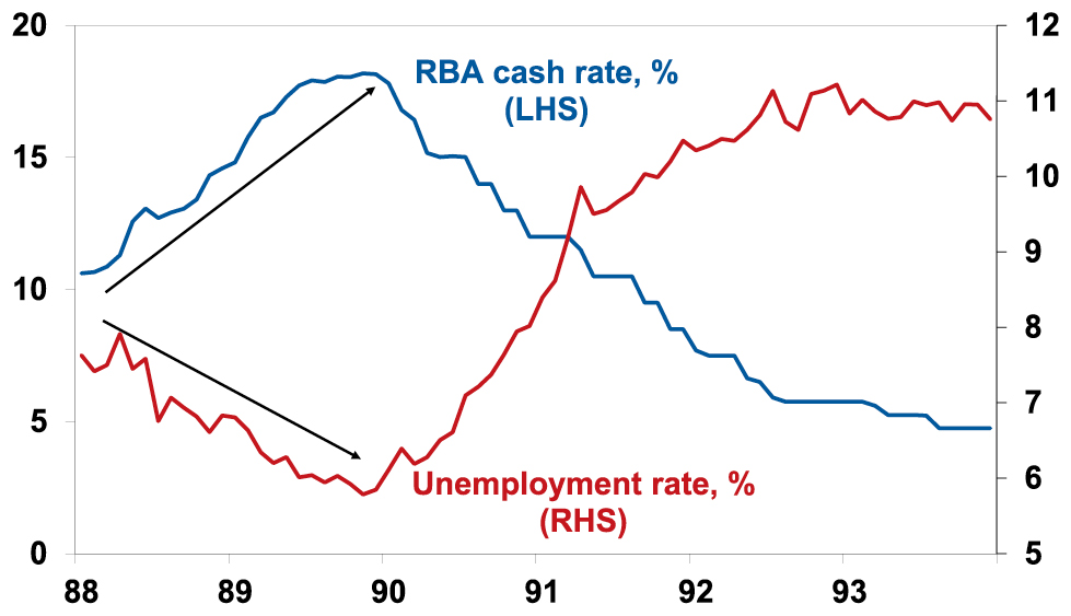
Source: ABS, RBA, AMP
So what does it all mean for today?
The good news is that this is not 1980 and more like the early 1970s: inflation expectations are low; there is no evidence of a wage price spiral, notably in Australia; supply bottlenecks, freight costs and surging money supply which led inflation are now reversing; and high household debt ratios compared to the 1970s should make monetary policy more potent. But the lessons from the 1970s explain why central banks are so fearful of letting inflation get out of control and also the difficult balancing act facing them. As RBA Governor Lowe said they “are managing two risks…not doing enough [resulting in high inflation persisting & proving costly later] [and] that we move too fast, or too far” and trigger recession. Balancing these two risks is seen as resulting in a narrow path to low inflation and the economy continuing to grow. But what is too much or too little tightening is a judgement call. The RBA’s view has become more hawkish after the December quarter CPI and is signalling at least two more rate hikes and money markets and the consensus of economists have moved to reflect this with consensus rate expectations rising above 4%. Our view is that the RBA risks doing too much given the high vulnerability of a significant minority of indebted Australian households and that the impact of past rate hikes is just being masked by normal lags accentuated by revenge spending associated with reopening. Signs of slowing consumer spending and jobs growth along with there still being no evidence of a wages breakout in Australia are consistent with this. As such, it risks a re-run of the late 1980s/early 1990s experience where Australia was inadvertently knocked into a deep recession as the lagged impact of rate hikes took time to show up. So, while we believe rates are close to the top, the RBA’s tough guidance means that the risks are skewed to the upside. Further evidence of a slowing consumer and jobs data are necessary to cause the RBA to rethink so upcoming retail sales and jobs data are critical in this.
Source: AMP Capital February 2023
Important note: While every care has been taken in the preparation of this document, AMP Capital Investors Limited (ABN 59 001 777 591, AFSL 232497) and AMP Capital Funds Management Limited (ABN 15 159 557 721, AFSL 426455) make no representations or warranties as to the accuracy or completeness of any statement in it including, without limitation, any forecasts. Past performance is not a reliable indicator of future performance. This document has been prepared for the purpose of providing general information, without taking account of any particular investor’s objectives, financial situation or needs. An investor should, before making any investment decisions, consider the appropriateness of the information in this document, and seek professional advice, having regard to the investor’s objectives, financial situation and needs. This document is solely for the use of the party to whom it is provided.
Seven key charts for investors to keep an eye on
Dr Shane Oliver – Head of Investment Strategy and Chief Economist, AMP Capital
IntroductionShares had a strong start to the year seeing gains into early February around or above what we expect for the year as a whole. But we still expect that it will be a volatile year given that: the process of getting inflation back down won’t be smooth;
Read MoreDr Shane Oliver – Head of Investment Strategy and Chief Economist, AMP Capital
Introduction
Shares had a strong start to the year seeing gains into early February around or above what we expect for the year as a whole. But we still expect that it will be a volatile year given that: the process of getting inflation back down won’t be smooth; the topping process in central bank rates will take time with setbacks along the way as we have seen for both the Fed and the RBA recently; recession risks are high; raising the US debt ceiling around the September quarter won’t be smooth; and geopolitical risks around Ukraine, China (as highlighted by the balloon over the US) and Iran (which is getting close to nuclear weapon breakout capacity) are significant. With shares becoming overbought after the new year rally and seasonality turning less positive, shares both globally and in Australia are vulnerable to more of a pull back in the short term. This note updates seven charts we see as critical for the investment outlook.

Chart # 1 – global business conditions PMIs
Whether share markets fall back to new lows and resume the bear market in US and global shares that started last year will be crucially dependent on whether major economies slide into recession and, if so, how deep that is. Our assessment is that global growth will be around 2.5-3% this year. Global Purchasing Managers Indexes (PMIs) – surveys of purchasing managers at businesses – will be a key warning indicator.
Global Composite PMI vs World GDP
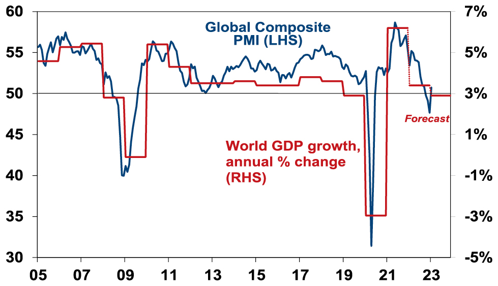
Source: Bloomberg, AMP Capital
They have slowed but are not at levels associated with recession. In January they rose, helped by China’s reopening. So far, they still look ok.
Chart 2 (and 2b) – inflation
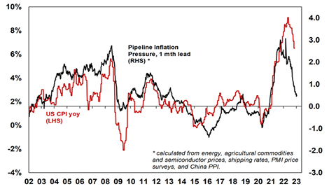
A lot continues to ride on how far key central banks raise interest rates. And the path of inflation will play a key role in this. Recently the news has been better with inflation rates in key countries rolling over. US inflation is well down from its high last year and our US Pipeline Inflation Indicator – reflecting a mix of supply and demand indicators – has been falling, pointing to a further fall in inflation. The key is that US inflation continues to fall – if so, this should allow the Fed to stop hiking in either March or May and it could find itself needing to cut rates from later this year.
AMP Pipeline Inflation Indicator
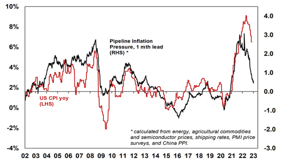
Source: Bloomberg, AMP
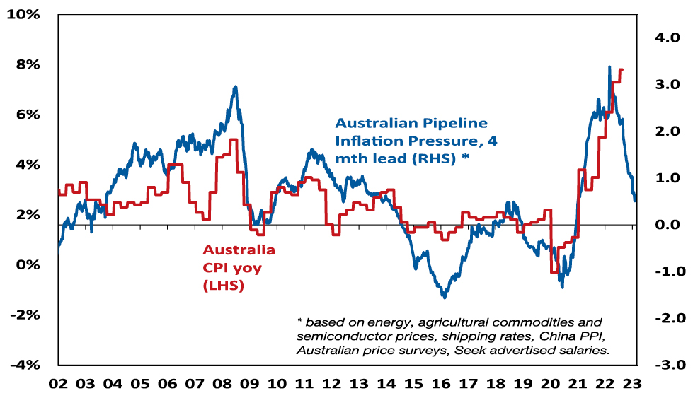
Our Australian Pipeline Inflation Indicator also suggests that Australian inflation has peaked and will fall through this year, albeit Australian inflation and the RBA are lagging the US and the Fed.
Australia Pipeline Inflation Indicator
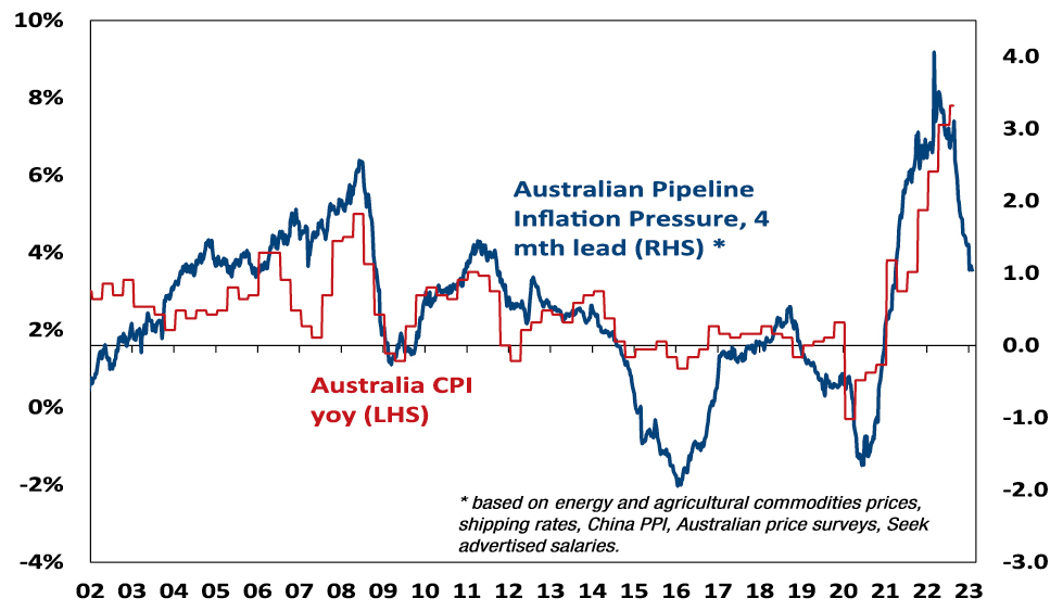
Source: Bloomberg, AMP
Chart 3 – unemployment and underemployment
Also critical is the tightness of labour markets as this will help drive wages growth. If wages growth accelerates too far it risks locking in high inflation with a wage-price spiral which would make it hard to get inflation down. Unemployment and underemployment are key indicators of this. Both remain very low in the US & Australia (putting upwards pressure on wages), but there is some evidence that labour markets have seen the best and may now be slowing. And wages growth in the US looks to have peaked.
Labour market underutilisation rates
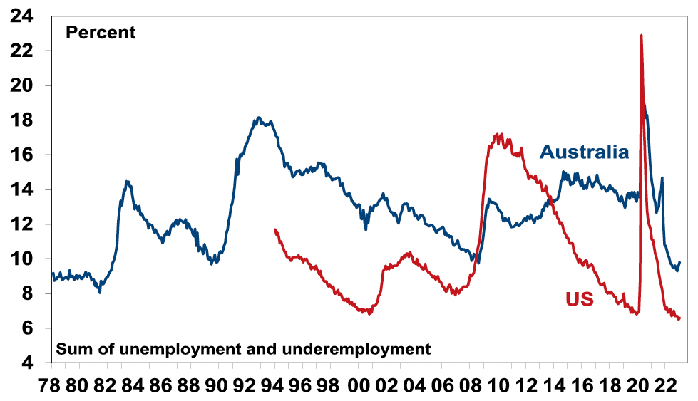
Source: Bloomberg, AMP
Chart 4 – longer term inflation expectations
The 1970s experience tells us the longer inflation stays high, the more businesses, workers and consumers expect it to stay high & then they behave (in terms of wage demands, price setting & tolerance for price rises) in ways which perpetuate it. The good news is that short term (1-3 years ahead) inflation expectations have fallen lately in the US and longer-term inflation expectations remain low. The latter is consistent with 2% or so inflation & suggests the job of central banks should be far easier today than say in 1980 when the same measure was around 10% and deep recession was required to get inflation back down. The key is that it stays low.
US University of Michigan Consumer Inflation Expectations
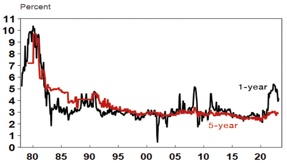
Source: Macrobond, AMP
Chart 5 – earnings revisions
Consensus earnings growth expectations for this year are around 11% for the US and around 7% for Australia. They look a bit too high, but a deterioration on the scale seen in the early 1990s, 2001-03 in the US and 2008 would be bad news. So far so good.
Earnings Revision Ratio
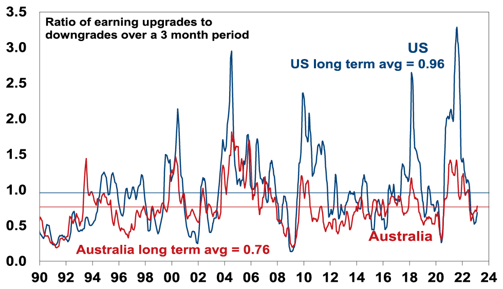
Source: Reuters, AMP
Chart 6 – the gap between earnings and bond yields
Over the last year rising bond yields have weighed on share market valuations. As a result, the gap between earnings yields and bond yields (which is a proxy for shares’ risk premium) has narrowed to its lowest since the GFC in the US. Compared to the pre-GFC period shares still look cheap. Australian share valuations look a bit more attractive than those in the US though helped by a higher earnings yield. Ideally bond yields need to continue to decline and earnings downgrades need to be limited in order to keep valuations okay.
Shares still offer a reasonable risk premium over bonds
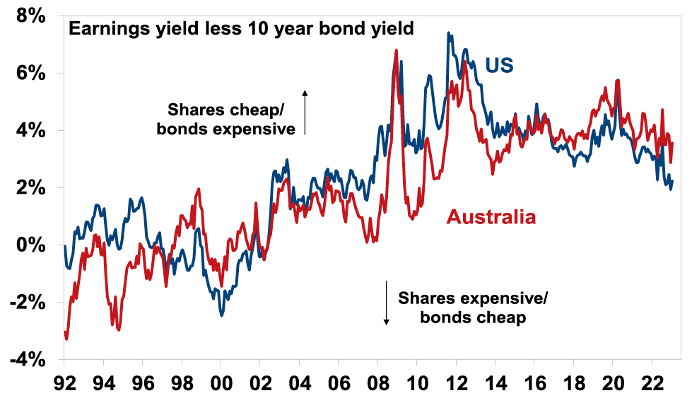
Source: Reuters, AMP
Chart 7 – the US dollar
The US dollar is a counter cyclical currency, so big moves in it are of global significance and bear close watching as a key bellwether of the economic and investment cycle. Due to the relatively low exposure of the US economy to cyclical sectors, the $US tends to be a “risk-off” currency, ie, it goes up when there are worries about global growth and down when the outlook brightens. Last year the $US surged with safe haven demand in the face of worries about recession and war and more aggressive monetary tightening by the Fed. Since September though it has fallen back as inflation and Fed rate hike fears have eased and geopolitical risks receded a bit. A further fall in the $US would be consistent with our reasonably upbeat view of investment markets this year, whereas a sustained new upswing would suggest it may be vulnerable. So far so good.
The $US v major currencies & the $A
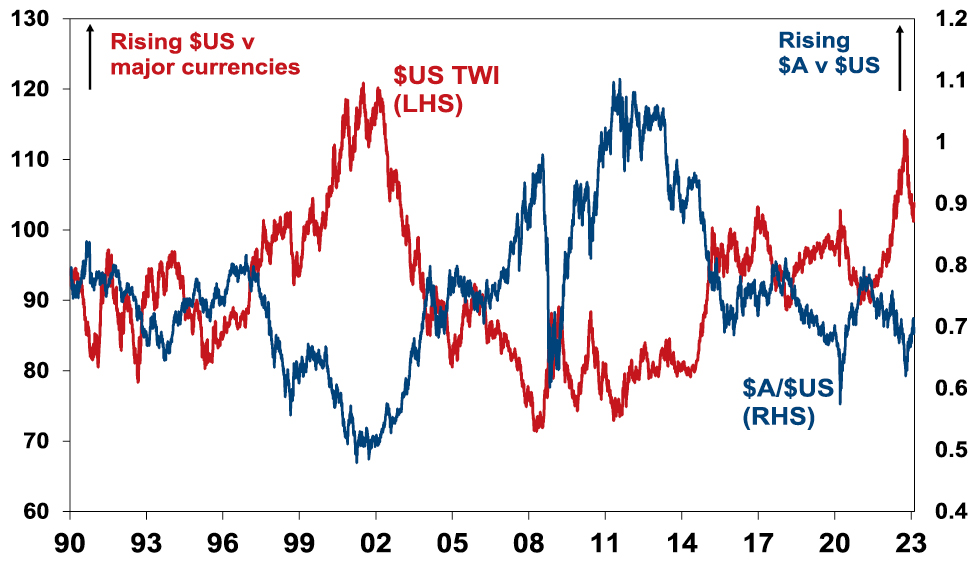
Source: Bloomberg, AMP
Source: AMP Capital February 2023
Important note:While every care has been taken in the preparation of this document, AMP Capital Investors Limited (ABN 59 001 777 591, AFSL 232497) and AMP Capital Funds Management Limited (ABN 15 159 557 721, AFSL 426455) make no representations or warranties as to the accuracy or completeness of any statement in it including, without limitation, any forecasts. Past performance is not a reliable indicator of future performance. This document has been prepared for the purpose of providing general information, without taking account of any particular investor’s objectives, financial situation or needs. An investor should, before making any investment decisions, consider the appropriateness of the information in this document, and seek professional advice, having regard to the investor’s objectives, financial situation and needs. This document is solely for the use of the party to whom it is provided.
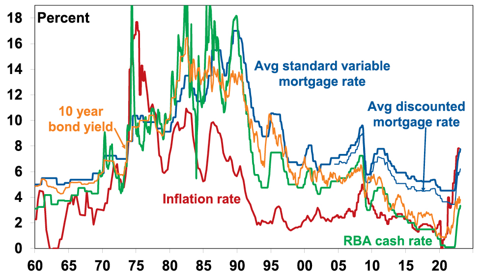
The RBA hikes rates by another 0.25% – are we there yet?
Dr Shane Oliver – Head of Investment Strategy and Chief Economist, AMP Capital
IntroductionThe RBA raised its cash rate by another 0.25% taking it to 3.35%. This is the ninth consecutive rate hike in a row over ten months totalling 325 basis points and exceeds the 2002-2008 tightening cycle (of 300 basis points over 71 months) making it the biggest tightening
Read MoreDr Shane Oliver – Head of Investment Strategy and Chief Economist, AMP Capital
Introduction
The RBA raised its cash rate by another 0.25% taking it to 3.35%. This is the ninth consecutive rate hike in a row over ten months totalling 325 basis points and exceeds the 2002-2008 tightening cycle (of 300 basis points over 71 months) making it the biggest tightening cycle since the 1980s. Prior to 1990 the RBA cash rate was not officially announced, and short-term rates were very volatile. In the period January 1988 to November 1989 the overnight cash rate rose from 10.6% to 18.2% but mortgage rates were more regulated then and “only” rose from 13.5% to 17%.

RBA rate hiking cycles since the 1990s
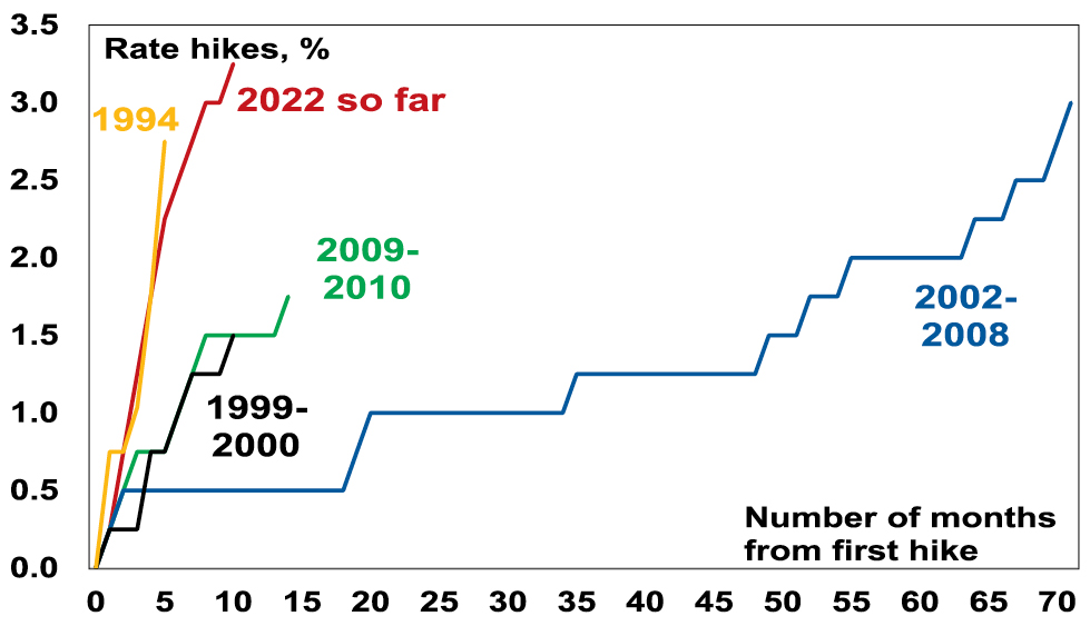
Source: RBA, AMP
In justifying another hike, the RBA noted that: inflation is at its highest since 1990 with underlying inflation higher than expected; the labour market remains tight; wages growth is expected to pick up; and its “priority is to return inflation to [the 2-3%] target”. The RBA also reiterated that: monetary policy operates with a lag; and it wants to keep the economy on an even keel. It made no significant changes to its forecasts and still sees growth slowing to 1.5% this year, unemployment rising to 3.75% and inflation slowing to 4.75%. But compared to its last post meeting Statement in December the RBA has become more hawkish most likely as a result of the stronger than expected rise in underlying inflation. In particular, the RBA noted that “the Board expects to increase interest rates further over the months ahead,” but removed the qualifier that “it is not on a pre-set course” (which had been interpreted as opening the door to a pause).
Banks are likely to pass the hike on in full taking variable mortgage rates to their highest in 11 years.
Australian interest rates still on the rise
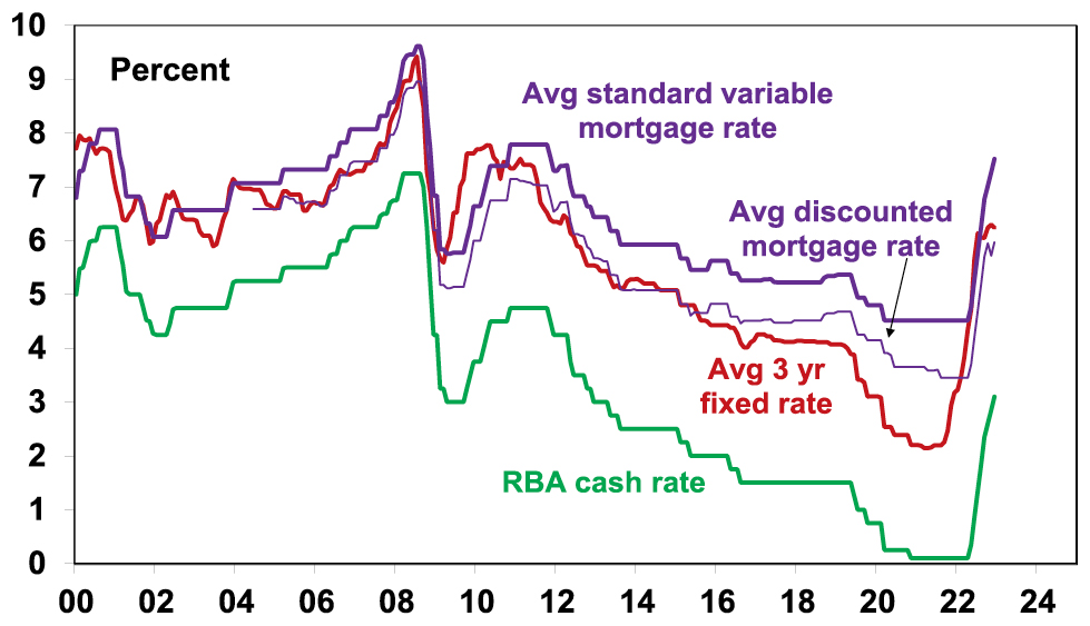
Source: RBA, Bloomberg, AMP
Are we there yet?
While the RBA stepped up its hawkishness and another rate hike now looks likely next month, its commentary is not necessarily a great guide to what happens with rates – just a bit more than a year ago it didn’t expect rates to start rising until 2024 at the earliest! What happens to inflation and growth will be key. Given the experience of the last year one has to be humble in trying to predict the cash rate peak. Prior to the December quarter CPI release we thought the RBA would leave rates on hold at this month’s meeting! And some argue there are still many hikes ahead of us. So, it’s worth considering both sides of the argument.
The case for much higher interest rates
The case for still much higher interest rates rests on the following:
-
Inflation in Australia is still rising.
-
The labour market remains very tight – with the sum of unemployment and underemployment near their lowest since the early 1980s potentially driving much higher wages and a wage-price spiral.
-
Against this backdrop and given the 1970s experience the RBA needs to keep demonstrating its resolve to get inflation back down to keep inflation expectations down – otherwise it will get harder to tame.
-
Simple monetary policy rules suggest the cash rate should be much higher. For example, the most common rule called The Taylor Rule – formulated by US economist John B Taylor 30 years ago – posits that the official interest rate should equal the inflation rate plus the neutral real interest rate plus 0.5 times the gap between the current and target inflation rate and 0.5 times the output gap (ie, the gap between actual & potential GDP) or alternatively the gap between the unemployment rate and the non-accelerating inflation rate of unemployment (NAIRU). In fact, given the high starting point for the inflation rate (7.8%), a neutral rate of 1% and the big gap between inflation and the target inflation rate (2.5%) and unemployment being below NAIRU a standard specification of the Taylor Rule suggests the cash rate should maybe be around 11% – a level not seen since the early 1990s!
-
Other central banks all have higher rates, viz US Fed 4.5-4.75%; the BoE 4%; BoC 4.5%, RBNZ 4.25%. The ECB is lower at 3% but it started later.
-
The economy so far has been resilient with households supported by $250bn or so in extra saving built up in the pandemic lock down years.
Based on this it can be argued that interest rates need to rise a lot further – with several economists expecting the cash rate to rise above 4%.
The case for rates being near the top
The counterargument suggesting that we may be at or close to the top on rates is based on the following:
-
First, monetary policy operates with a lag. It takes 2-3 months for RBA rate hikes to impact actual variable rate mortgage payments and then several months before this impacts spending. There are then flow on effects to jobs and businesses with feedback impacts on households which can take a year. And this lag may have been lengthened by the rise in fixed rate mortgages around 2020-21 and the reopening boost to spending. The lag was clearly evident in the late 1980s but ignorance of it contributed to the severity of the early 1990s recession.
-
Second, inflationary pressure is easing globally. This is evident in global business surveys showing reduced delivery times and falling work backlogs, lower freight costs, lower metal and grain prices, and falling input and output prices. US money supply which surged ahead of the US inflation spike is falling. US inflation peaked mid-year at 9.1% and has fallen to 6.5% and inflation in Europe, the UK and Canada appears to have peaked. Australian inflation appears to be following the US by six months (due partly to a later reopening in the economy and later surge in energy prices), suggesting it peaked here last quarter.
-
Third, there are signs Australian inflation is peaking with business surveys showing a downtrend in input and output price readings, low work backlogs & a falling capacity utilisation. Reflecting this and global indicators, our Australian Pipeline Inflation Indicator is falling sharply.
Australia Pipeline Inflation Indicator
Similar to our US Inflation Indicator but has more Aust components, Source: Bloomberg, AMP
-
Fourth, some of the components which drove inflation so high are unlikely to be repeated: the 10.9% December quarter rise in travel costs will start to fade as travel and travel industry capacity return to normal; dwelling purchase costs (up 18%yoy) are now slowing; petrol prices appear to be stabilising; and electricity prices this year may be lower than previously expected with falling gas and coal prices.
-
Fifth, while the Taylor Rule is a useful framework its prescription varies dramatically depending on the assumptions used, it makes no allowance for whether inflation psychology is entrenched or not (if it is like in the 1970s and 1980s then much higher rates are needed – but that looks unlikely) and it makes no allowance for the high level of household debt compared to the past and the degree of reliance of households on short dated mortgages compared to other countries (eg in the US 95% of mortgages are at fixed 30 year mortgage rates).
-
Specifically in relation to household debt, given the almost three-fold increase in the household debt to income ratios over the last 30 years, a 17% mortgage rate in 1989 – which preceded the early 1990s recession – is roughly equivalent to a 6% variable mortgage rate today and we are already pushing through that. A variable rate borrower on an existing $500,000 mortgage (which is the average) will see roughly another $80 added to their monthly payment from today’s RBA hike which will take the total increase in their monthly payments since April to nearly $1000 a month. That’s an extra $12,000 a year which is a massive hit to household spending power. And roughly two thirds of the 40% of mortgaged households with fixed rates (roughly about 1 million households) will see a 2 or 3 fold increase in their payments when their fixed term expires by the end of the year. And the RBA’s interest rate hikes have now exceeded the 2.5% mortgage rate serviceability buffer that applied up to October 2021 and the 3% since. The surge in interest rates has already pushed mortgage interest payments as a share of household income back to levels not seen since early last decade. A rise in the cash rate to 4% would push the interest payment share to near a record high and total mortgage repayments (ie, interest and principal) as a share of income to record highs. The hit to spending power for households with a mortgage (who tend to vary their spending more than older Australian’s with big bank deposits) is likely to drive a big slowing in consumer spending.
Household housing interest payments v disposable income
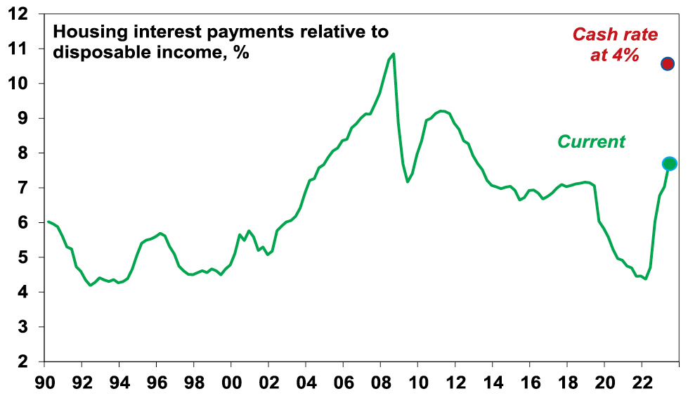
Source: ABS, RBA, AMP
-
Sixth, there is increasing evidence rate hikes are getting traction: housing related indicators are all very weak; the 9% fall in home prices will depress consumer spending via a negative wealth effect; consumer confidence remains depressed; retail sales are falling in real terms; and there are some signs of slowing jobs growth. Slower demand in the economy will further reduce inflationary pressures. This may become more evident as the reopening bounce (“revenge” spending) wears off.
-
Finally, Australia is not acting alone as global rate hikes are slowing growth in advanced countries which in turn will slow global inflation pressures – so other central banks are doing part of the RBA’s job.
Concluding comment
On balance, while the RBA now looks likely to hike rates again by another 0.25% next month – continuing much further down the path of rate hikes in response to inflation which is a lagging indicator while ignoring the lagged flow through of rate hikes to the economy, signs of slowing demand and improving supply risks plunging the economy into a recession we don’t have to have. So, despite being premature so far, we still see the RBA as being close to the peak with rates. Our base case is now for one more 0.25% hike next month, followed by a lengthy peak as it becomes clearer that inflationary pressures are easing and growth is slowing, ahead of the start of rate cuts late this year or early next year.
Source: AMP Capital February 2023
Important note: While every care has been taken in the preparation of this document, AMP Capital Investors Limited (ABN 59 001 777 591, AFSL 232497) and AMP Capital Funds Management Limited (ABN 15 159 557 721, AFSL 426455) make no representations or warranties as to the accuracy or completeness of any statement in it including, without limitation, any forecasts. Past performance is not a reliable indicator of future performance. This document has been prepared for the purpose of providing general information, without taking account of any particular investor’s objectives, financial situation or needs. An investor should, before making any investment decisions, consider the appropriateness of the information in this document, and seek professional advice, having regard to the investor’s objectives, financial situation and needs. This document is solely for the use of the party to whom it is provided.
Seven reasons why Australian shares are likely to outperform global shares over the medium term
Dr Shane Oliver – Head of Investment Strategy and Chief Economist, AMP Capital
IntroductionSince the March 2009 Global Financial Crisis (GFC) low in share markets, Australian shares are up 138%, compared to a 310% gain in global shares in local currency terms and a 500% gain in US shares.
Australian and global shares
Source: Bloomberg, AMP
Last year though Australian shares outperformed global shares,
Read MoreDr Shane Oliver – Head of Investment Strategy and Chief Economist, AMP Capital

Introduction
Since the March 2009 Global Financial Crisis (GFC) low in share markets, Australian shares are up 138%, compared to a 310% gain in global shares in local currency terms and a 500% gain in US shares.
Australian and global shares
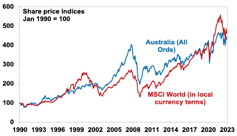
Source: Bloomberg, AMP
Last year though Australian shares outperformed global shares, helped by strong commodities and a less hawkish RBA. The big question is whether the structural underperformance by Australian shares since 2009 is over?
Why have Australian shares underperformed?
To get a handle on the future, it’s useful to understand the past. The underperformance of Australian shares since 2009 reflects a mix of:
-
Payback for its huge outperformance in the 2000s – Australian shares go through periods of relative out & underperformance. This can be seen in the next chart that shows the relative decade by decade real returns of global and Australian shares since 1940. Australian shares outperformed in the 1940s, unperformed in the 1950s, outperformed in the 1960s resources boom years, underperformed in the high inflation 1970s and 80s, outperformed in the 1990s (although this was marginal and Australia underperformed in the second half of the 1990s when the tech boom raged), outperformed dramatically in the resources boom of the 2000s and underperformed in the 2010s.
Australian versus global shares returns – mean reversion
Source: ABN-Amro Global Investment Returns Yearbook, Bloomberg, AMP
The swings in relative performance can also be seen in the next chart which shows the ratio of Australian share prices to global share prices.
Australian shares prices relative to global share prices
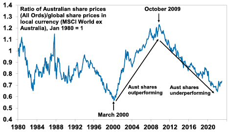
Source: Bloomberg, AMP
-
After underperforming global shares in the tech boom in the second half of the 1990s, Australian shares came roaring back in the 2000’s resources boom. This meant the 2007 high for Australian shares was a much higher high than for global shares which spun their wheels in the 2000s. So, the poor relative performance of Australian shares since 2009 is partly payback for their outperformance in the 2000s.
-
The slump in commodity prices from 2011 – this weighed heavily on Australian resources shares through much of last decade.
-
Relatively tighter monetary policy in Australia for much of the post GFC period – whereas the US, Europe and Japan had near zero interest rates and quantitative easing, Australia has had much higher rates and no money printing until the pandemic. In fact, the relative underperformance started in October 2009 when the RBA raised rates post GFC which wasn’t followed by other major countries.
-
The surge in the $A to $US1.10 in 2011 – this reduced the competitiveness of Australian companies which takes time to reverse.
-
Property crash phobia – foreign investor fear of a crash in Australia’s expensive housing market has been a periodic theme over the last decade leading many foreign investors to be cautious of Australia.
-
Worries about the deteriorating relationship with China – this started in 2018 with President Trump’s trade war but was accentuated through the pandemic. It arguably resulted in foreign investors demanding a risk premium to invest in the $A and Australian shares.
-
A low exposure to pandemic winners – like tech stocks, which helped the US share market and hence global shares in 2020 & 2021.
Are high dividend payouts to blame?
An often expressed view is that Australian companies are not investing because shareholders want high dividends and this could be causing poor profit growth & share returns. This is unlikely. The dividend payout ratio (ie dividends relative to earnings) is not out of line with its historic norm.
Australian dividend payout ratio
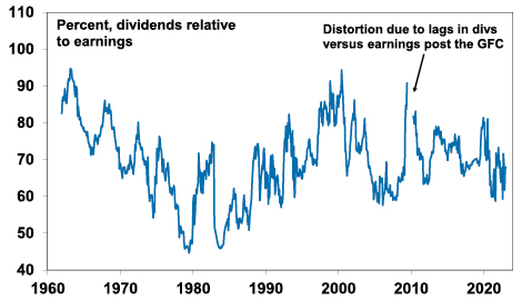
Source: Bloomberg, RBA, AMP
Australia’s high dividend payouts are in fact healthy from a long-term perspective. There is evidence that high payouts actually drive higher earnings growth and share returns as: high dividend payouts mean less risk of poor investment decisions from retained earnings; they are indicative of corporate confidence about future earnings; & they indicate earnings are real and not an accounting fiction.
In fact, because Australian shares pay relatively high dividend yields (around 4.4%) compared to global shares (2.5%) they should be included in comparisons of Australian with global share market returns. The next chart compares the relative performance of Australian to global shares since 1970 in terms of: relative share prices in local currency terms (green line); relative total returns ie with dividends added in (blue line); and relative total returns with global shares in Australian dollars (red line).
Australian shares relative to global shares allowing for dividends and currency movements
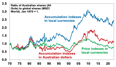
Source: Thomson Reuters, Bloomberg, AMP
A rising ratio means Australian outperformance and vice versa. Several things stand out. First over long periods of time and when dividends are allowed for Australian shares have had better returns than global shares. Since 1970 Australian shares have returned (capital growth plus dividends) 10.1% per annum compared to 8.2% pa for global shares in local currency terms. The falling $A over this period has enhanced the return from global shares to 9.8% pa but they still underperformed Australian shares. Second, the swings in the relative performance of Australian shares are apparent if dividends and currency movements are allowed for or not – in particular in the big outperformance in the 2000s and underperformance since 2009. Since October 2009, when Australian shares peaked relative to global shares, Australian shares have returned 7.7% pa compared to 9.7% pa from global shares in local currencies or 11.3% pa in $A terms (as the $A fell).
Seven reasons Australia’s underperformance is likely over
Over the last year Australian shares have outperformed global shares and the various comparisons in the last chart have hooked higher. It could just be noise, but several fundamental considerations suggest that the structural relative underperformance since 2009 is likely to be over:
-
Mean reversion – after 12 years of underperformance & the reversal of the 2000s outperformance Australian shares are due for a lengthy period of outperformance. Consistent with this, Australian shares are trading on a lower forward price to earnings multiple of 14.5 times than global shares on 15.3 times & US shares on 17.1 times.
-
A new super cycle in commodities – the commodity price slump from their 2008-2011 highs looks to be over with commodities embarking on a new super cycle bull market driven by constrained supply after low levels of investment and low inventories for most commodities, decarbonisation driving increased demand for metals and increased defence spending on the back of increased geopolitical tensions which is metal intensive. This will benefit Australia’s resource stocks.
-
The $A is no longer expensive – the surge in the $A to $US1.10 of 2011 has long ago reversed with the $A hitting a low of $US0.57 in 2020 & $US0.62 last year making Australian companies more competitive.
-
Stronger growth potential – Australia’s potential growth rate remains higher than the US, Europe & Japan due to higher population growth.
-
Relatively high dividends – Australian shares pay a higher dividend yield than traditional global shares: 4.4% versus 2.5%. This is important because dividend payments are a big chunk of the return an investor will get and so the higher the better. Franking credits add around 1.3%pa to the post tax return for Australia-based investors.
-
Less aggressive monetary tightening – RBA monetary policy is no longer relatively tight compared to other major central banks, notably the Fed. It has been taking a more balanced approach to returning inflation to target. Higher than expected December quarter inflation is a concern and is now likely to see the RBA hike rates by another 0.25% in February. But its likely to be the peak in inflation as supply is improving, freight costs have fallen and demand is slowing and its unlikely to see the RBA adopt a more aggressive policy compared to other major countries.
-
A thawing in the China relationship – the risk of a sharp deterioration in the trade relationship with China appears to be receding (at least for a while) helped by a change of Government in Australia.
Finally, while Australian property prices likely have more downside there is no sign of a property crash dragging down banks and the economy into recession. In the absence of much higher interest rates this looks unlikely.
Concluding comment
The period of underperformance in Australian shares compared to global shares since 2009 is likely to be over. Expect a 5-10 year period of trend outperformance, albeit there will be bumps along the way.
Source: AMP Capital January 2023
Important note: While every care has been taken in the preparation of this document, AMP Capital Investors Limited (ABN 59 001 777 591, AFSL 232497) and AMP Capital Funds Management Limited (ABN 15 159 557 721, AFSL 426455) make no representations or warranties as to the accuracy or completeness of any statement in it including, without limitation, any forecasts. Past performance is not a reliable indicator of future performance. This document has been prepared for the purpose of providing general information, without taking account of any particular investor’s objectives, financial situation or needs. An investor should, before making any investment decisions, consider the appropriateness of the information in this document, and seek professional advice, having regard to the investor’s objectives, financial situation and needs. This document is solely for the use of the party to whom it is provided.